We understand it’s not for everyone, but we are suckers for a bulky, Brutalist building. International House at 3701 Chestnut St. in West Philly most certainly fits this description. This 14-story building was completed in the early 1970s and has served as student housing since then. A couple years ago, CSC (a co-living company) teamed up with local developers Alterra to propose a major addition consisting of a residential tower and a retail podium facing Chestnut, per a submission to the Historical Commission. Since then, the building has been rebranded as the Mason on Chestnut and has been designated as historic, meaning any alterations would need to be approved by that same Historical Commission. Let’s check out the site today before we check out how the plans have evolved.
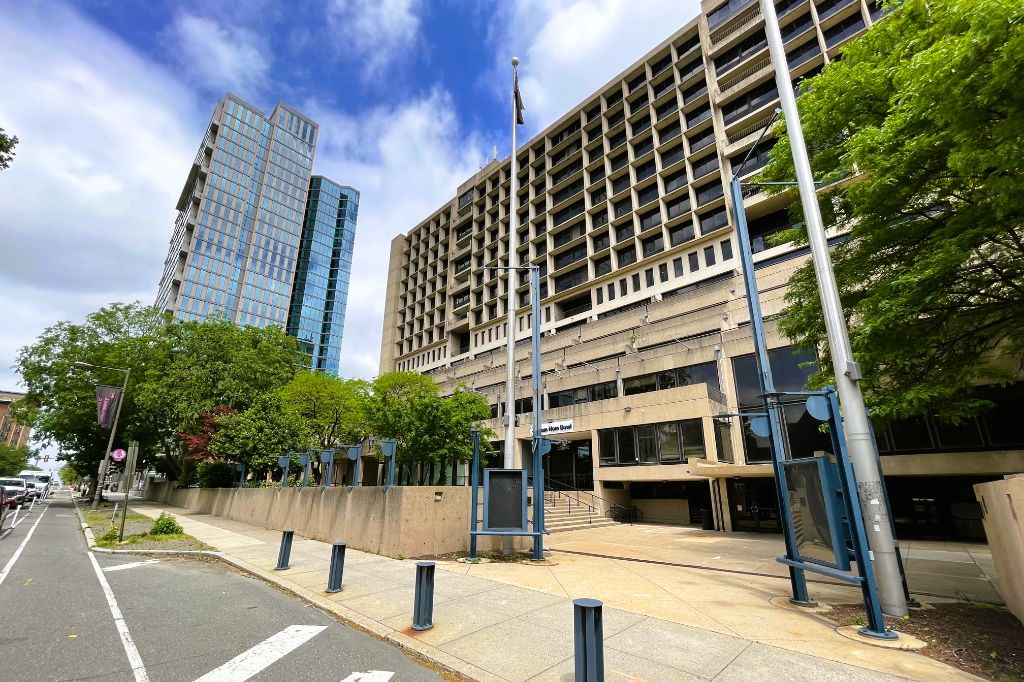
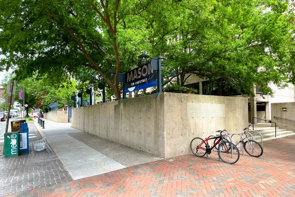
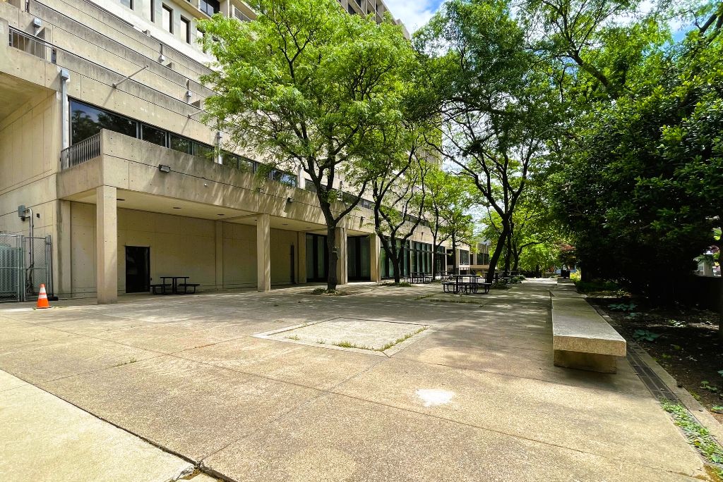
This isn’t exactly the most welcoming entry from the street and there isn’t much action once you’re beyond the concrete walls. Past proposals called for a huge addition on the Ludlow St. side of the lot, drastically altering the existing building, designed by Bower & Fradley, which may be more familiar to you by their current name – BLT Architects. How about a quick reminder of what’s been proposed?
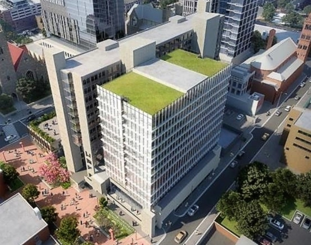

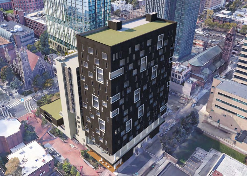
For fellow Brutalism fans or folks who are fond of historic preservation in general, fear not. We are happy to report that current plans are focused on the opposite side of the building, so no residential addition will be added like what you see above, at least not now. On the Chestnut-facing side, there are plans for a commercial addition. We wouldn’t be doing our scholarly diligence if we didn’t walk you through what’s been proposed previously before for this side of the building.

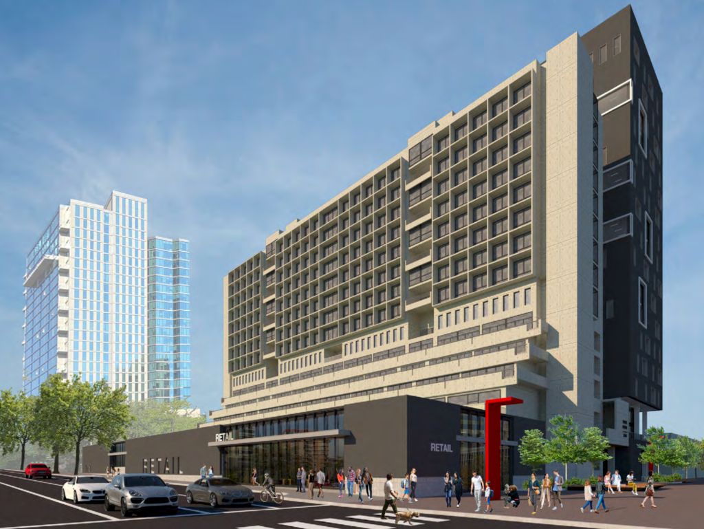
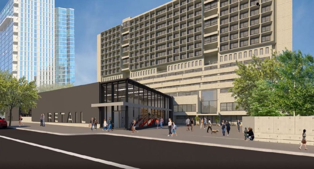
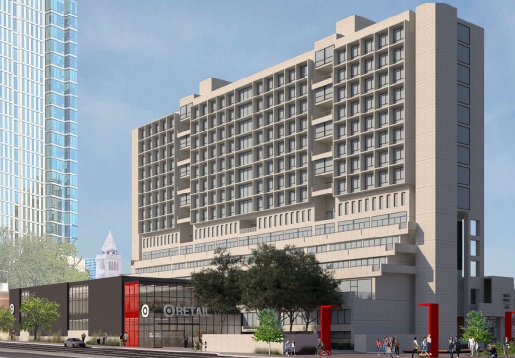
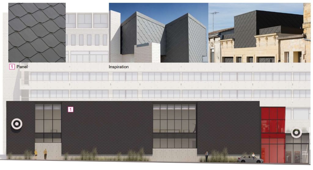
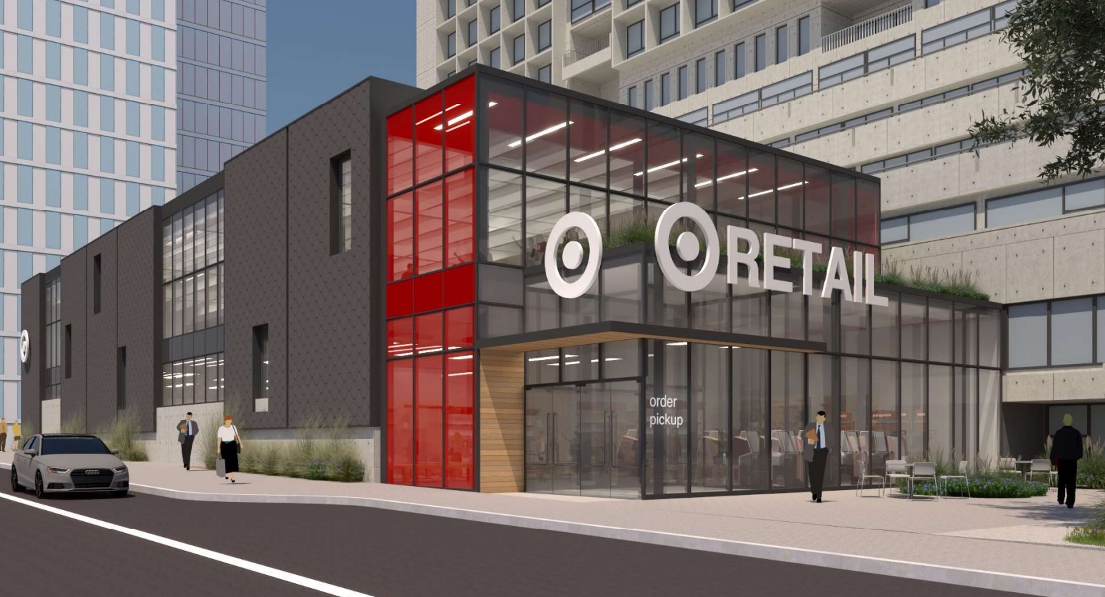
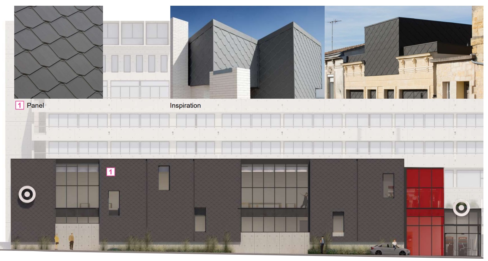
ALMA architecture has designed a two-story addition for the western side of the lot, with a refurbishment of the eastern end which abuts the pedestrian-only 37th Street Walk. While the renderings only say RETAIL, it seems pretty apparent that a Target is slated for the site given, oh, just about every single design feature possible. This new building takes up a smaller area of the plaza while integrating more appropriately than past versions, design-wise. We are especially fond of the shingle choice, which somehow gives off an industrial pinecone vibe (in a good way). The removal of a portion of the existing wall and the addition of more plantings will soften the eastern side of the plaza. And good news? This new structure will barely touch the existing building.
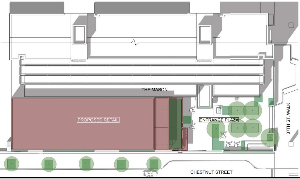
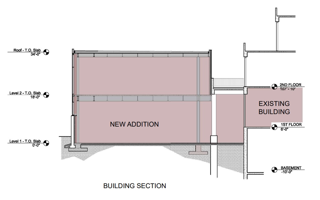
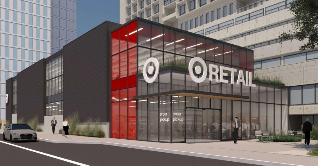
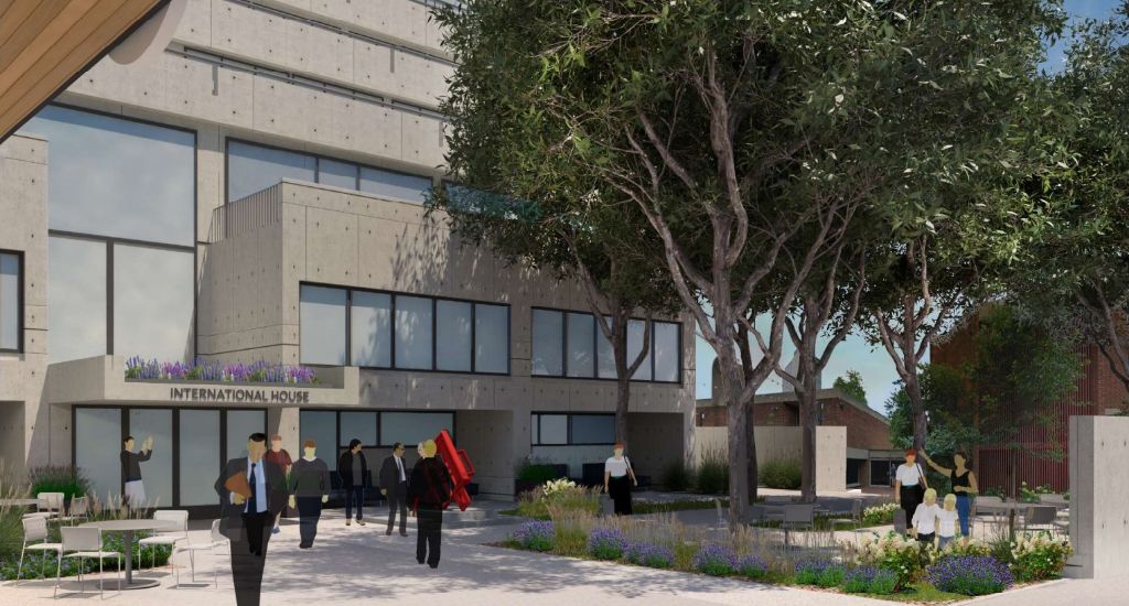
This seems like a solid outcome overall given what could have been. The scale of this new version is much more appropriate for the site, which quite frankly doesn’t offer much currently where it will rise. The inward focus of Brutalist plaza/landscape design (see: the uninviting, non-original walls surrounding the Roundhouse or the garden updates at the Hirshhorn in DC) is one aspect that we don’t mind receiving a makeover. Will we see a later addition rise on the other side of the site? We can’t be sure, but given all of the action very close by, we’ll keep an eye on things, just in case.
UPDATE (6/7/2022): Per a recent update from the Historical Commission, some changes have been made to the facade. The charcoal facade and additional vertical windows do a good job of breaking up the former very dark, windowless massing and visual weight along Chestnut. The slight setback to the entry also makes the building more friendly and seamless with the sidewalk flow of pedestrians. Check out the updates on this still-not-a-Target below.

Leave a Reply