What better way to get 2024 kickstarted than by referencing a hit from a UK reggae band that was released 41 years ago? We’re not sure, but we do know that there are indeed some new red lines reaching into the sky at 210 S. 12th St. in Washington Square West these days. And these lines are somewhat unexpected, as our most recent trip to the site late this summer hinted at a different set of hues for this new apartment tower.
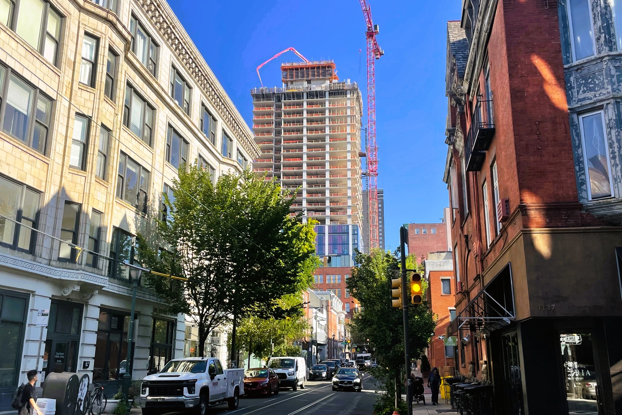
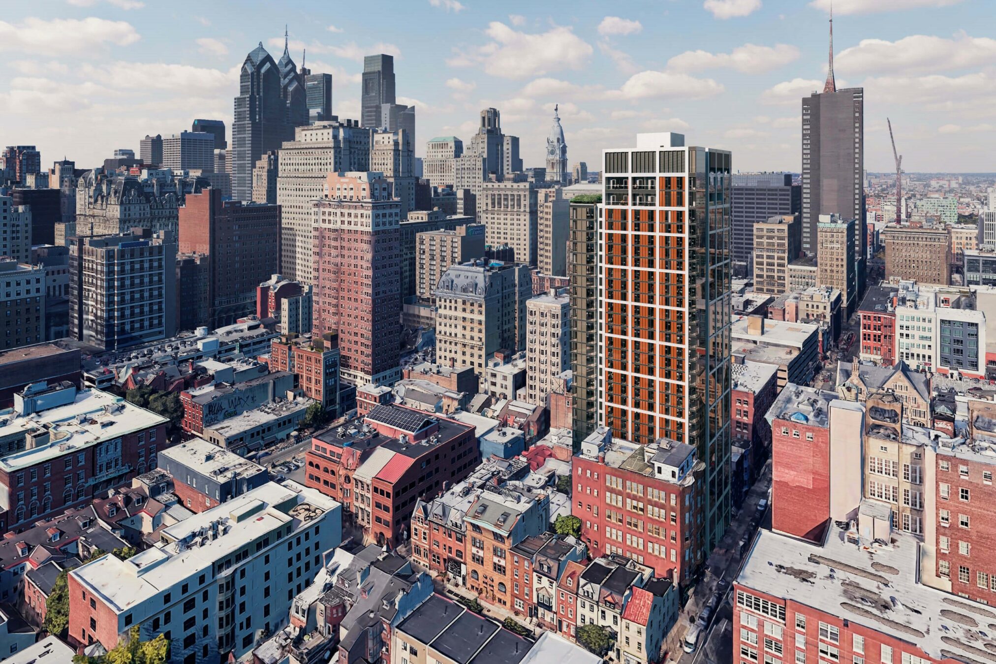
Things have changed, both design and function-wise, for this project designed by RSHP and BLTa. It appeared that a 378-unit tower with some warm, natural toned vertical elements, along with ground floor retail space, was in store. Since then, zoning documents indicate that the unit count has decreased slightly to 376, but the biggest change is most certainly in the design of this project from developers Midwood. Gone are the subtle tones, and in comes the red, punctuating the white grid that rises over the entire height of the building. This new approach creates a glossier, shinier vibe to the building, creating an obvious contrast with the surrounding architecture, heavy with brick and masonry on all sides. But as a picture is worth a thousand words, let’s make our way around the site today and check out some of those new renderings before we subject you to yet another UB40 reference.
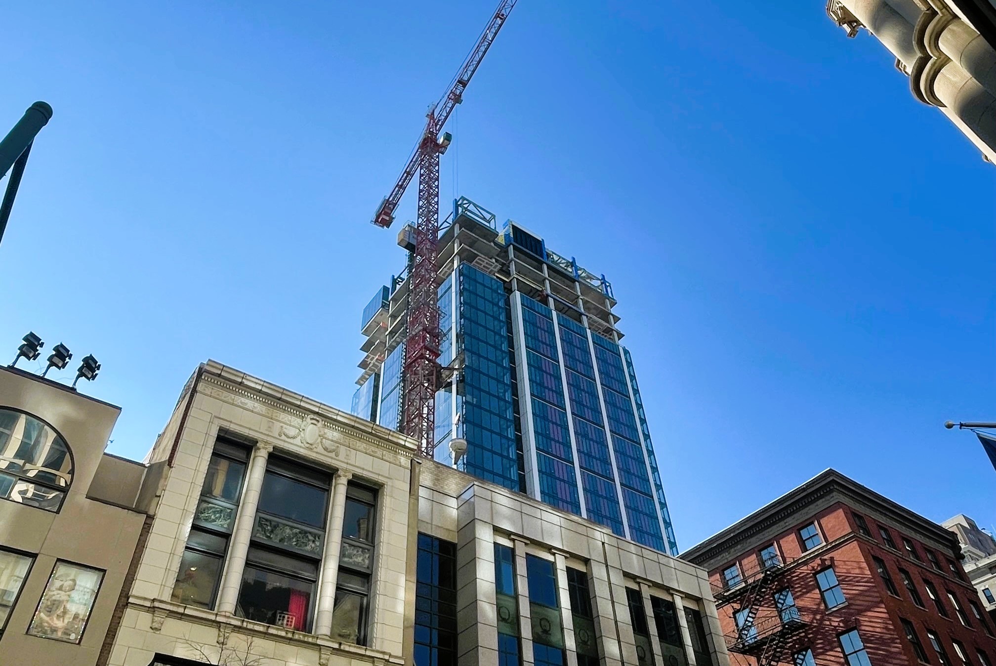
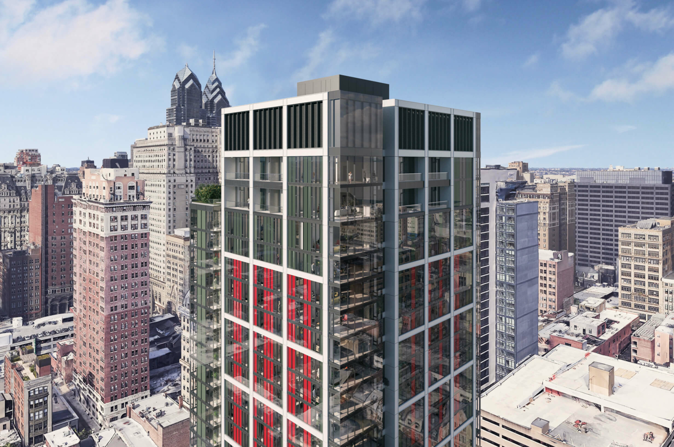
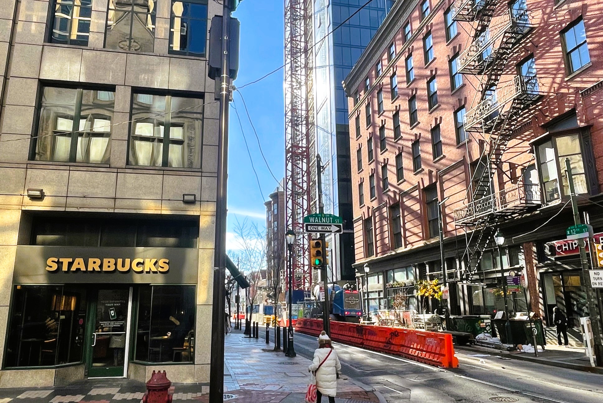
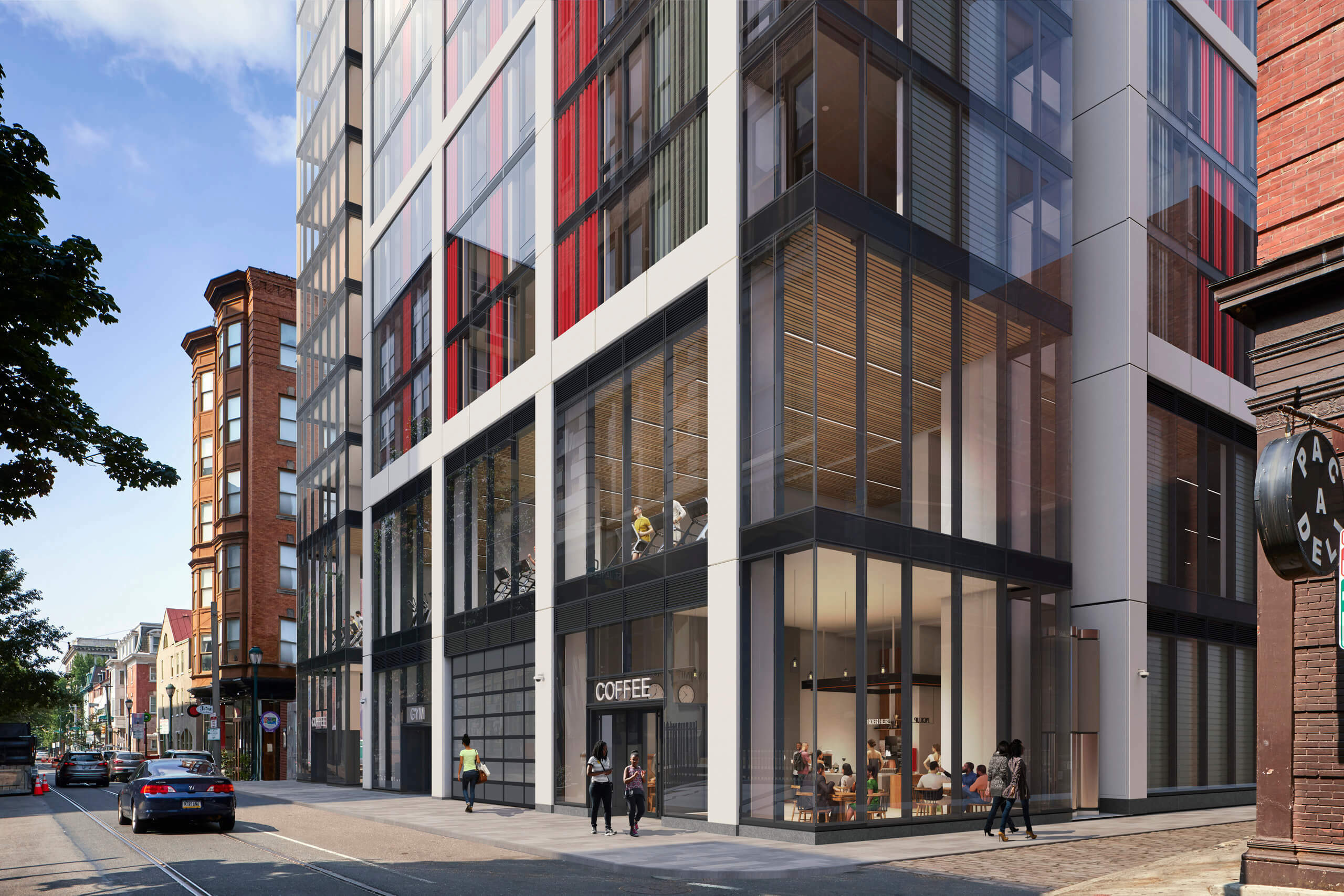
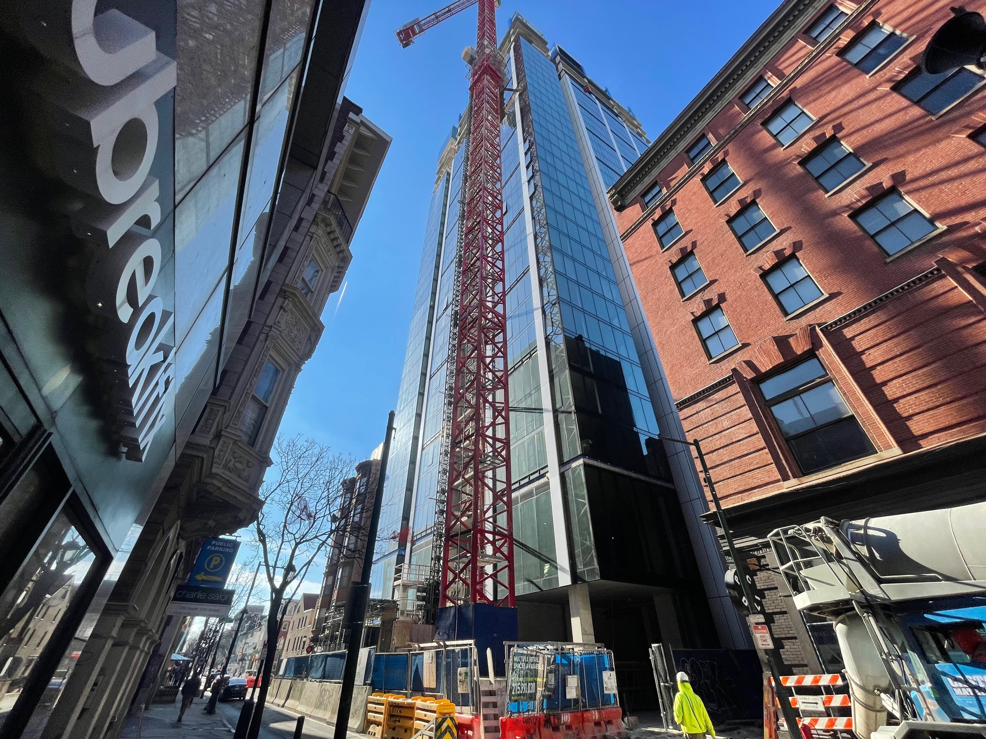
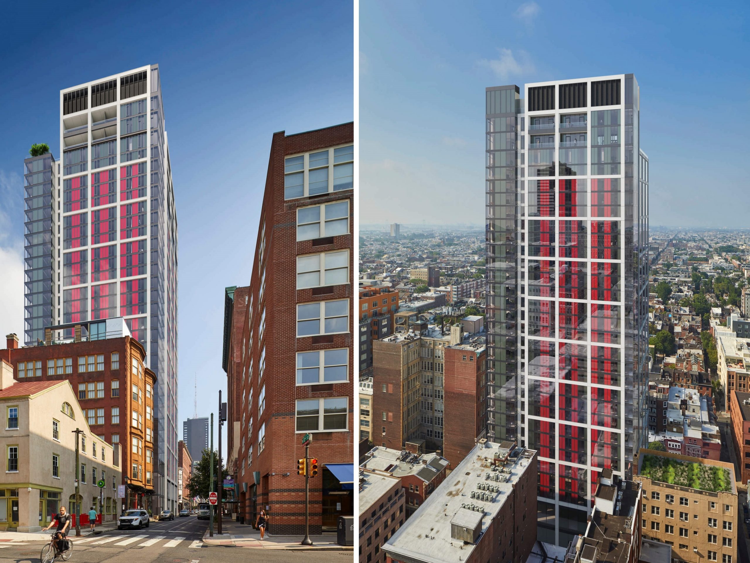
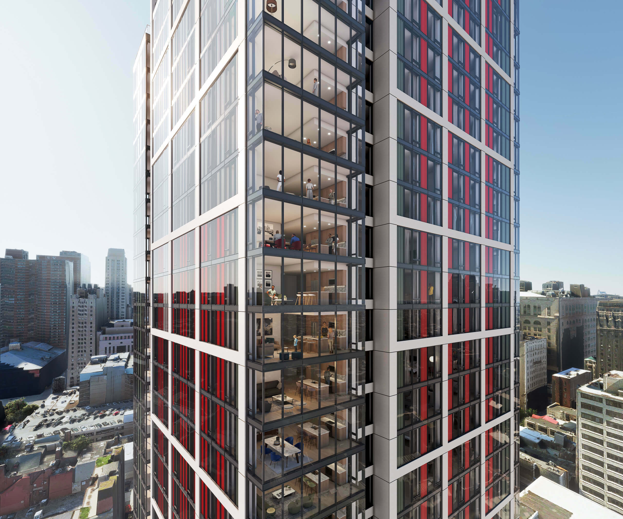
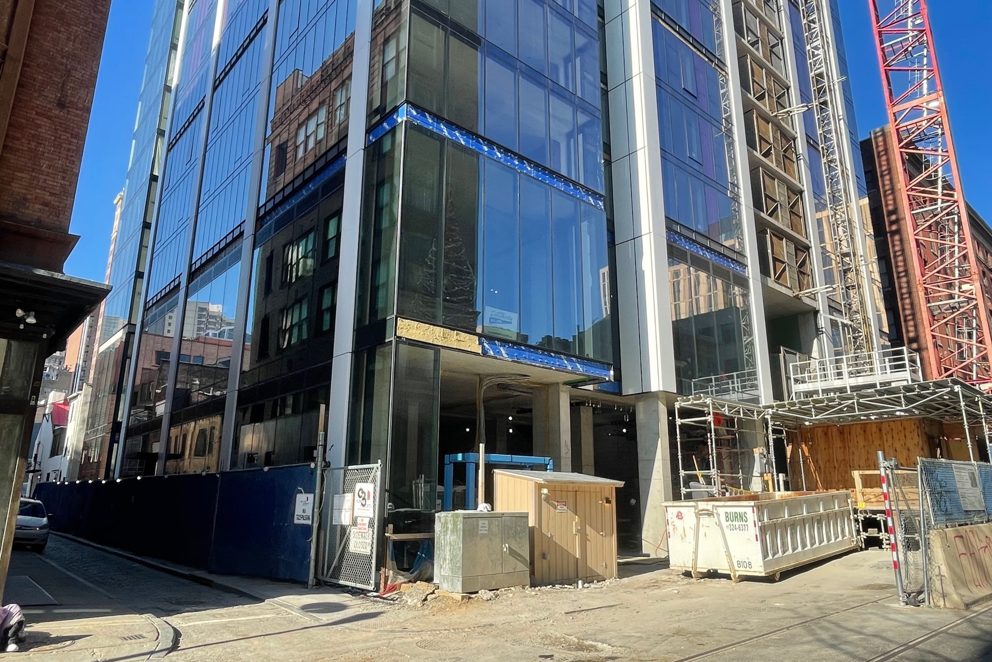
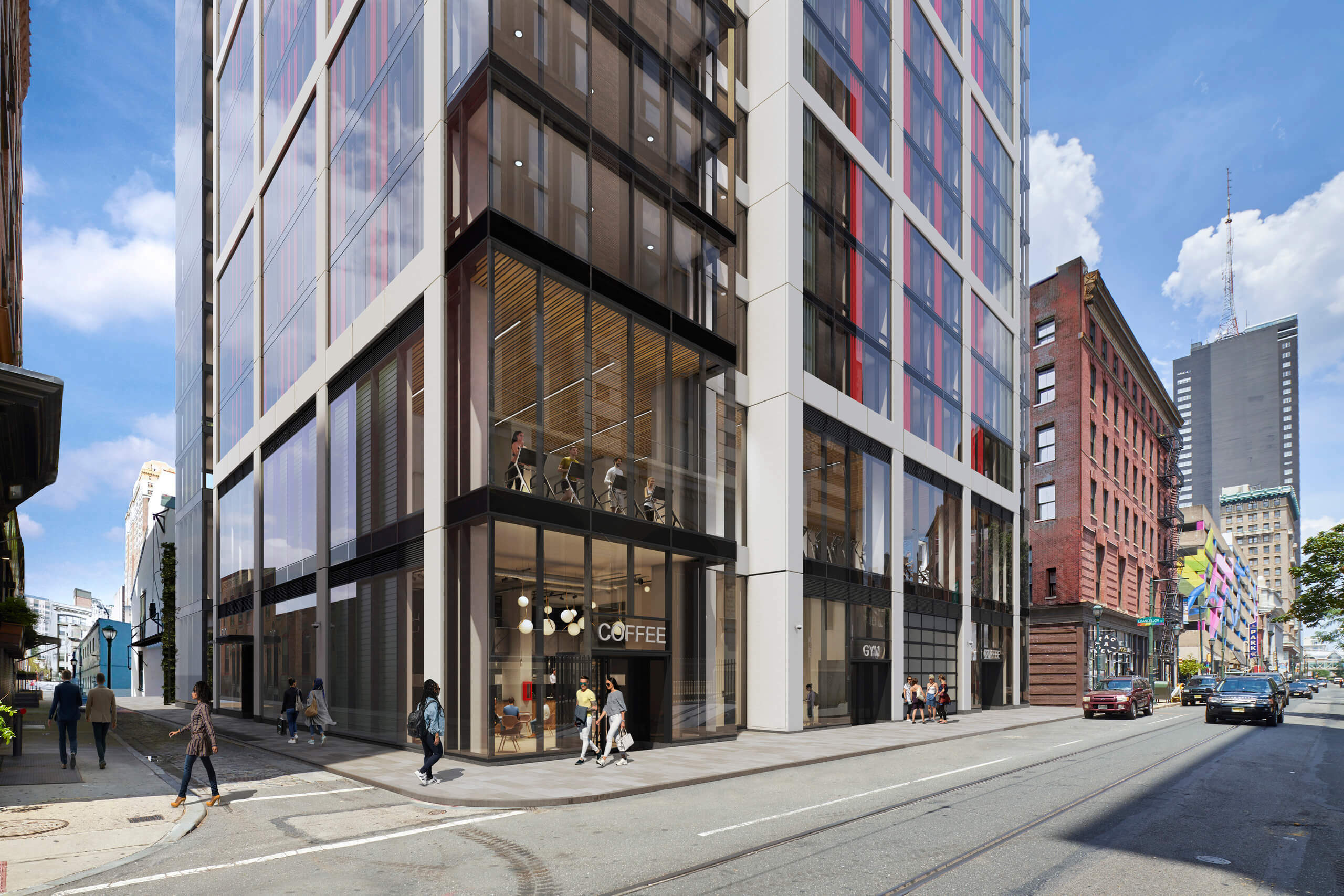
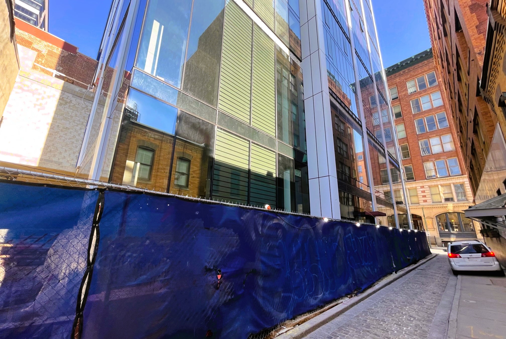
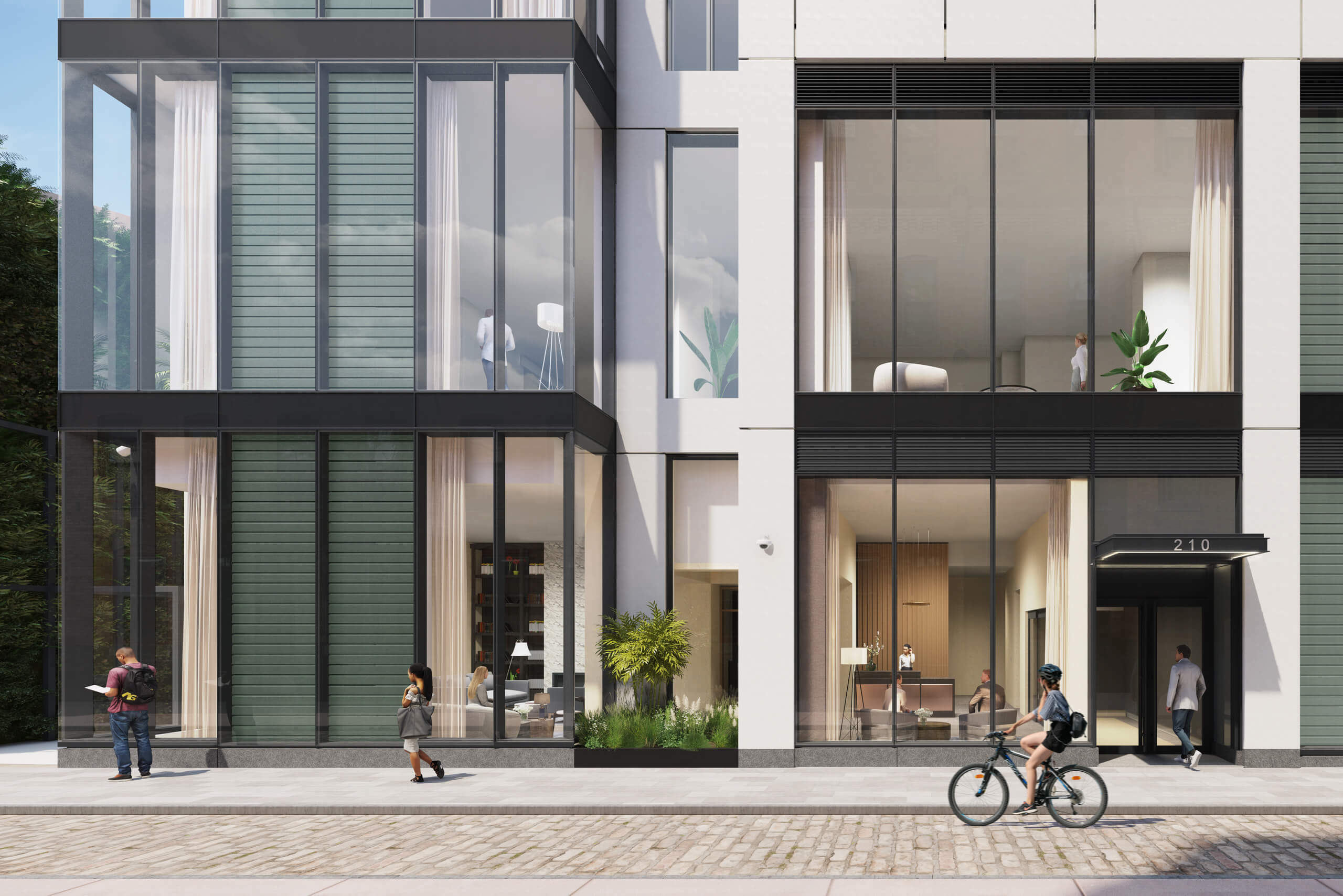
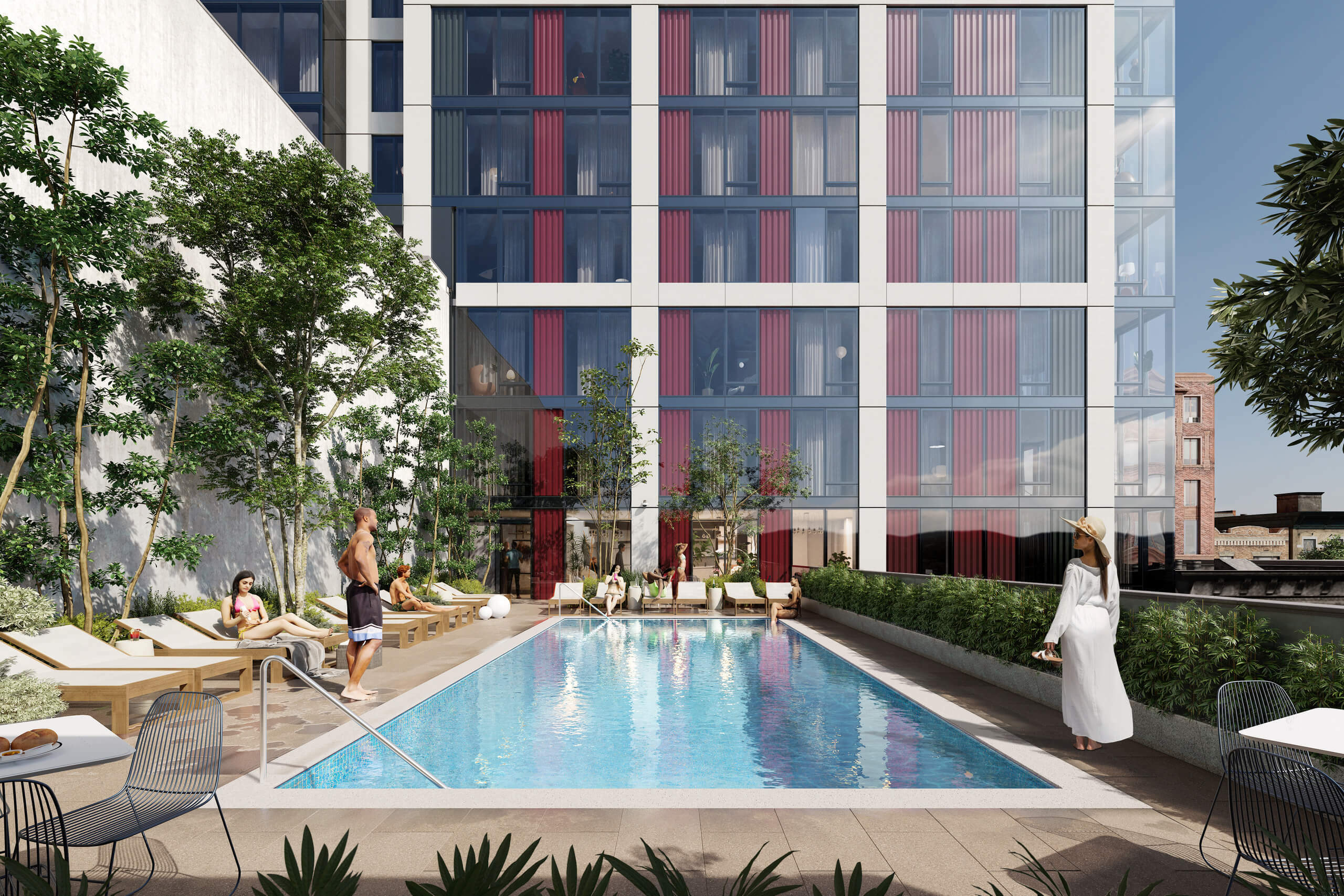
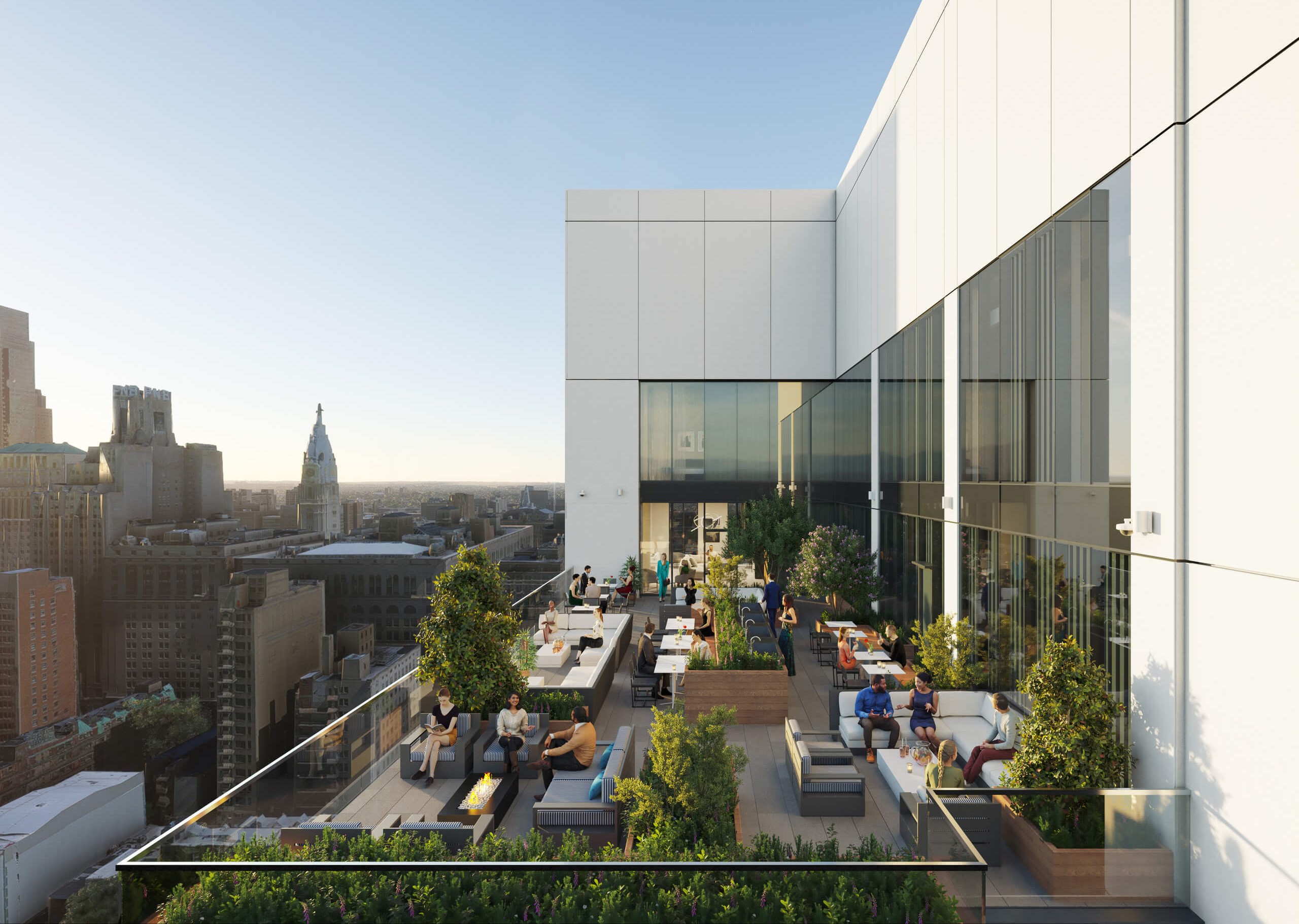
Red, white, black, and glass wouldn’t necessarily be our first choice when designing a mood board for a tower amongst pre-war buildings. But we can’t help but appreciate the design more and more as we continue to soak it in. The subtle variation of facade depths and the slick sheen of the window curtain create what will surely be a building that stands out from many angles. And as we alluded to above, the views from the roof and upper-level units will be some of the best in the city, with an unimpeded view of the Center City skyline at one of those wonderfully jaunty angles that is so rare to encounter. The 97 parking spaces here are sure to go quickly, as we would imagine this tower will have plenty of folks champing at the bit to live in such a central location. Who knows, perhaps someone will even pour themselves a glass of Carménère as they gaze toward a dipping sunset, savoring their favorite pop-reggae classics atop their new digs.

