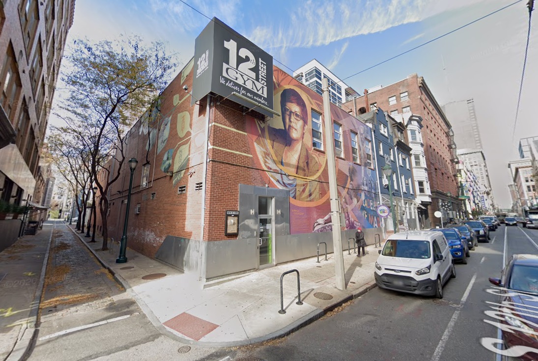
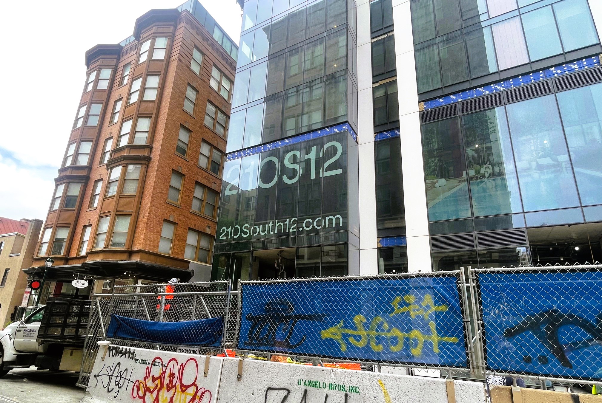
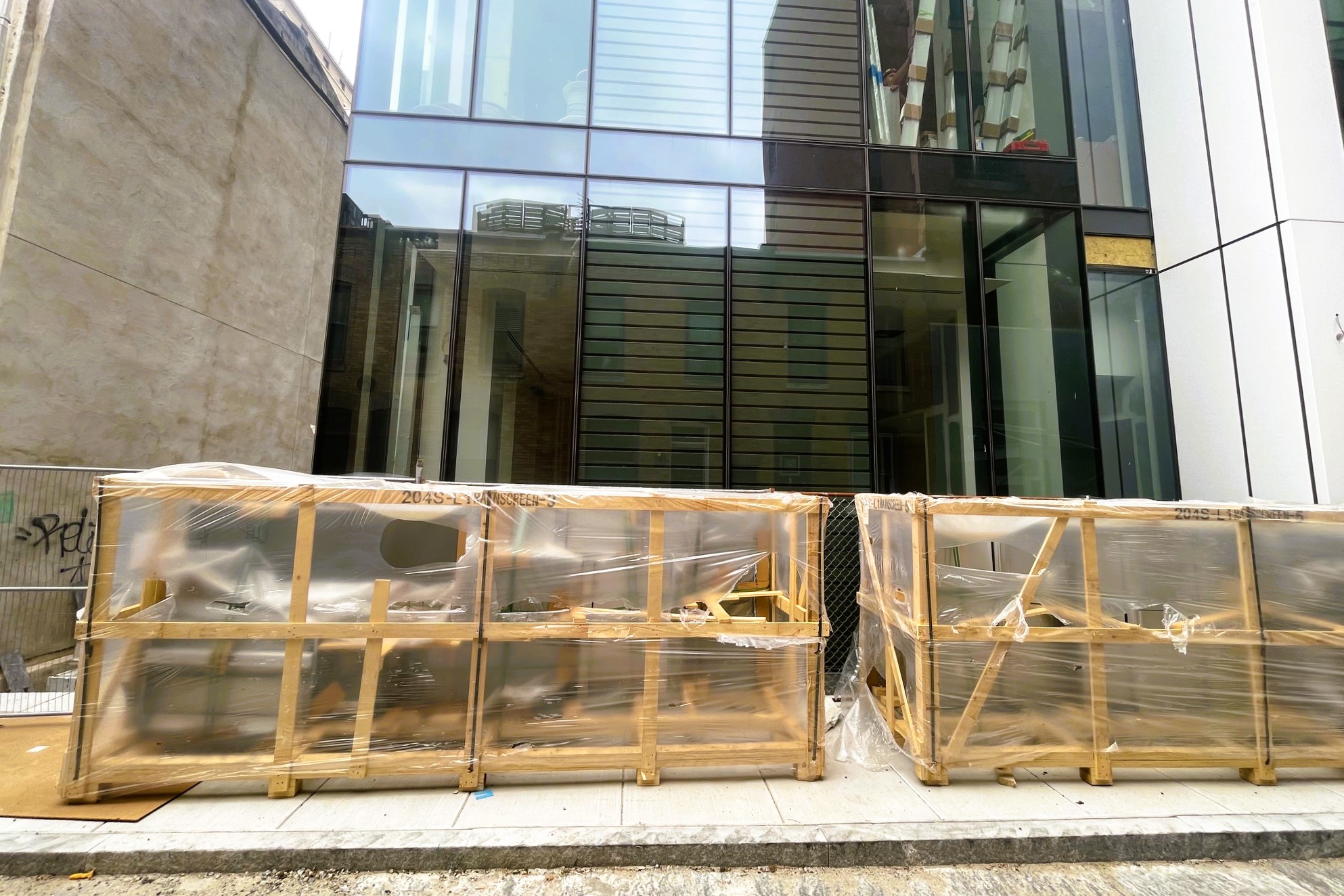
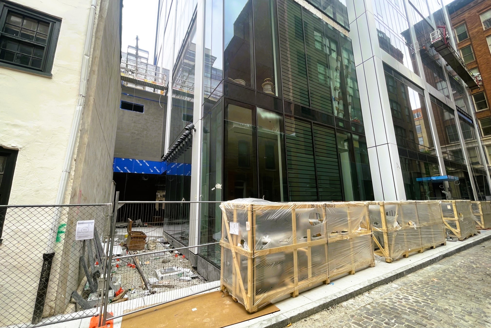
It was back in January when we last visited 210 S. 12th St. in the Gayborhood, as its bold, red design was making an impression on the skyline. This project from NYC-based Midwood has not been without its fair share of controversy, however, thanks to what used to sit on this site. The 12th Street Gym and its mural of LGBTQIA+ activist Gloria Casarez were once prominent fixtures here before the mural was suddenly painted over in advance of demolition. The development team had been in discussions with the Mural Arts program and artist Michelle Angela Ortiz about a new mural, but those talks were squashed after the unannounced removal. We hadn’t heard any art updates for 210 South 12th until the other day, when plans emerged anew to bring something colorful to several parts of the property.
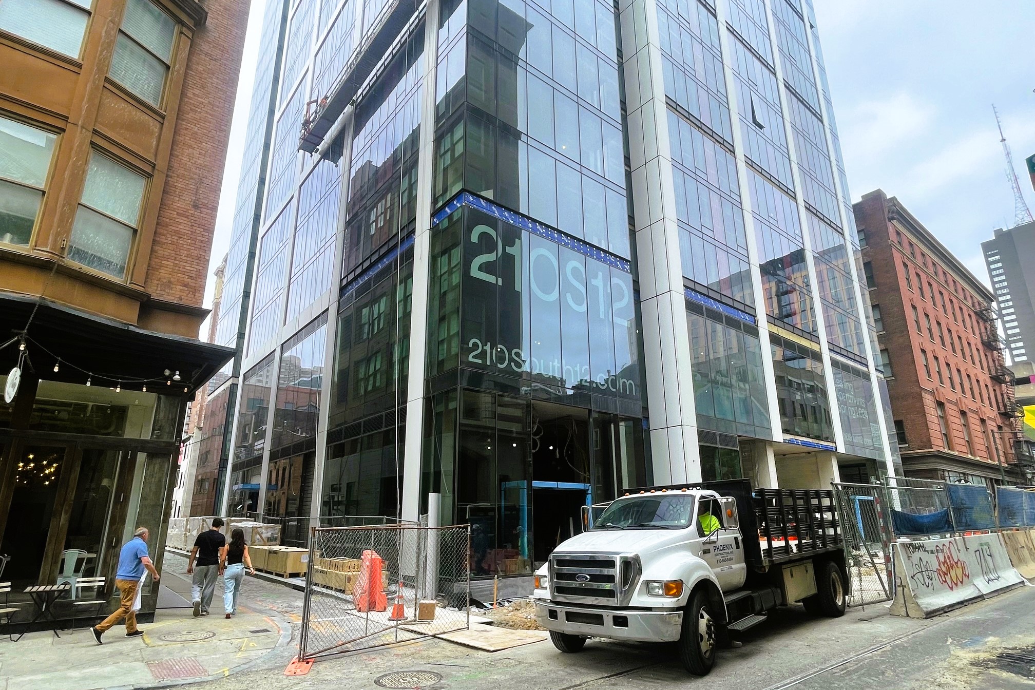
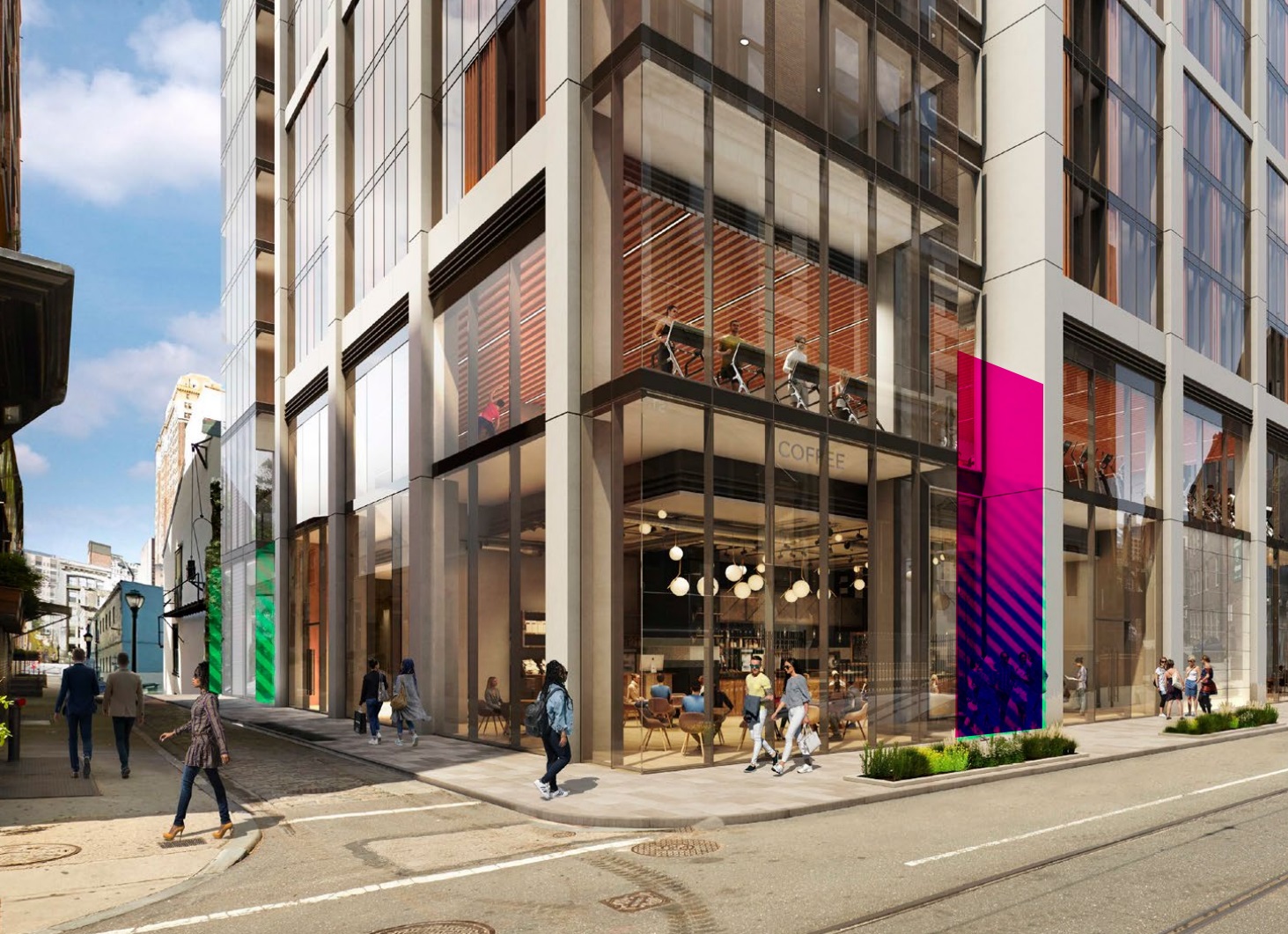
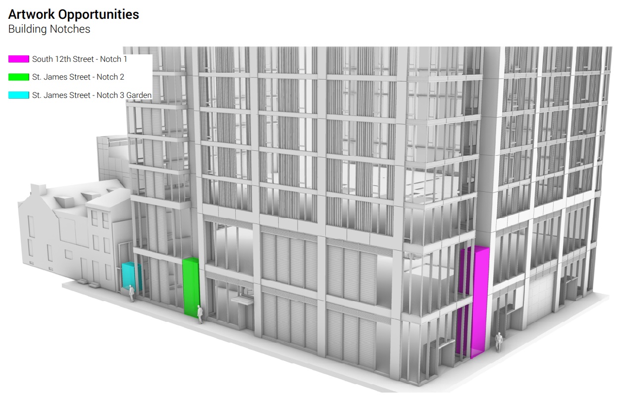
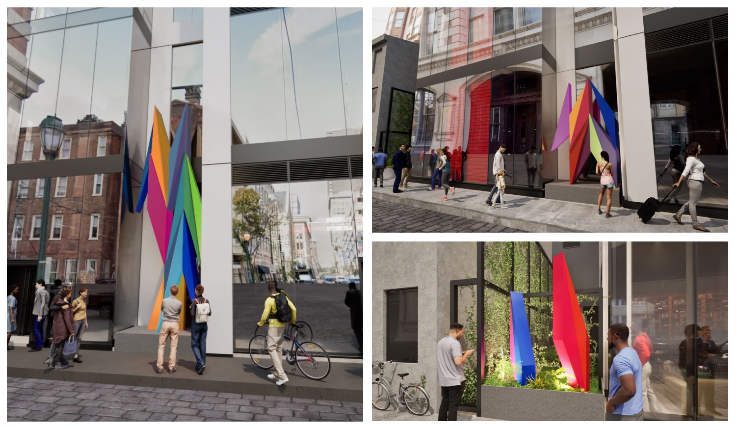
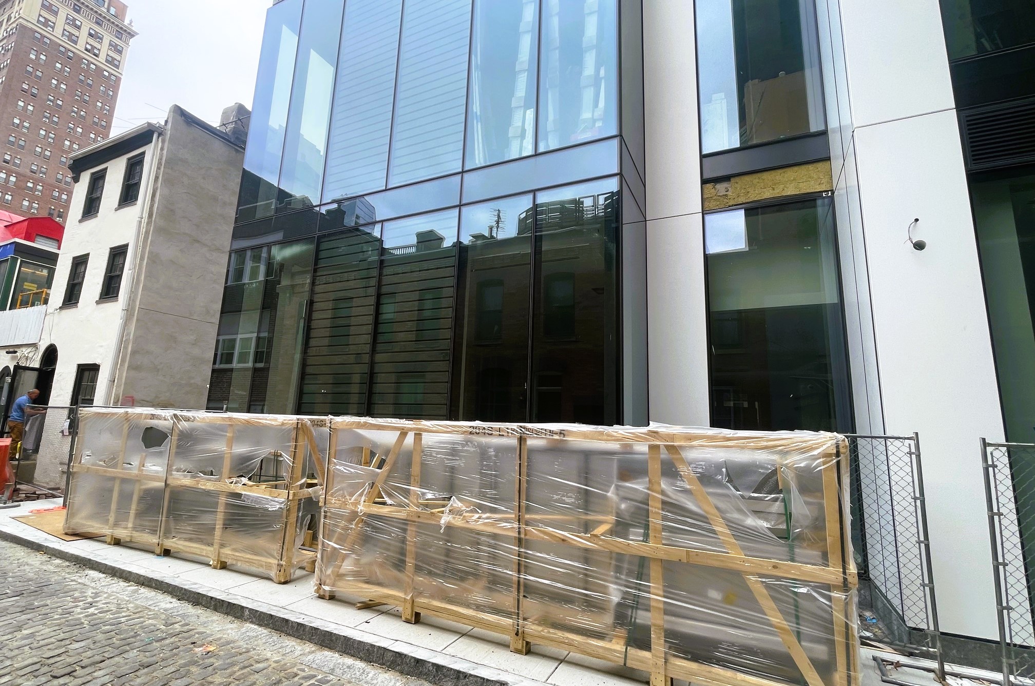
So, while this design from RSHP and BLTa is looking nice as it comes into form, we are here for a different reason: updates on the art. Midwood is indeed planning on bringing an art component to the project, but not one we expected. Those three nooks you see in the images above will soon be home to new installations, though not in mural form. The developer is utilizing a public art bonus here, allowing for more density thanks to the inclusion of the art. And, thanks to that submission to the Art Commission, we now have plenty more details on what will soon be gracing the ground level here.

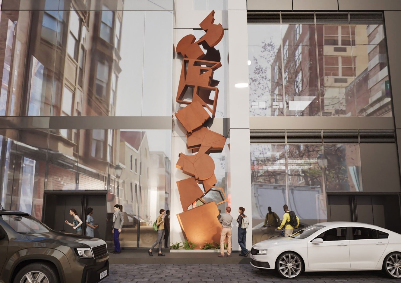
Onto the news! After a list of artists was narrowed down, Philly-based Odili Donald Odita was selected by arts consultant team UAP to bring a pop of color to the project. Odita’s approach was picked for three notches that sit at ground level along both 12th St. and St. James. The most prominent of the nooks along 12th will feature a two-story installation, creating a dramatic visual along this busy pedestrian stretch. Two more intimate nooks along the pedestrian entryway will feature similar motifs, with the shortest artwork complemented by a dollop of lush landscaping.
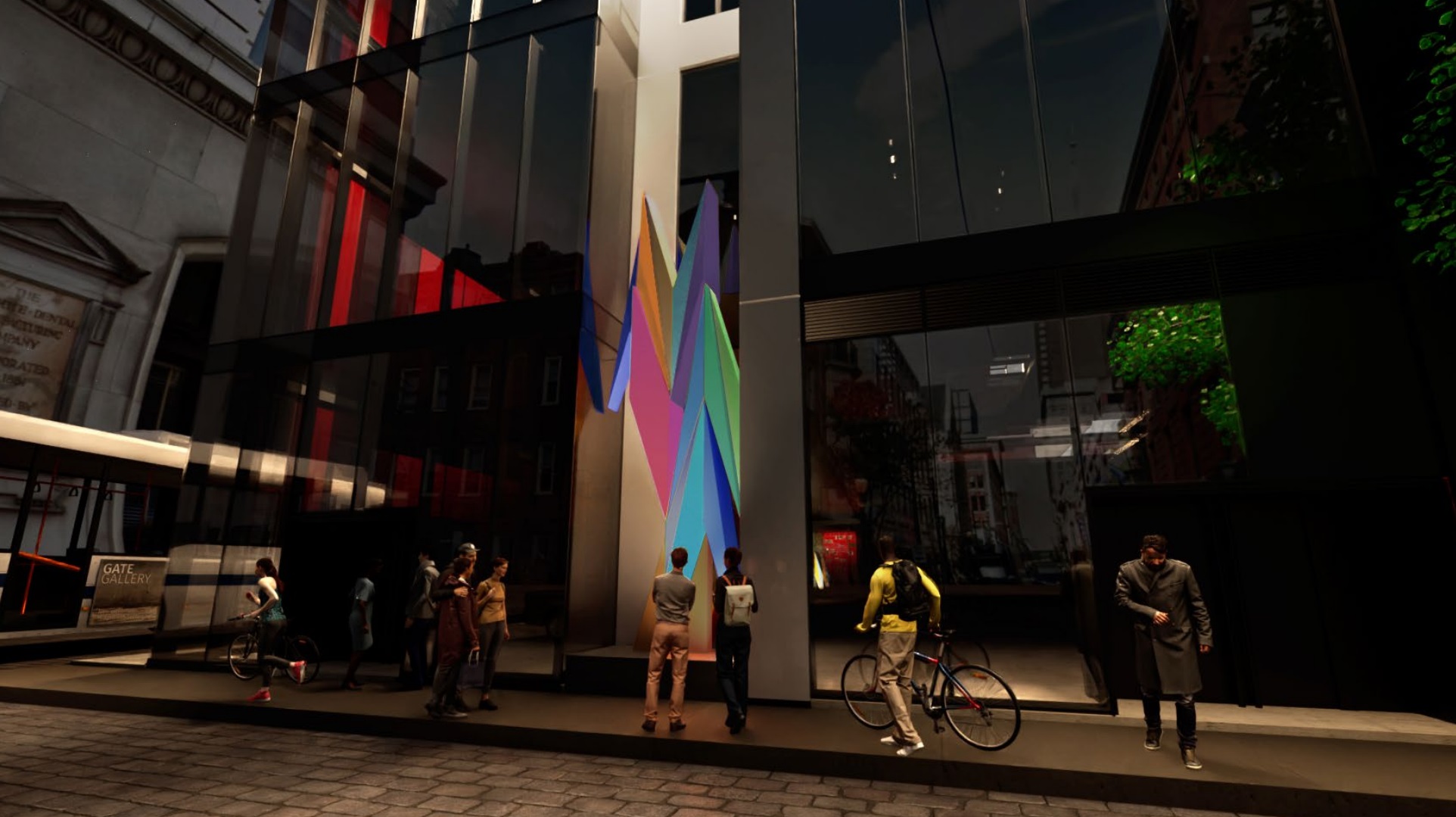
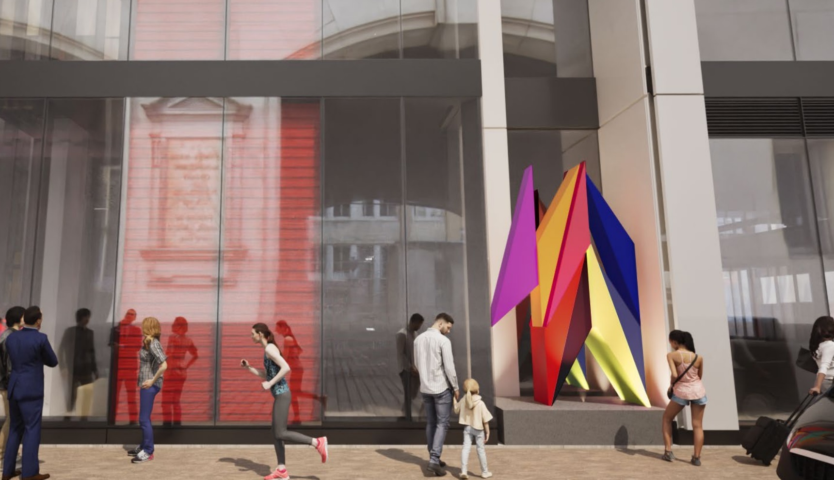
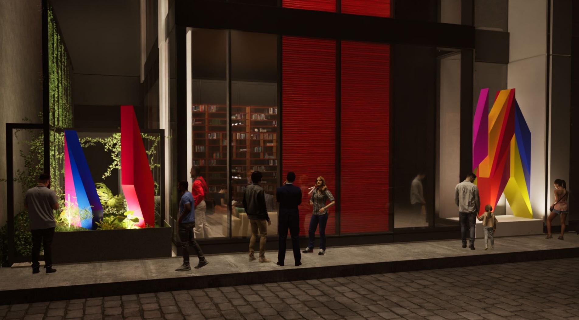

We are big fans of this look, with the three-dimensional aspect making the colorful, geometric approach of Odita’s work really stand out – especially with the additional lighting at night. The size seems appropriate as well, creating something that’s both human-scaled and dramatic enough to catch one’s eye when walking by. We did want to give a quick nod to Wyatt Kahn and Annie Morris, the other finalists who brought their own interesting approaches, despite the fact that the developers opted to go in a different direction.
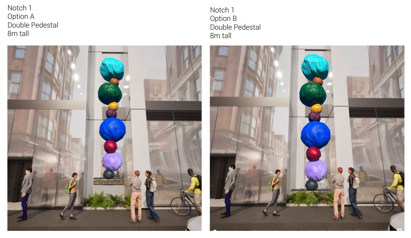
New art and additional density, what’s not to like – right? While there is a reference to the site’s important place in the Gayborhood’s history buried deep in the Art Commission document, there’s something here that feels like a missed opportunity. Per our own thoughts in advance of today’s meeting as well as the comments from the Art Commission, the work itself is truly lovely on its own. However, we would have liked to see something that tied in more to the culture of the neighborhood, especially given the developer’s initial stated desire to create something that speaks to Casarez’s long-lasting impact to this area and beyond. Given the limitations of the spaces for public art offered by the project, this now-approved installation is probably as good of an outcome as we could have hoped for – but alas, the opportunities for something more were probably passed up years ago during the design phase of the project.

