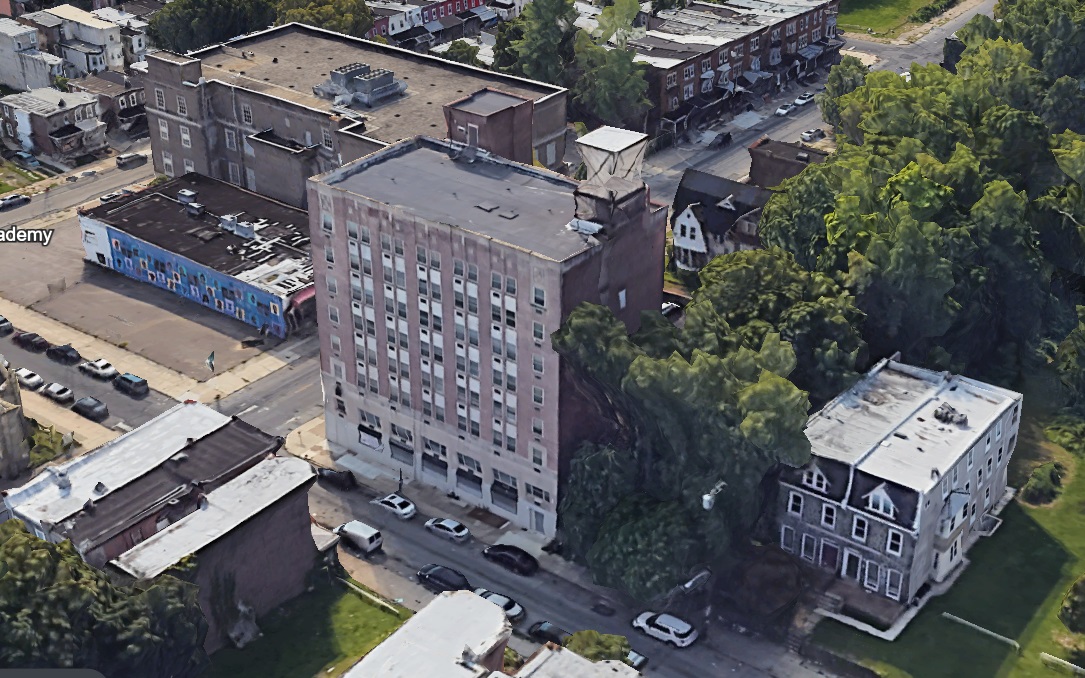
It’s no secret that much of the development coverage on your favorite real estate blog focuses on the Greater Center City area, with a heaping dose of West Philly to round out the offerings. However, more and more development is taking in place in North Philadelphia, with 1708 W. Tioga St. in the eponymously named Tioga neighborhood joining the list. Currently a tree-filled lot, this property sits directly next to the former Tioga Trust Company, which received a residential conversion since we visited back in 2017. And it appears that even more residential is on the way, thanks to a trip to the Civic Design Review.

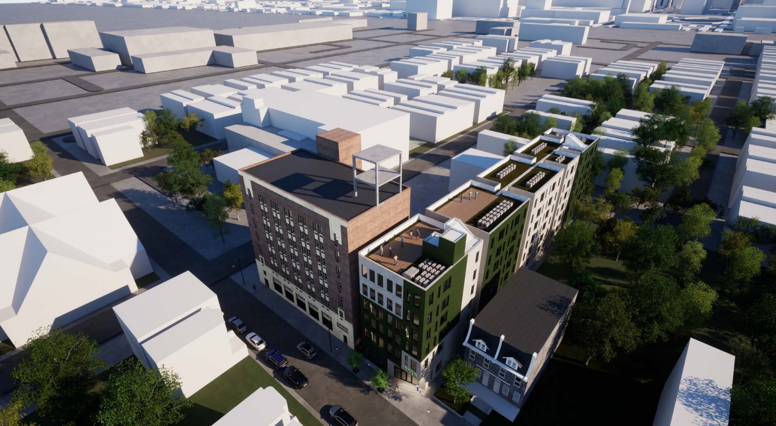
In what is actually a follow-up to a smaller project that was approved back in 2020, 90 units of affordable senior housing are being proposed for this long narrow lot. The plans call for 90 studio and one-bedroom units across six floors, with a roof deck and basement amenities as well. This building utilizes a long, single corridor flanked by the small units, with its massing broken up by light wells, also bringing air circulation and some brightness to more of the units. This would be a purely residential building, with no on-site commercial space or parking included for this RSA-3 zoned property.
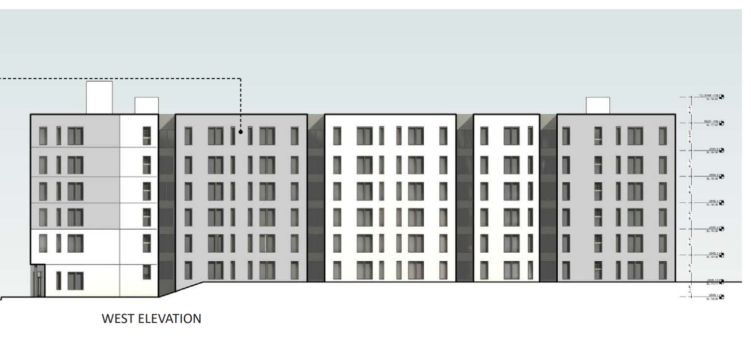
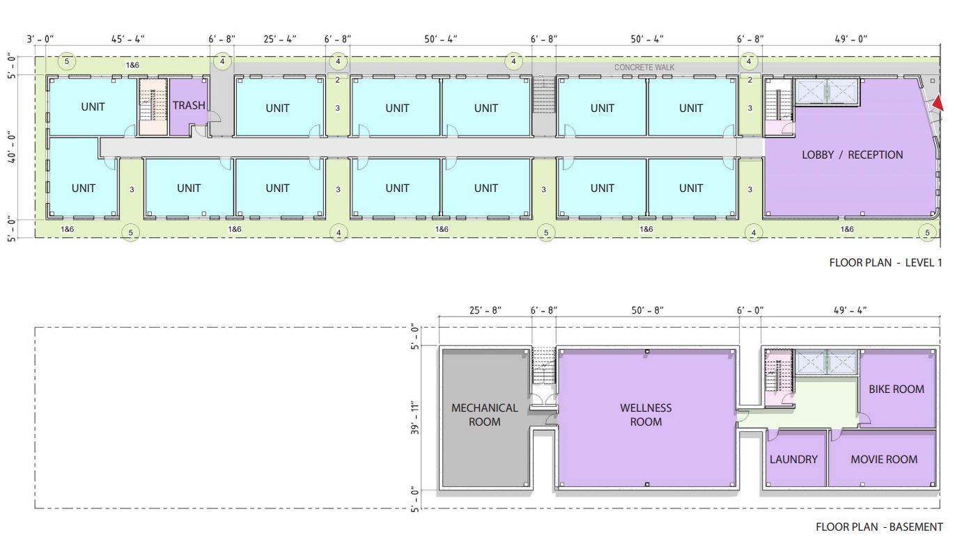
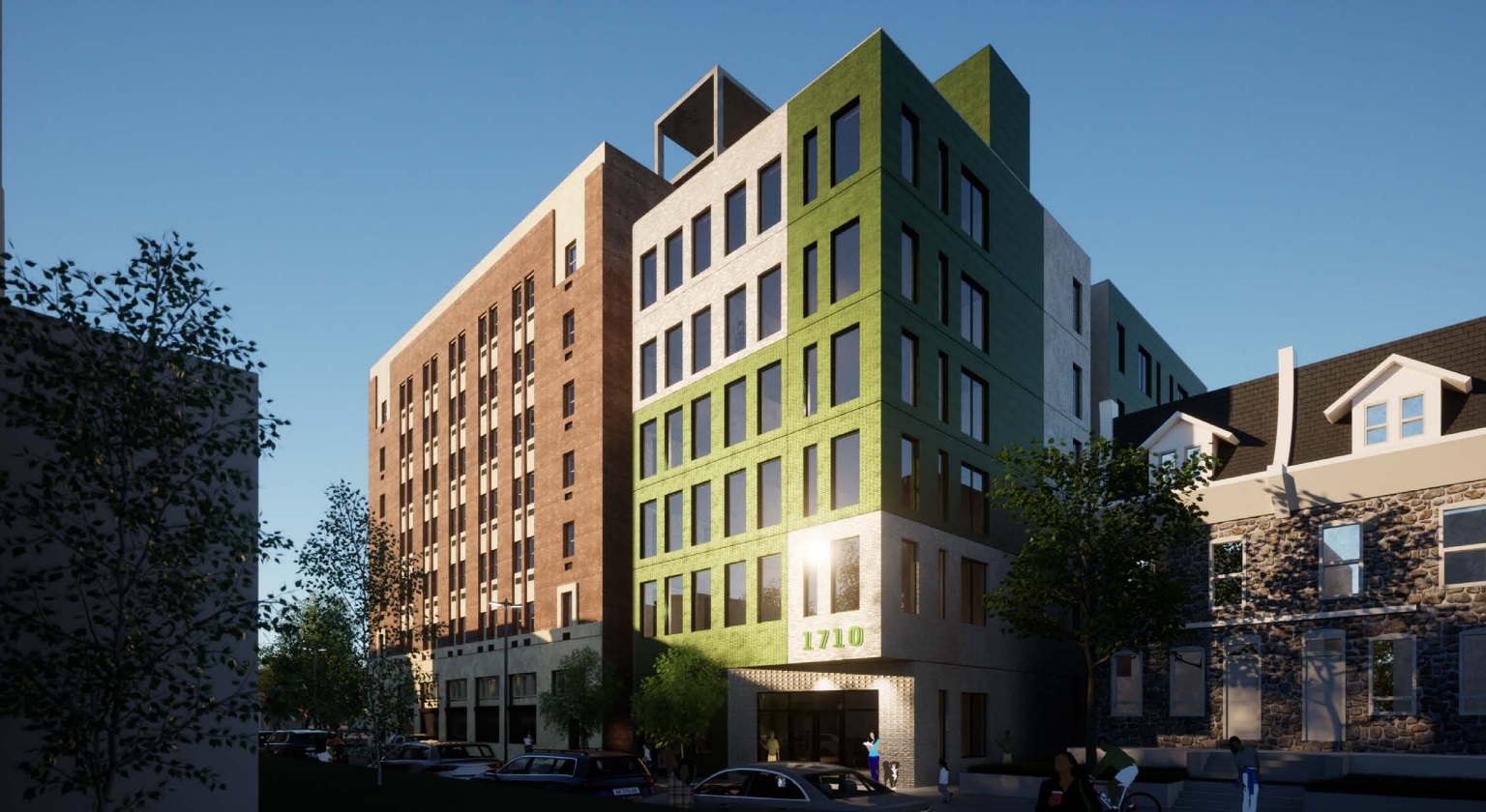
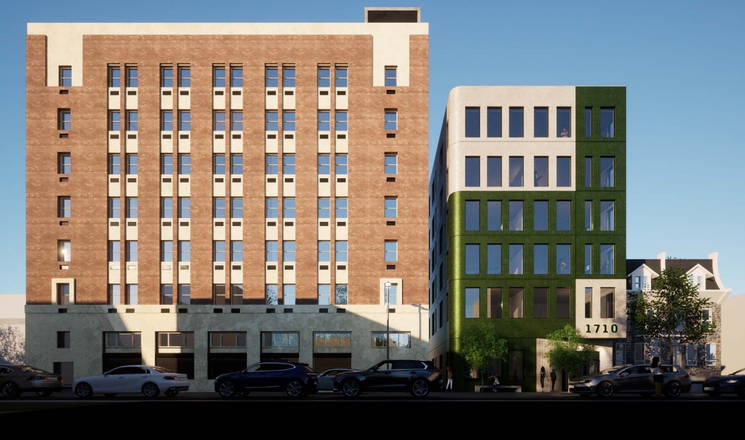
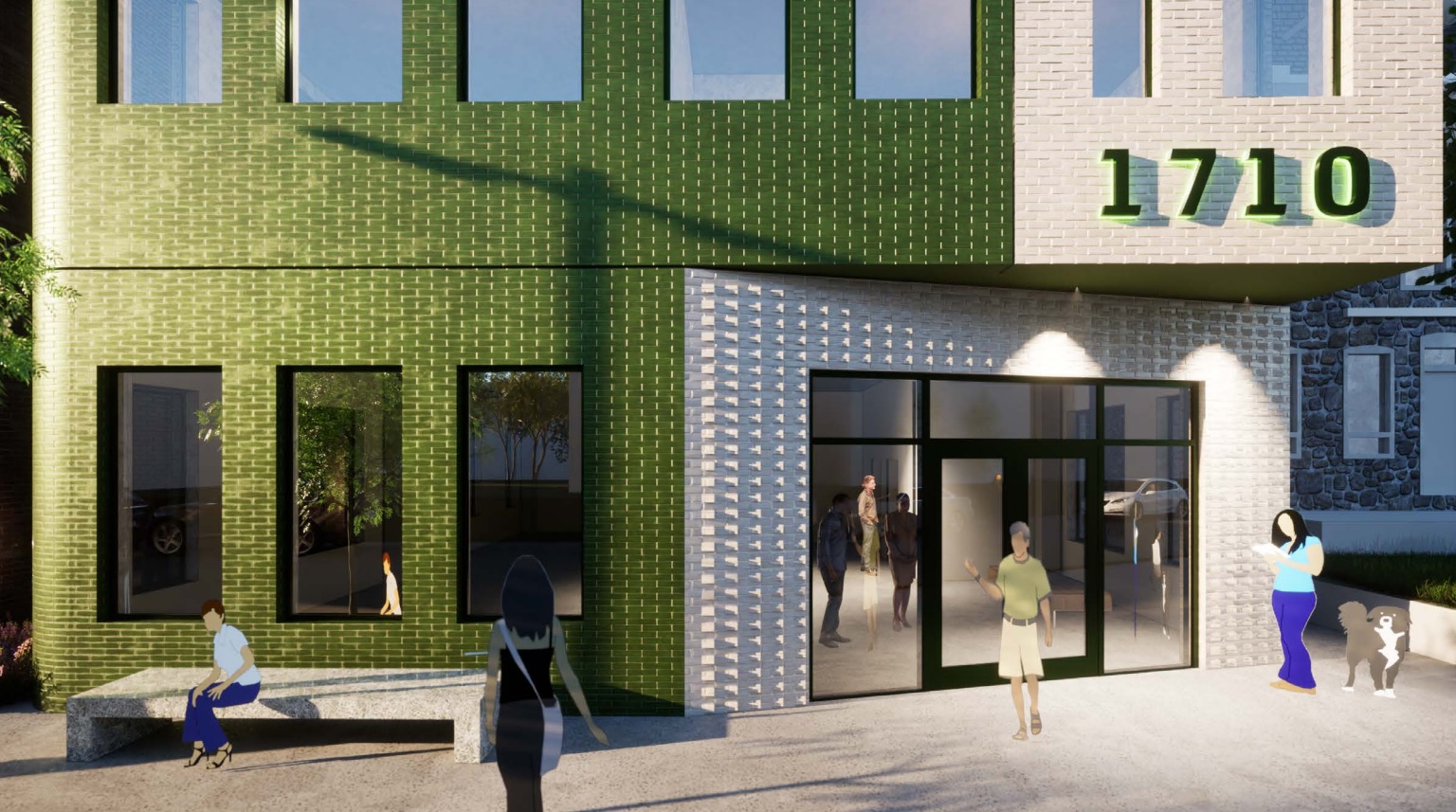
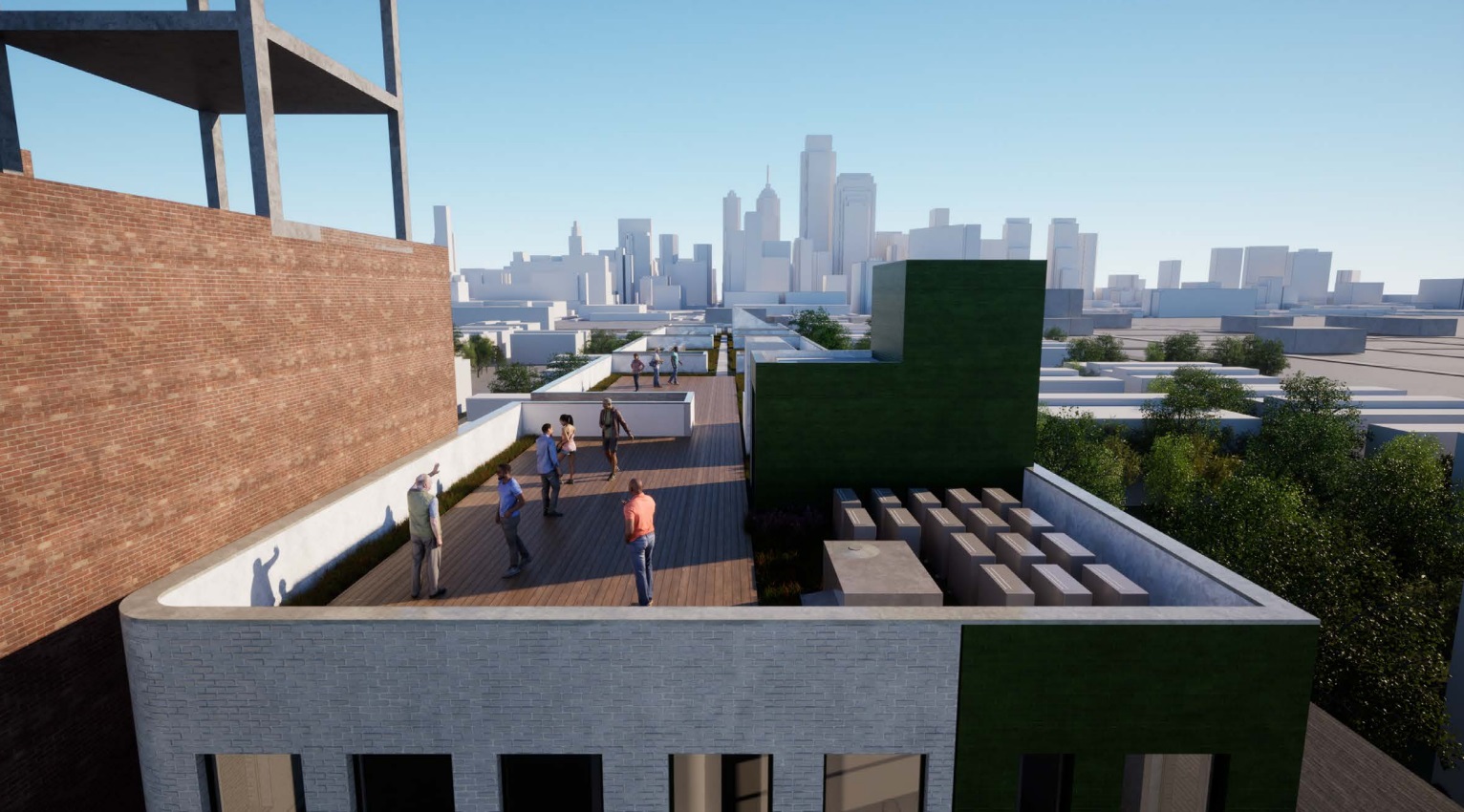
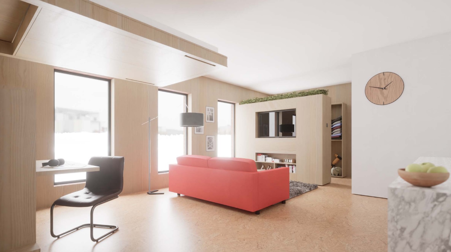
The design from Oombra Architects is not what we would have expected here. The building utilizes bright green and white brick for the entirety of its facade, with the window scale and placement mimicking the tower next door (which sits very close to said windows). The rounded front corner adds a playfulness to what could otherwise be a heavy design, and a large roof deck will offer up views of Center City – even if the rendered skyline is a bit out of date. The units will also utilize a space-saving system to mitigate some of the impact of their small dimensions, which will be in the 400-500 sqft range.

Before you start grabbing a lease agreement for your aunt, this isn’t quite a certainty, at least not in its current form. Though the feedback of the Civic Design Review board is non-binding, there were some major issues with regards to the layout and practicality of the project. The lack of parking and the small units didn’t seem ideal for an older audience, and the open space is almost non-existent, with just a few feet of barely usable space ringing the building. Additionally, there were concerns with the grade of the site and access, along with relegating the amenities to the basement. Board member Leo Addimando was the most scathing in his critique, stating tersely that the lack of details on the plan was due to this not being an economically viable project in the first place. Ouch!
Interestingly, there was nearly no talk about the design – almost all of the concerns were due to the functionality and use of the project. Perhaps “Civic Function Review” just didn’t have a nice ring to it, or maybe we’re just being a bit nit-picky. Either way, there was a unanimous vote to continue this project, meaning this project will need to make a return to the CDR board in the future. Will we see a revamped and refined project? We’d lean towards yes, even though the non-binding feedback is merely a suggestion and not a mandate. Hopefully we’ll see some edits here, as this design sure looks cool, and we’d be pleased to see it appear here somewhere down the line.

Leave a Reply