The historic Spring Garden neighborhood is one of the under-appreciated architectural gems in Philadelphia. The neighborhood is home to block after block of intact three and four story brick townhomes, many of which have been chopped up into apartments over the years. Some blocks have some particularly attractive and unusual buildings, with the 2200 block of Green Street enjoying some especially nice examples. But the neighborhood hasn’t always been a historic district, so plenty of buildings in the area have been demoed over the years, and until the establishment of the district around Y2K, said demolitions were generally followed by, uh, uninspiring replacements.

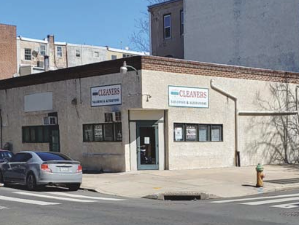
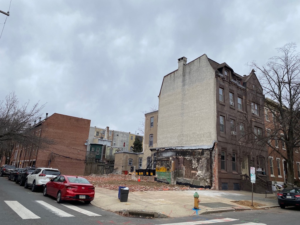
Such is the case at the northeast corner of 20th & Green, where the original building at the site was torn down shortly after World War II. Its replacement stood here until this year, a one-story stuccoed building which was home to a laundromat over the course of all that time. Developers purchased the building back in May, paying $1.3M, which was a good indication that they weren’t planning to maintain the longtime underuse at the site. The recent demolition of the building certainly clarified the point.

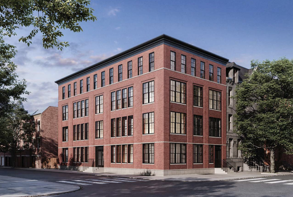
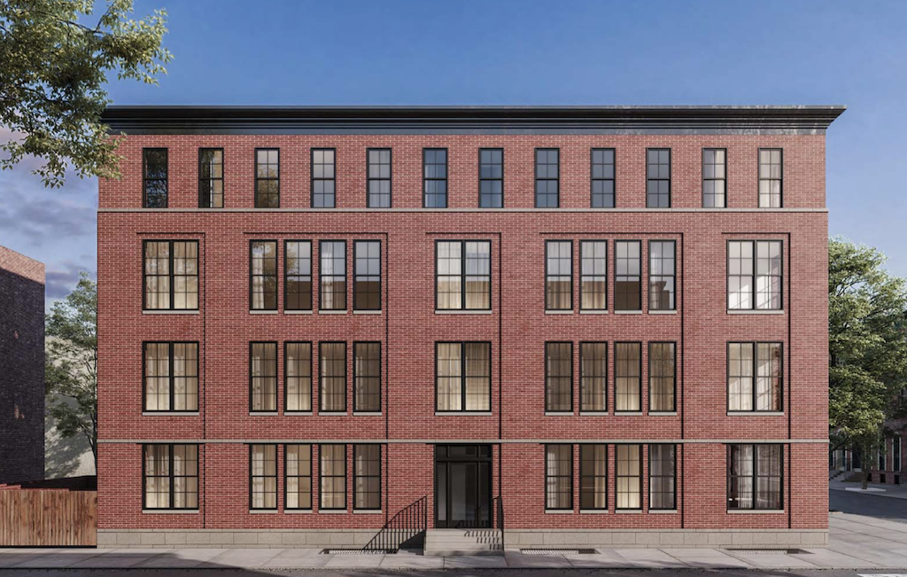
In place of the demoed laundromat, look for a new four story building with ten units and no commercial space. Given the price paid for the property, we have a feeling that these units will be listed as condos and won’t be offered as rentals, and we’d wager that they’ll sell at a pretty high price per square foot. The project is proceeding as a matter of right, using an affordable housing bonus to pick up a couple extra units and some height as well. As a result, one of the units will be sold at a discounted price, but we suspect the developers are willing to lose money on one unit to avoid the zoning risk of trying to get a variance at this location. CANNOdesign is doing the architecture, and they’re planning a rather handsome building, if we do say so.


As we mentioned before, this is a local historic district, and as such, the Historical Commission needed to sign off on the plan. This process surely resulted in a project that uses higher quality materials, seeking to blend in with the surrounding architecture. The use of red brick for the entire facade, the cornice, the windows, and the transom above the door are all quite compatible with other buildings in the historic district, and we imagine that within a few years, people won’t even realize that this building doesn’t date back to the times of some of the others in the neighborhood. Certainly, for what we expect will be a condo project, we’d imagine that these features will only enhance the eventual sale prices.

Leave a Reply