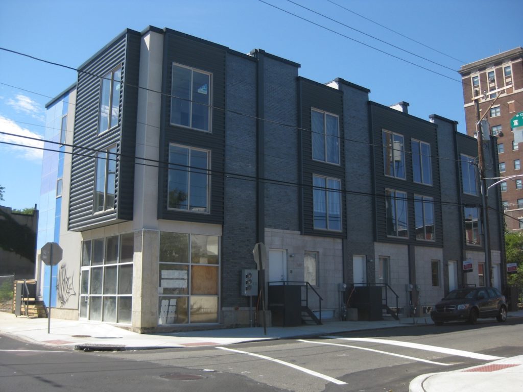
Last fall, we first told you about plans for development at the corner of 7th & Thompson. Out was a long vacant lot, in were four single family homes and a corner building with a retail space and two apartments above. When we passed by the site in January, framing was done and brickwork was underway. Visiting last week, we spied a project that's nearly finished.

Current view
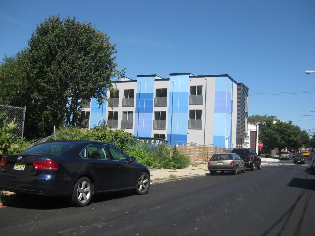
As you can see, the buildings have a fairly contemporary look. Their most noticable detail though, is in the rear.

Back of the project is so blue
What do you think about this project? Do you like the flashy colors on the back, or would you have preferred something more muted?

