It is not rare for projects to morph and change as they move forward, as all sorts of externalities can cause zigs and zags as a building grows from idea to realty. Sometimes, those changes can be rather dramatic, with 2112 Walnut St. being a wonderful case study. After a tall addition was proposed directly adjacent to another condo addition, plans were scaled back slightly at the end of last year, keeping the original ten units, but bumping the height down from over 170′ to the roof to about 140′ in the new version. All of this would rise over the handsome row of historic buildings that line the south side of Walnut.
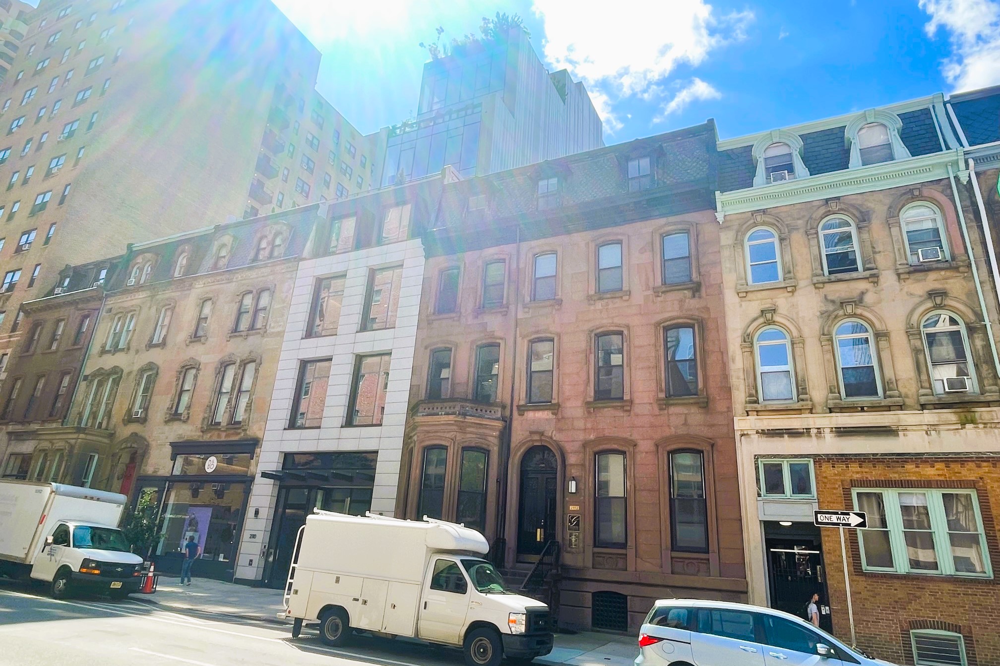
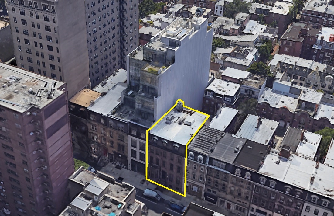
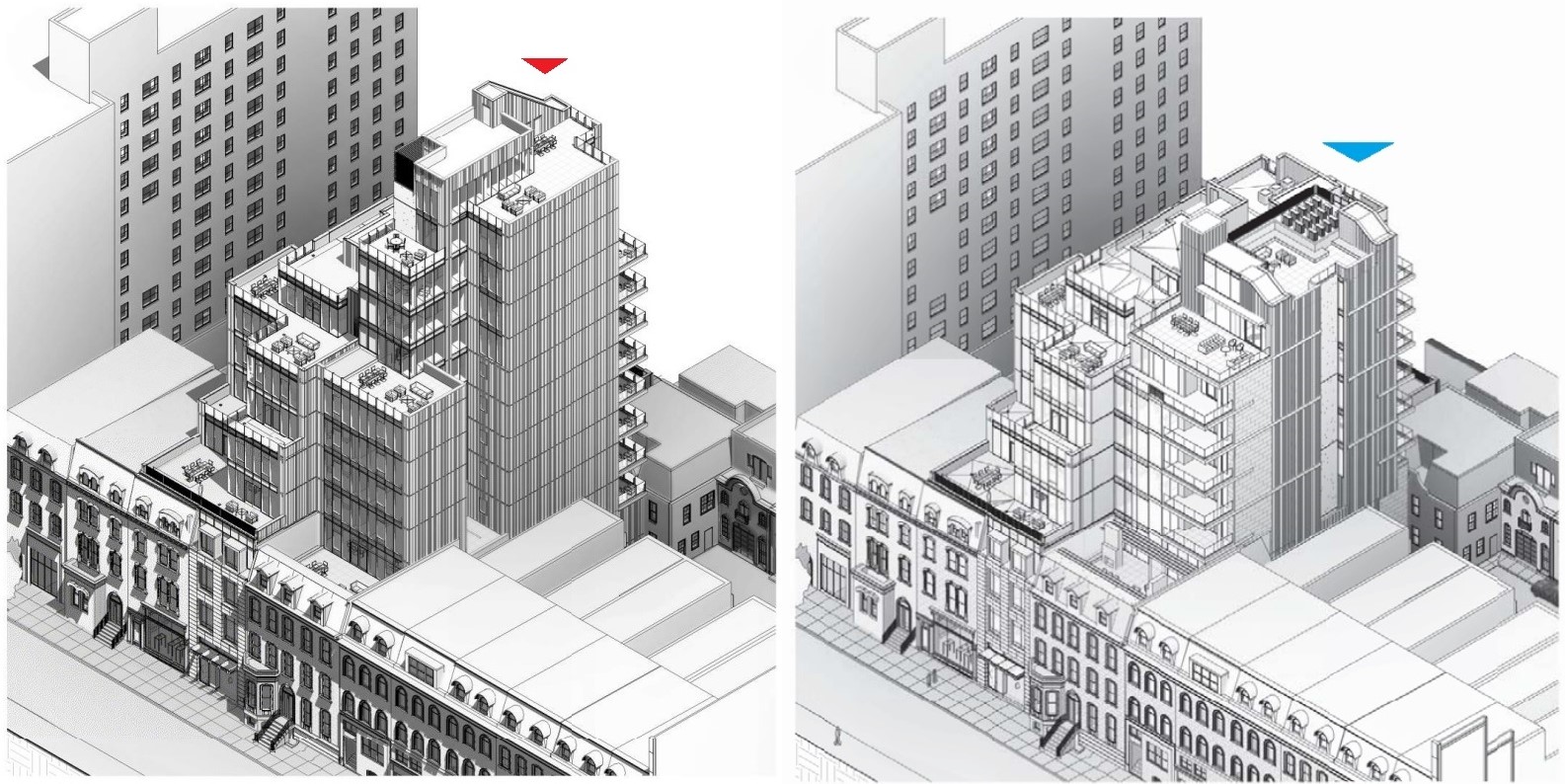
More changes are now afoot. You might be wondering, are we going to see another setback or two, perhaps another 20 or so feet in height being dropped? Nope, the latest round of changes are even more dramatic than we would have anticipated. As was the case in the past plans, the building will be restored, with new masonry and windows, with first floor commercial anchoring the space. the underground parking will also remain, with access along the back of the property. However, those ten units are not even nine, eight, seven, or even a Sixer – the height has been dropped from 170′ or so to 90′ or so, and only four units are now part of the plans. In fact, the plans have been so downsized, you won’t even be able to see the addition from the street.
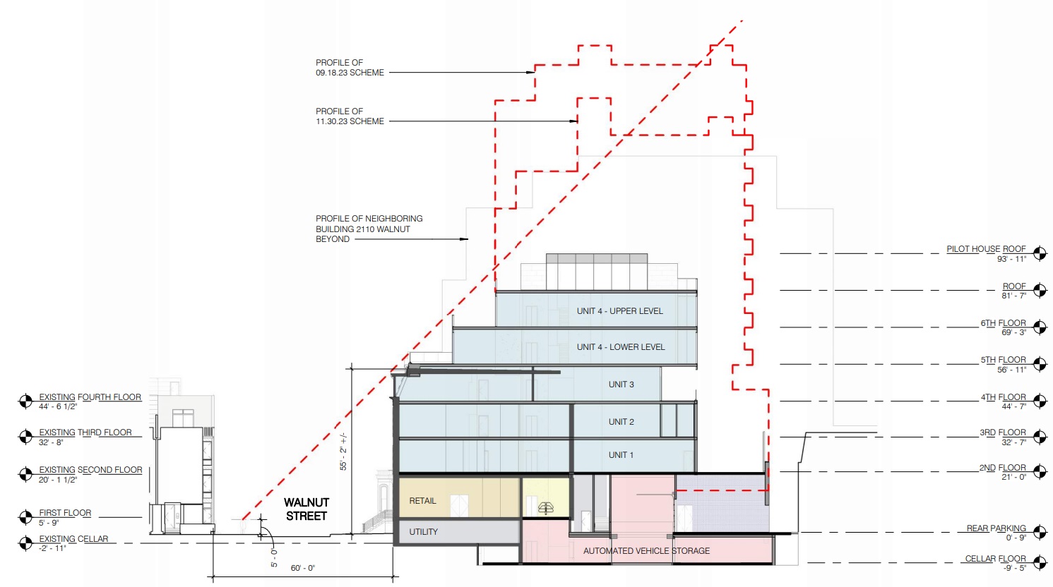
Developer Astoban must have gotten a lot of pushback, as this is quite a change in concept. Four parking spaces will be included in the basement, with commercial space and utilities making up the first floor. The second, third and fourth floors all include full story units with terraces, with the fifth and sixth floors dedicated to a bi-level penthouse, also with terraces and a roof deck. The design from CBP Architects has been streamlined, taking a more straight-forward design approach that also encroaches less on the neighbors in the back. We would assume these will remain condos, as the large floor plates and one-to-one parking ratio seems tailormade for sales.
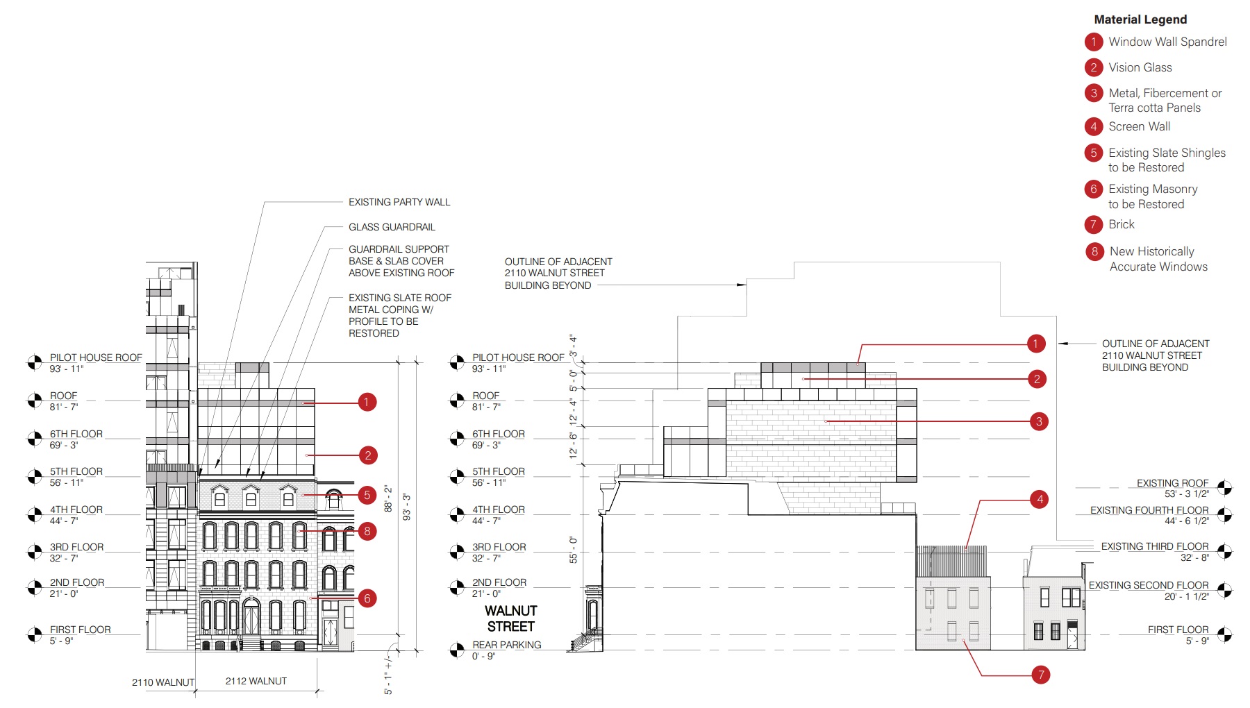
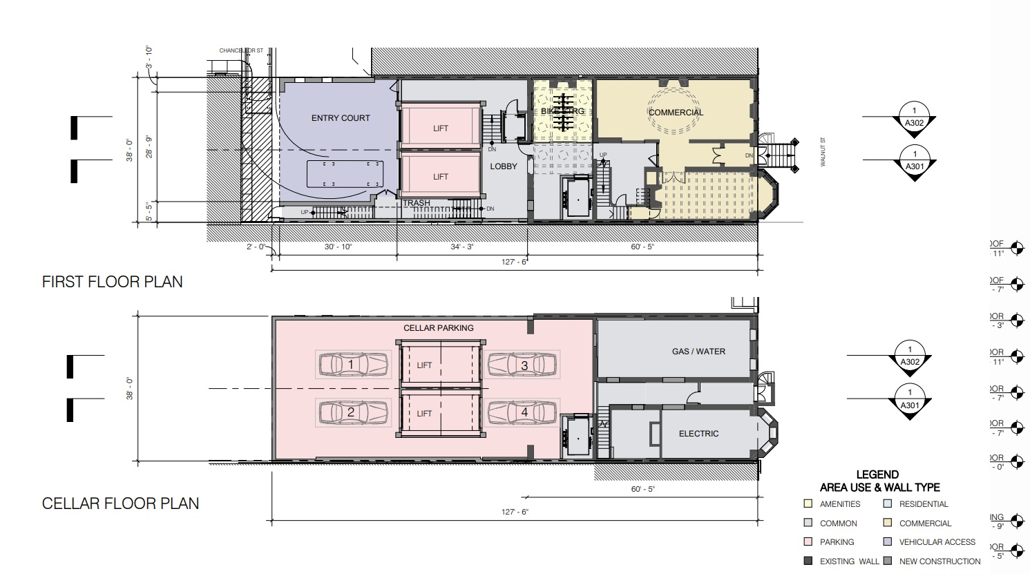
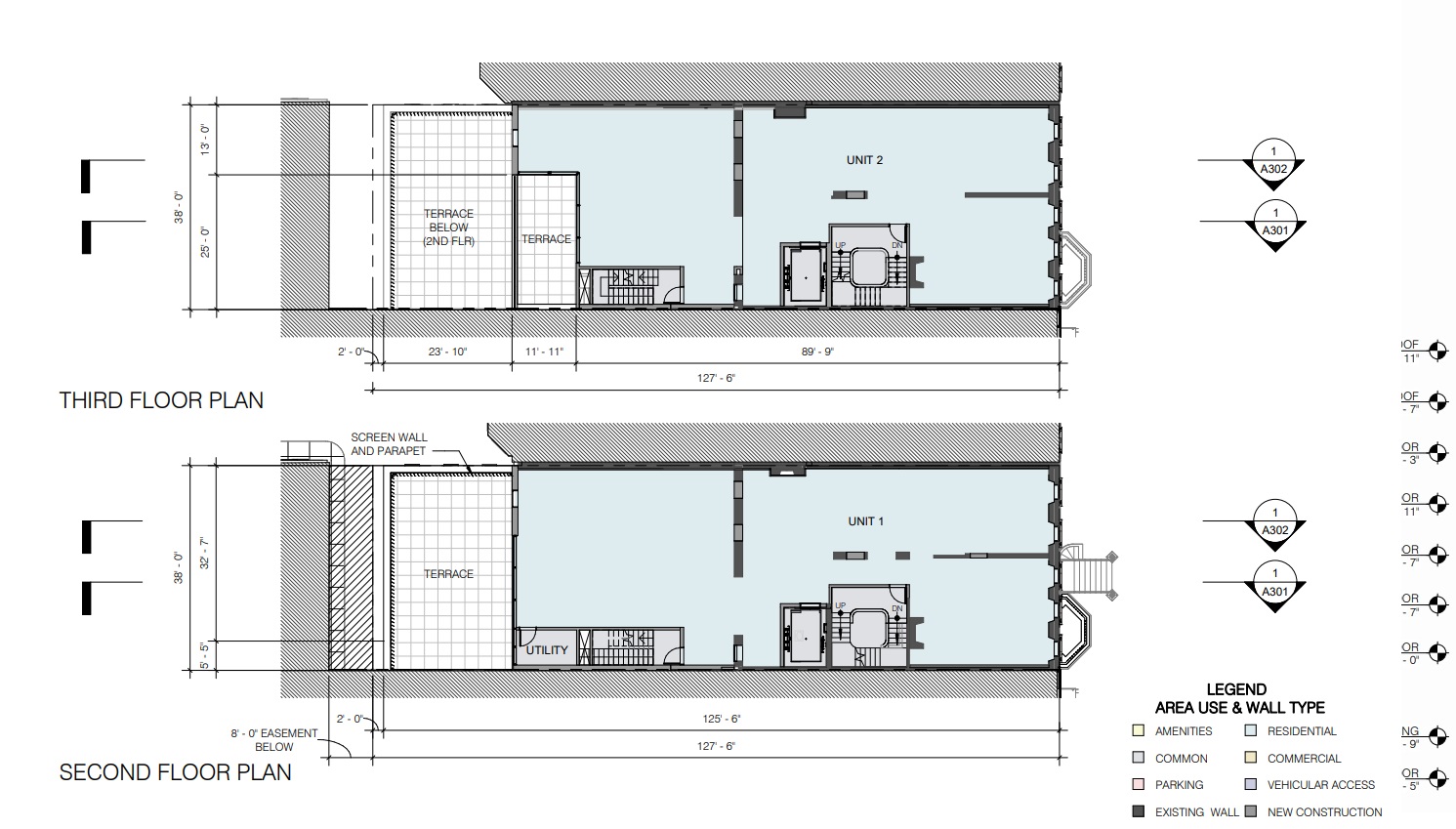
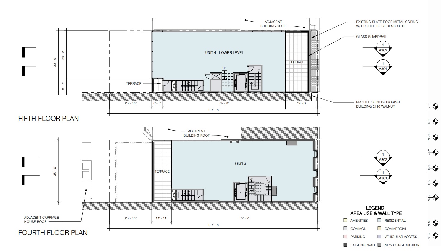
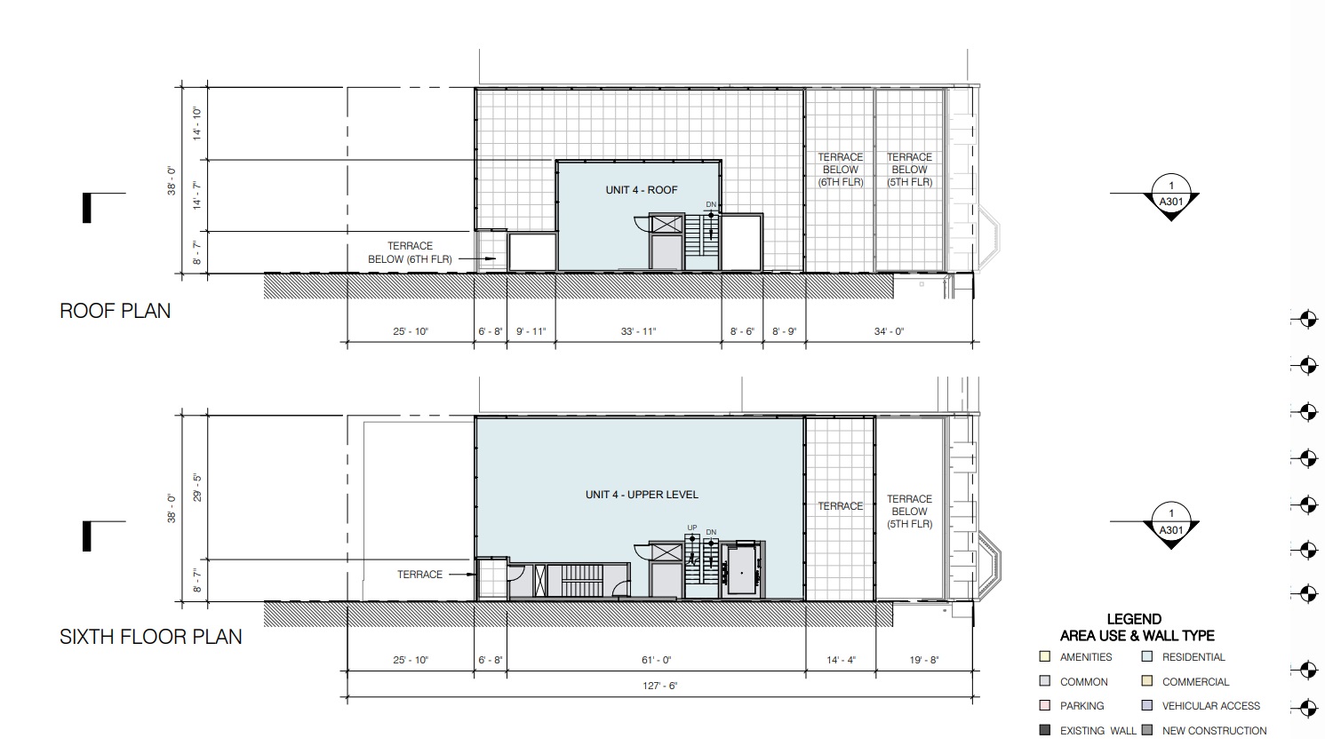
While we admittedly love towering skyscrapers and density in central parts of the city, this approach takes a much different look at what’s possible. Despite the presence of the contemporary overbuild immediately next door, this new proposal should blend in more easily with its surroundings, while being less obtrusive neighbors, especially to those houses to the south. And as “the grass is always greener,” if this current plan was the original proposal, we would likely have been more than content. We’d imagine that these units will eventually be multi-million-dollar offerings, with high-end finishes that are expected for a fancy Rittenhouse home.
All of this could be a moot point, however, as this project still needs to be approved at next week’s meeting of the Architectural Committee of the Historical Commission. The recommendation is currently for denial, so we may see yet another turn here before Joel’s return from injury. Even with all this uncertainty still in the air, it sure seems like we’ll see some version of this smaller plan proceed sometime soon.
