You may remember back in August when we took you to 2112 Walnut St. in Rittenhouse Square to tell you about a proposed overbuild directly next to an already completed overbuild. We had a bit of a fake-out on our hands since then, as the proposal was pulled from subsequent Architectural Committee agendas. The site – currently a handsome but non-contributing building in a historic district has remained in limbo… until yesterday.
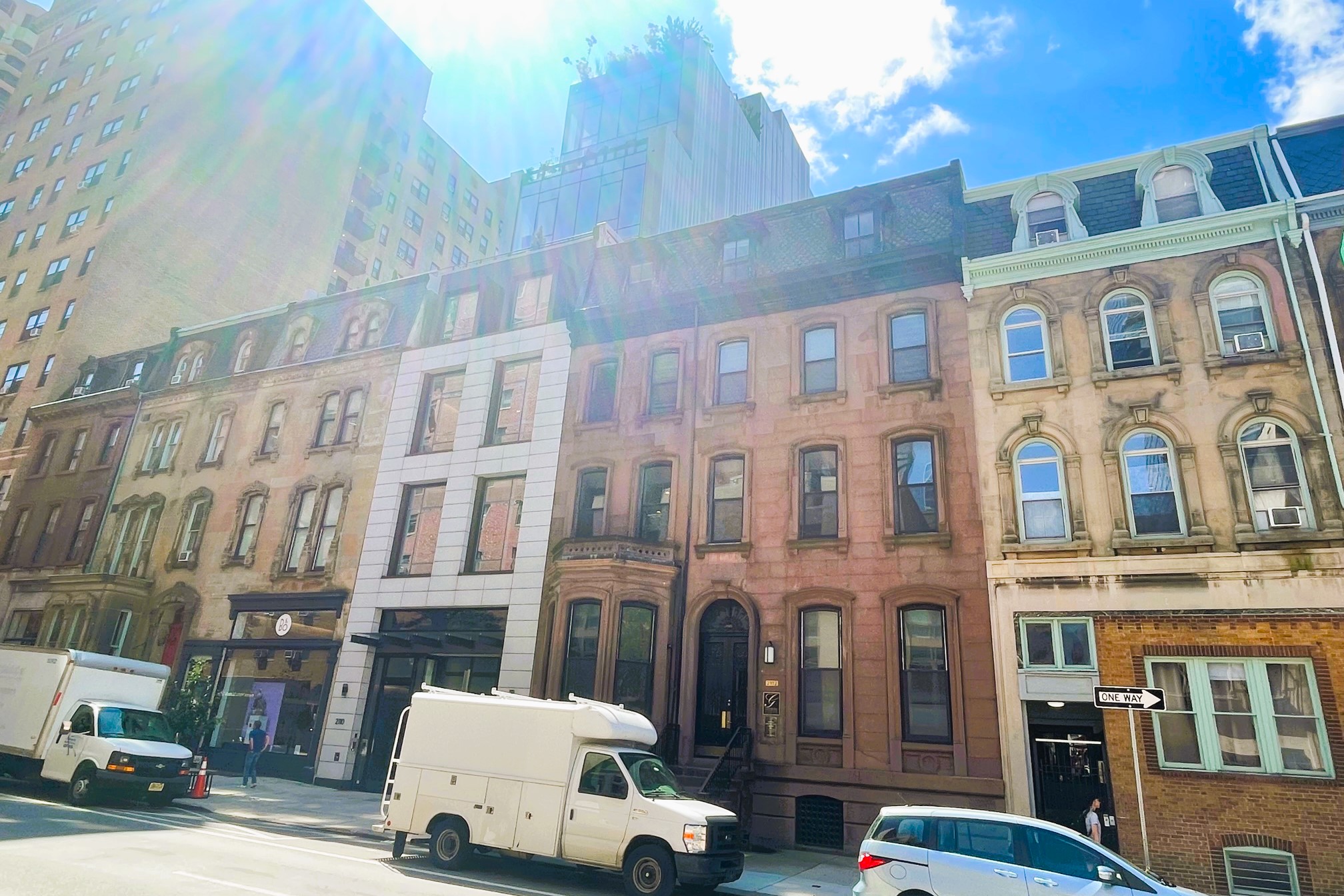
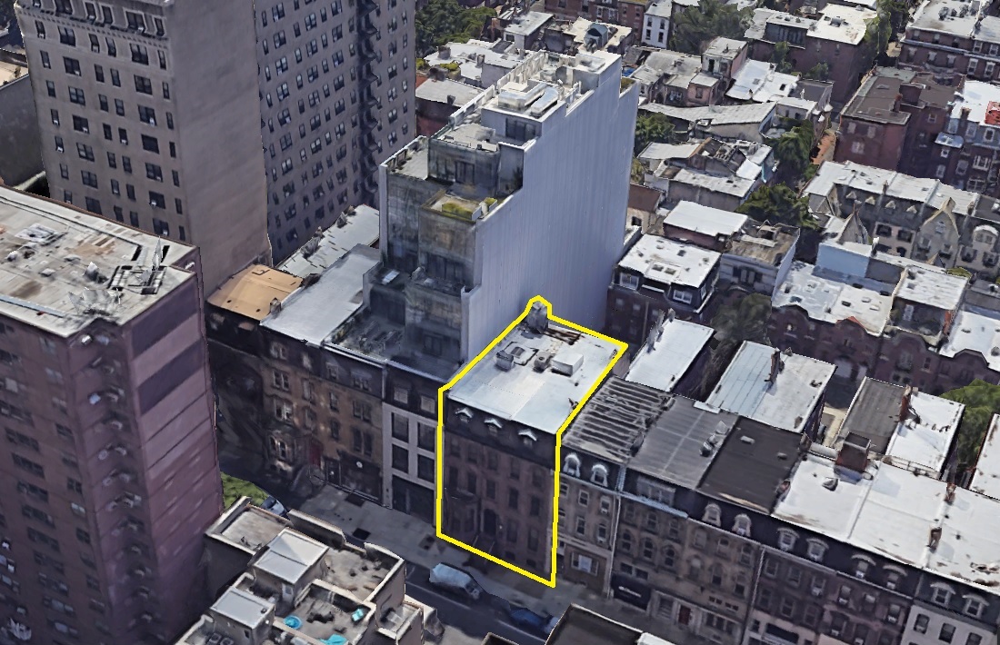
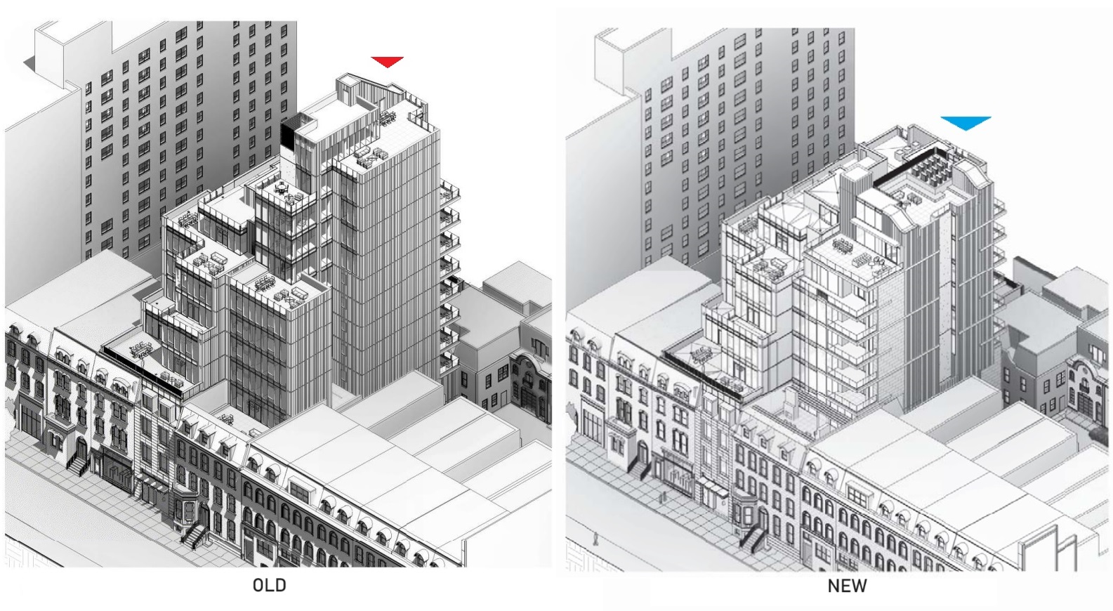
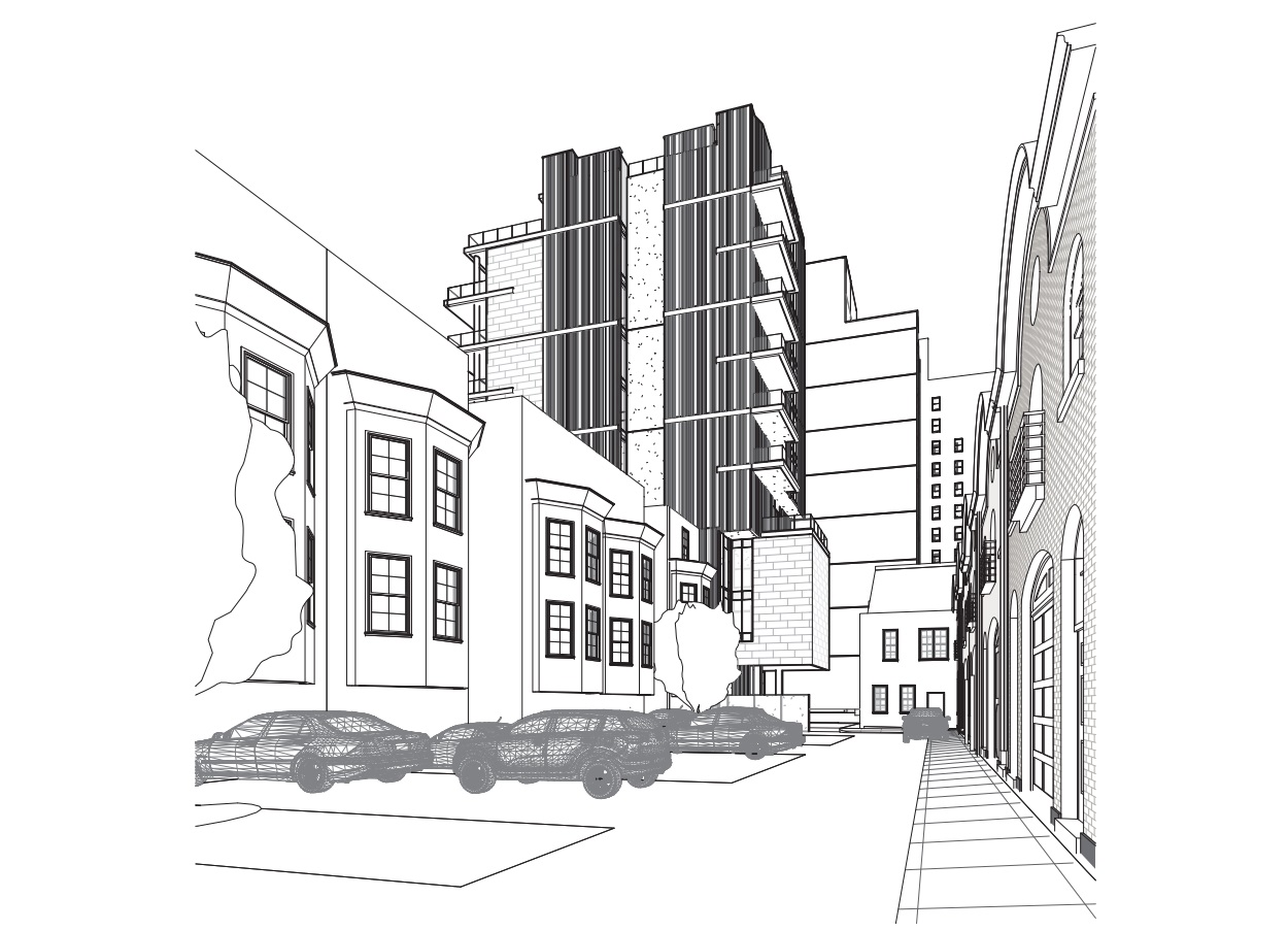
New plans were posted for an upcoming Architectural Committe meeting, with some changes, as one might expect. Most notably, the size of the project will be reduced, with the building dropping two floors and a few dozen feet in height. As you can see from the updated streetscape drawings, the new structure’s visual impact has been greatly changed since its initial iteration.
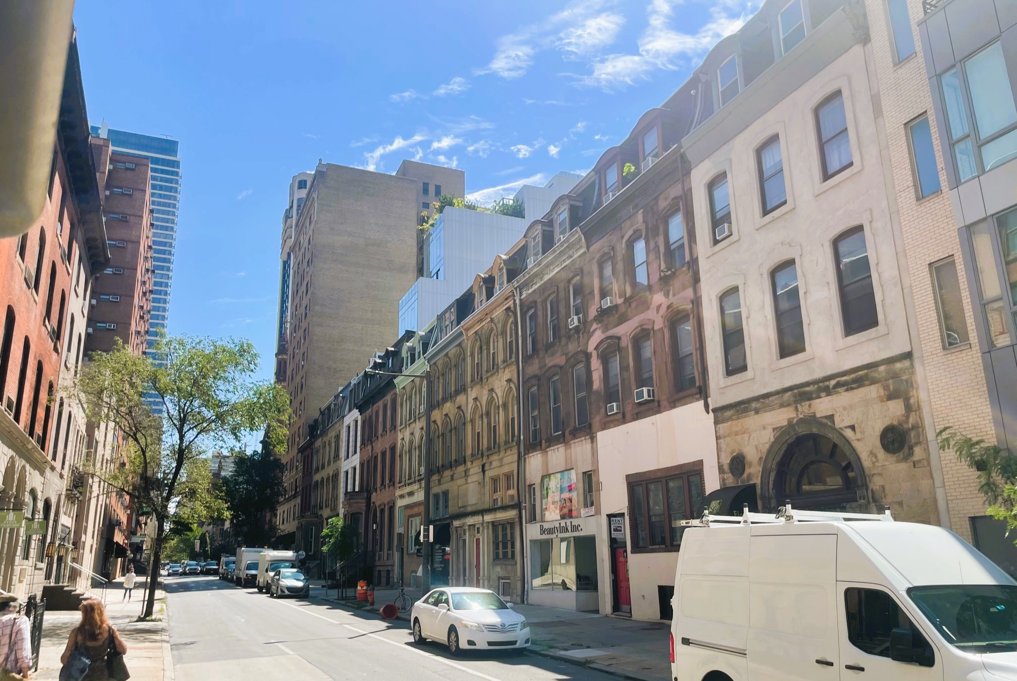
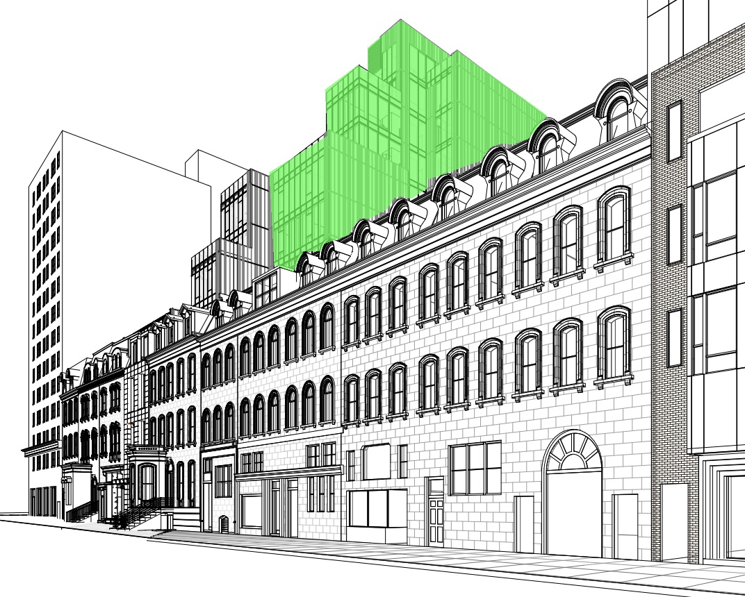
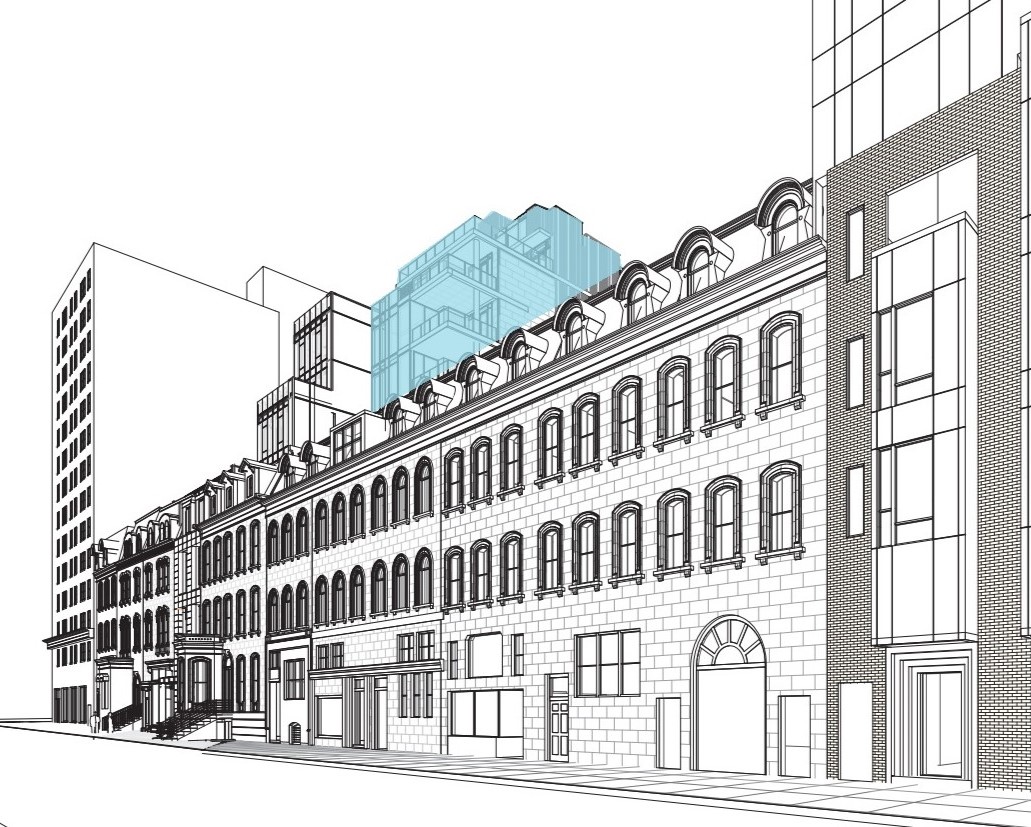
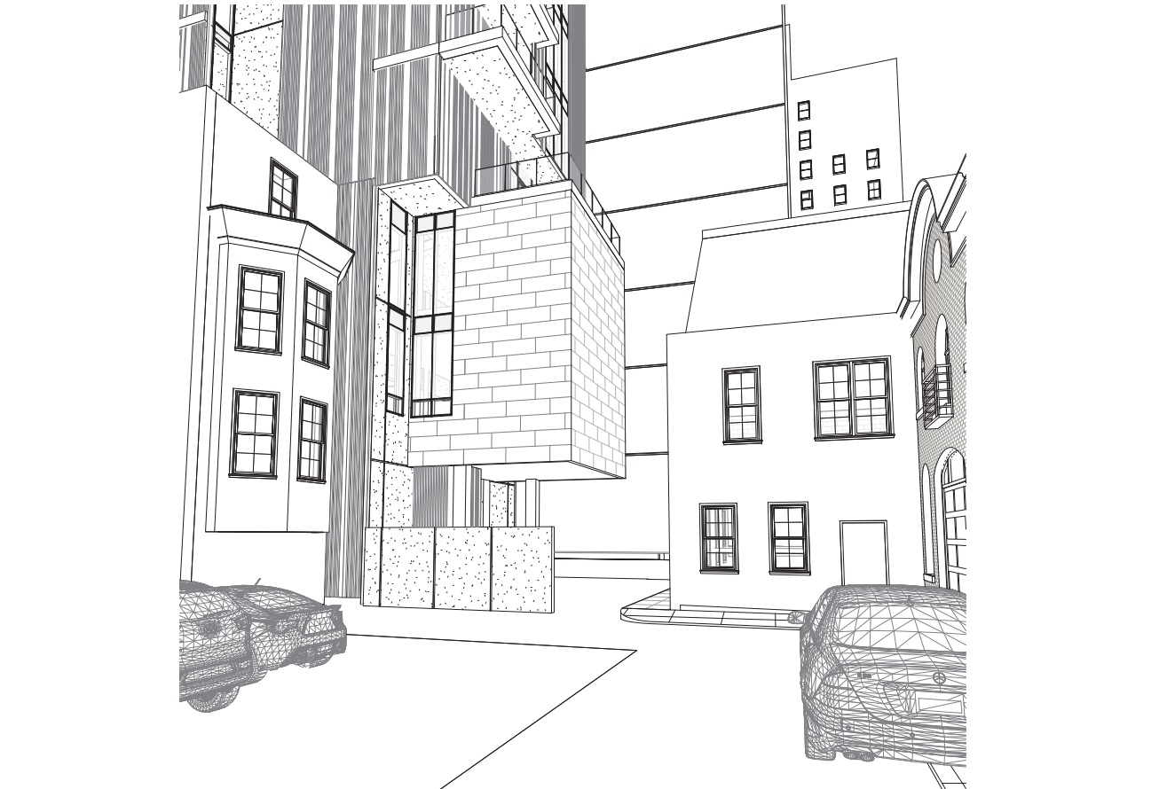
Developers Astoban Investments and designers CBP Architects clearly took previous feedback and the concerns of the neighbors to heart. This design still contains ten luxury condo units, with the dramatic look of the previous design traded out for one that closely resembles the one next door. The protruding fins and looming walls have been traded out for a boxier design, but one which allows for more light and air to the neighbors next door. The parking has been reduced, with eight underground spaces now part of the plans. Ground-floor commercial space is still included here, with some slight changes to the site plan to accommodate easier parking, loading, and circulation. Excitingly, nearly all of the original structure will be retained, keeping the character of the existing streetscape.
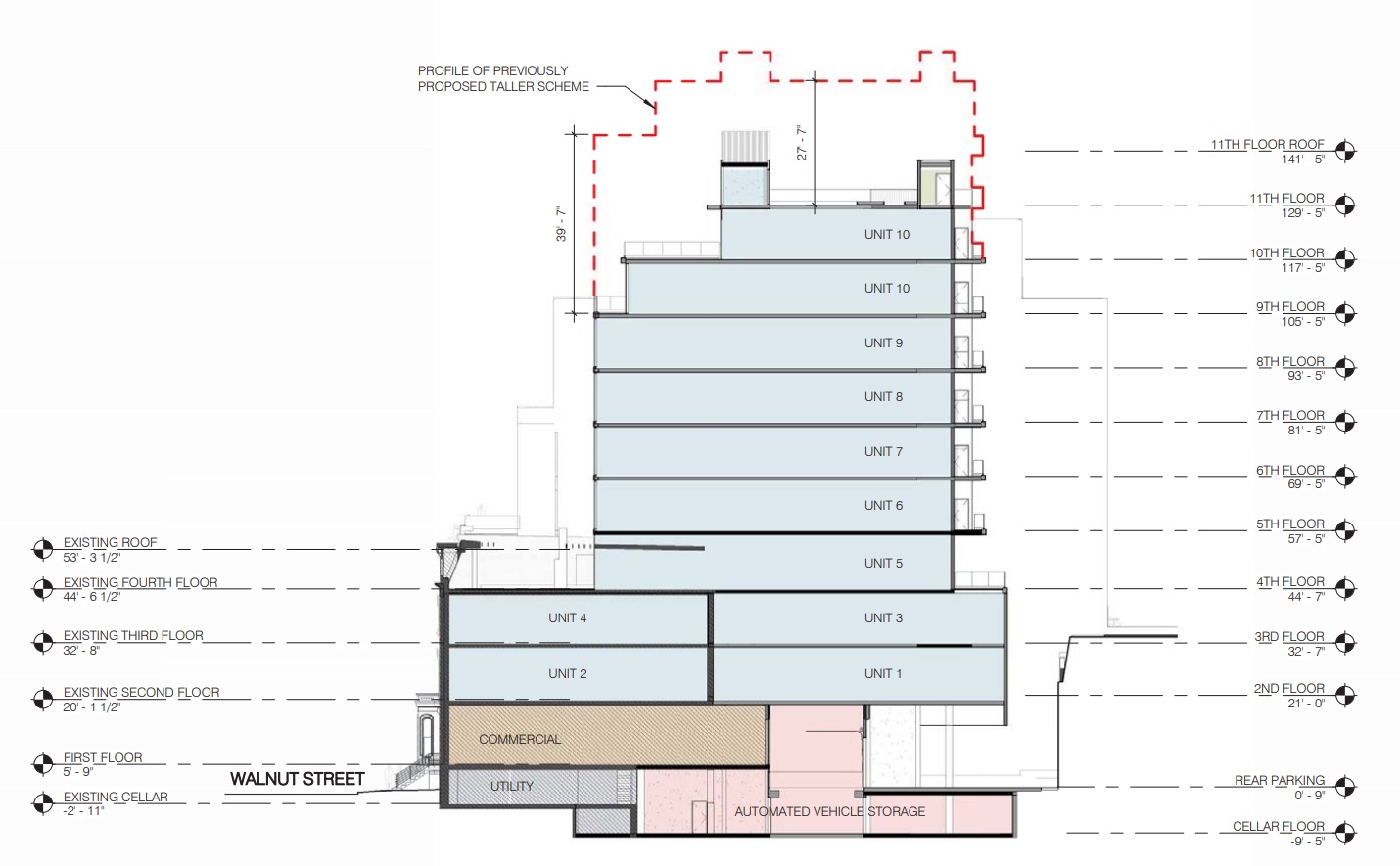
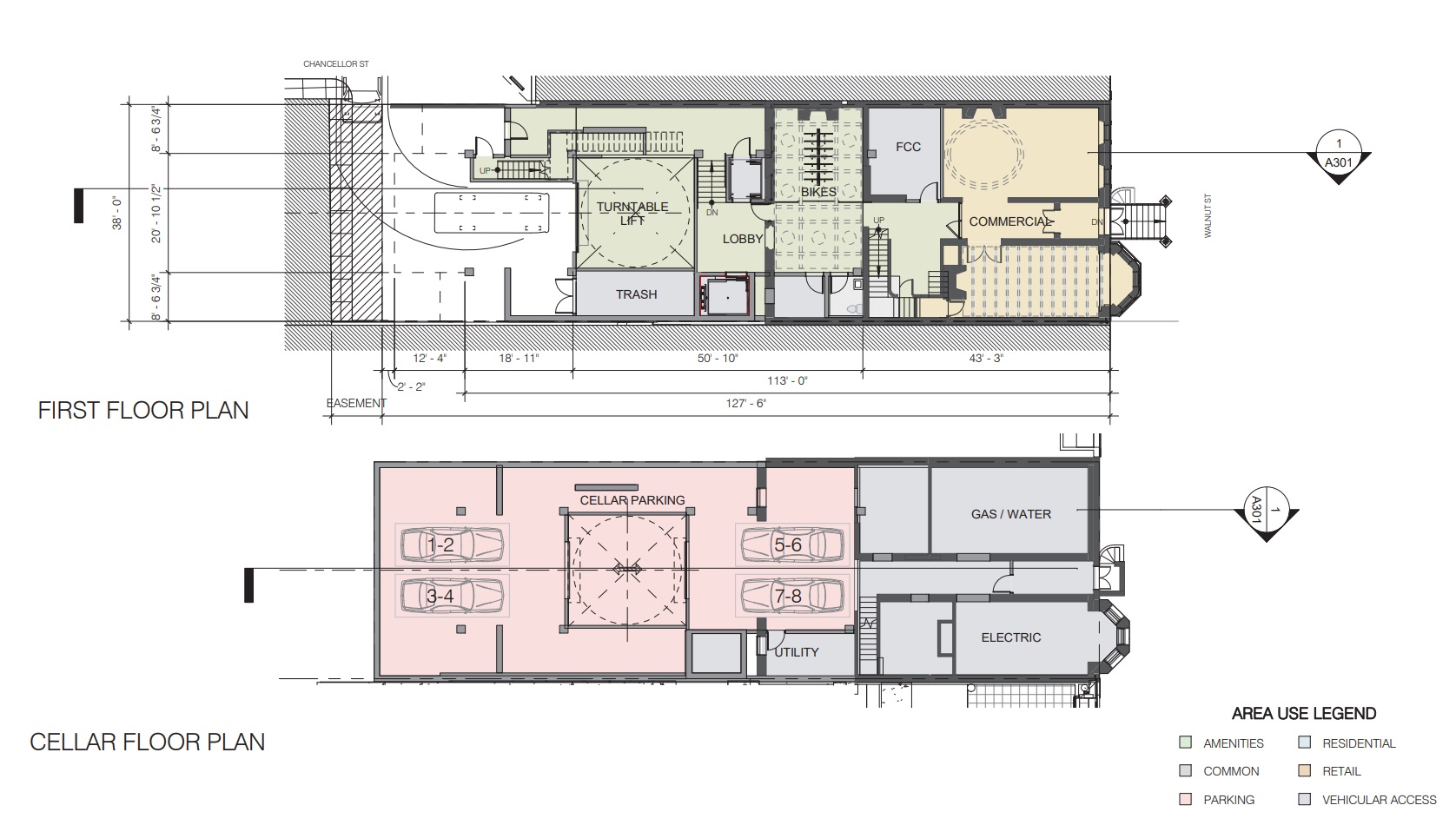
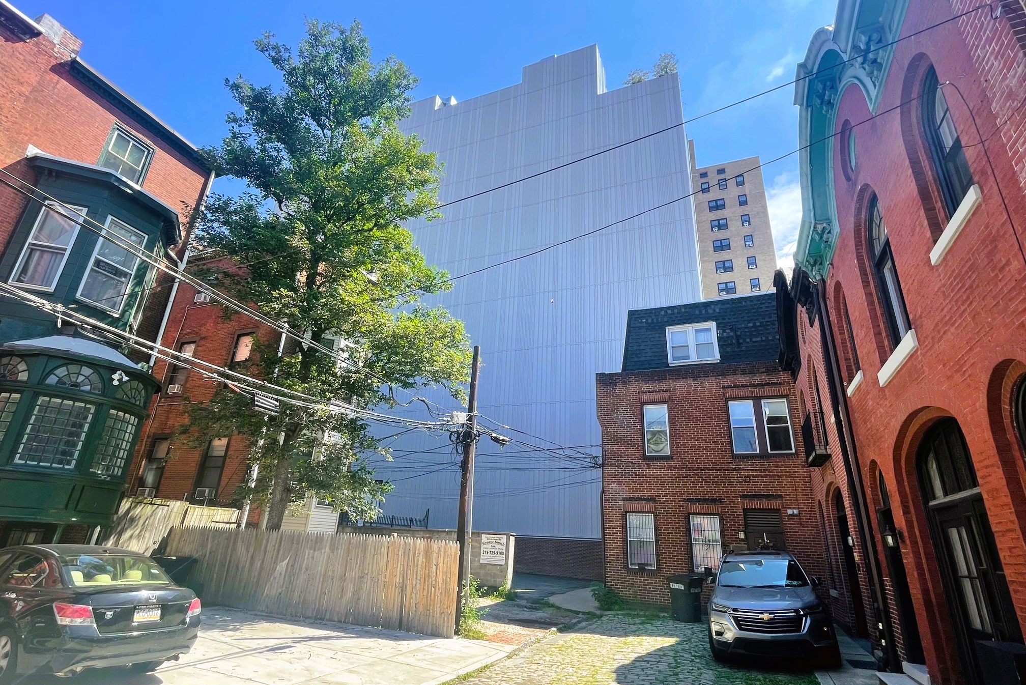
We also have a better idea of what the look along the back of the property on Chancellor Street will entail. The large blank wall that currently welcomes those making their way back here will soon be parking access and the back of the residential tower, with an odd protrusion in the back to accommodate more residential square footage.
While this new design in and of itself may not be an upgrade, we are big fans of this updated approach. The original iteration was indeed exciting, but it stuck out like a sore thumb, even next to an identical concept. The density remains, the parking is reduced, the intrusion upon the neighbors is lessened… and hopefully that means this is more likely to happen now. We don’t see an updated meeting agenda to go along with these newly posted plans, but we hope to learn more about this proposal once it returns for review.
