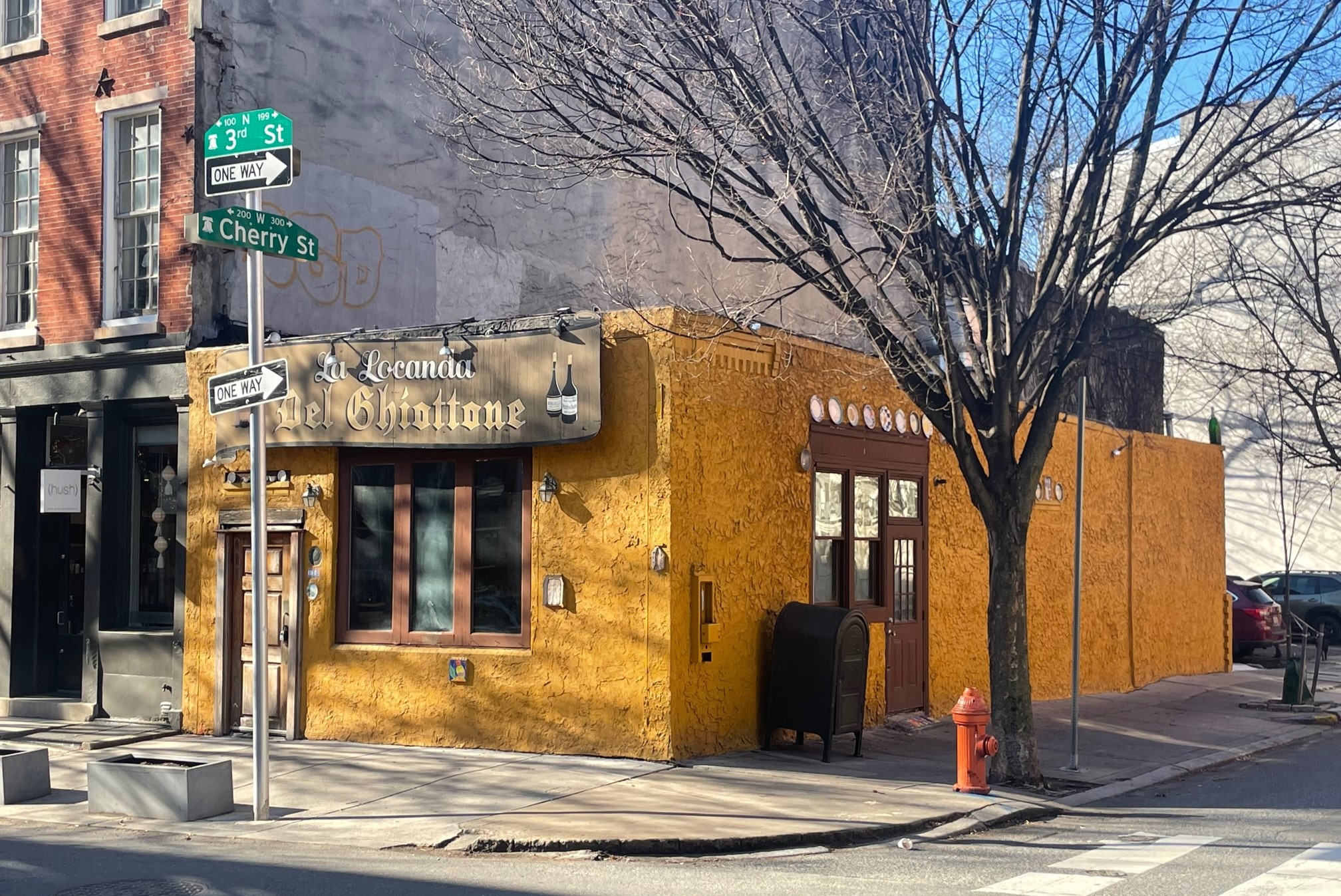
It was only a few weeks ago, back in the days before the Eagles were Super Bowl bound (Go Birds), when we last stopped by 130 N. 3rd St., where La Locanda Del Ghiottone had been dishing out Philly-style Italian dishes for years. The stubby yellow building and surface lot which had stood for so long were slated for a big change, with a residential proposal to rise at this spot.
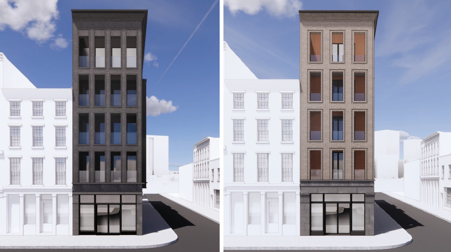
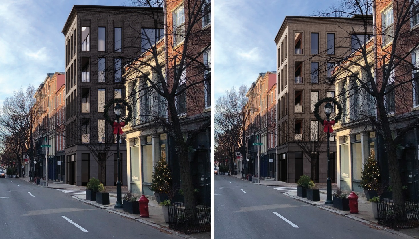
As for those plans, developer Zoubek Properties brought in Gnome Architects to design a five-story, mixed-use building, with four three-bed units on the top floors and ground floor commercial space along the 3rd St. frontage. While this is a by-right project, the Old City Historic District necessitates a trip to the Historical Commission, so we got a little peek at the plans. While we were fans of the dark brick, the tall, curved cornice and the modern fenestration, the Commission had different feelings, as did the public. But as you can see below, a revised design has been submitted for consideration for this project, which will return to the Historical Commission for approval on Friday.
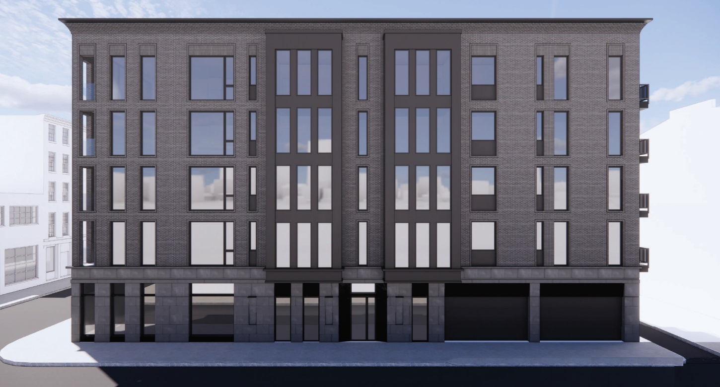
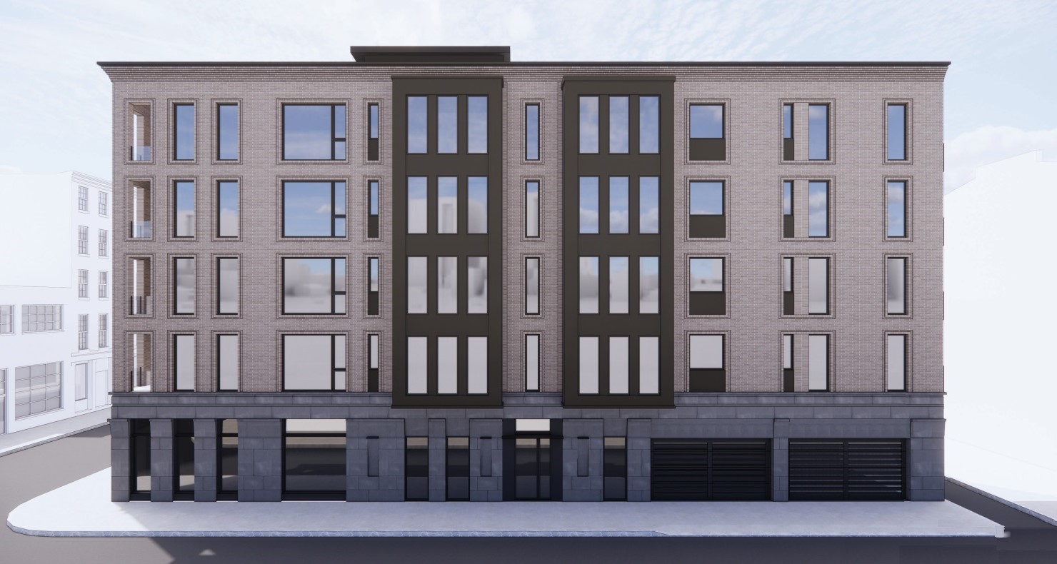
While keeping its original massing and overall look, there are plenty of changes between the two versions. The most obvious would be the color change, with a lighter, warmer brick replacing the dark gray brick that added heaviness to the overall design. The windows-per-floor were also reduced along the 3rd St. side, with the four windows opening onto the covered outdoor area being reduced to three. Additionally, all windows have received a new brick framing, shifting from an angled, vertically-asymmetrical pattern to a more inlaid, rectangular approach. The ground level masonry has been beefed up and the windows have been slightly reduced in height, once again fitting in more closely with the existing buildings. The overall height was also reduced, with the taller cornice being downsized, which looks like it fits right in with the current streetscape.
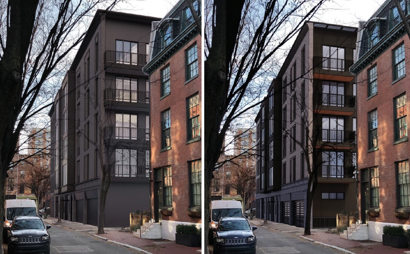
While the front of the building received the biggest changes, the back also got some love. The stark black walls have been warmed up with wood accents on the balconies, with additional windows being added along the ground level to create a friendlier looking facade.
It’s not often we see developers and designers not only willing to pivot to a new design, but doing it so quickly and successfully. This new look does blend in better than before, and we were huge fans of the design in its original form. Though it’s certainly not a common occurrence, we absolutely love when thoughtful, considered feedback is met with an open mind and leads to an even better project. Let’s just cross our fingers that something equally delicious will grace the ground floor as it did in that adorable yellow building when all is said and done.

Leave a Reply