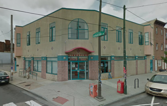
About a year and a half ago, a state-owned liquor store moved from their uninspired digs at Germantown & Girard into a huge and impressive space a block away, under the still-newish Superfresh next to the Piazza. It’s not that the store’s layout or its selection were bad per se (at least by Philly standards), but it was the building itself that bugged us. Architecturally, the structure looked like it was teleported from Florida, with a number of odd choices like pink-toned bricks, teal tiles, lots of stucco, and ostensibly decorative diamonds under all the windows. We’re guessing the building was constructed before the boom in Northern Liberties, but that doesn’t really excuse anything.
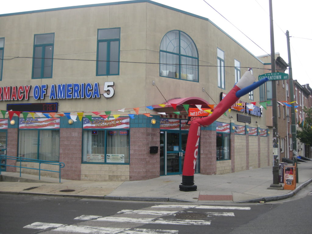
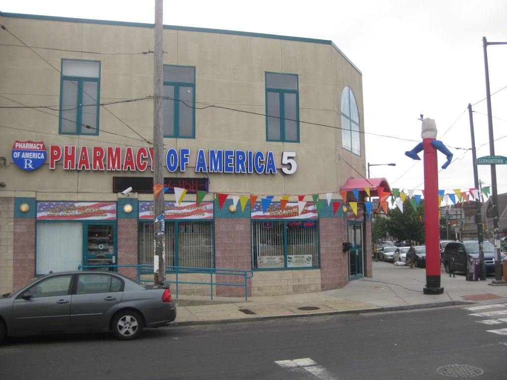
The building sat empty for a little while after the liquor store moved out, but a reader recently gave us the heads up that a new business has taken over the space. It’s an independent pharmacy! And we have to say, they’ve taken an already unattractive building and dressed it up in a really ugly outfit.
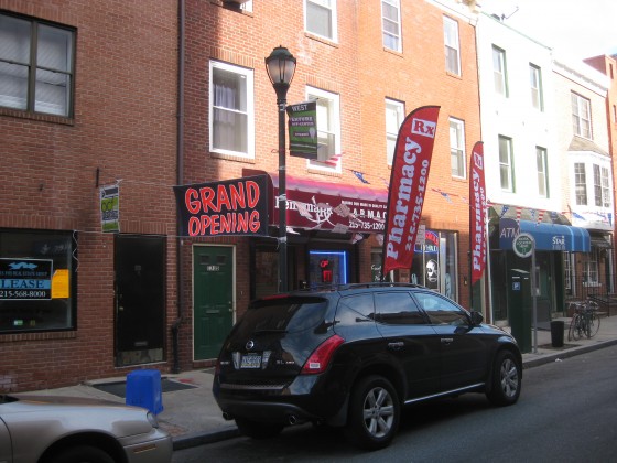
Somehow, pharmacies like CVS and Walgreens are able to succeed without over the top signage that makes the outside of their stores look awful. Unfortunately, this seems like a growing trend among independent pharmacies, especially right after they open. You may recall, a South Street pharmacy was over the top with their signage as well.
No way all the extra signage is legal, but does it really matter? Sure, it looks lousy and you wouldn’t want to look at it every day, but hopefully as the business becomes more established (thanks to all that signage, no doubt), some of those extra signs will disappear and the business will take on a better look. Not that it will change anything about the building though, which will likely remain hilariously terrible to look at for generations to come.


