We only have to go back a month ago to find ourselves at 6915 Germantown Ave., the property next to the historic John Gorgas House in Mt. Airy. At the time, we told you about a recent zoning permit to combine properties next to this old house, where there were big changes planned to where a single-family home stood.
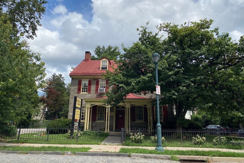
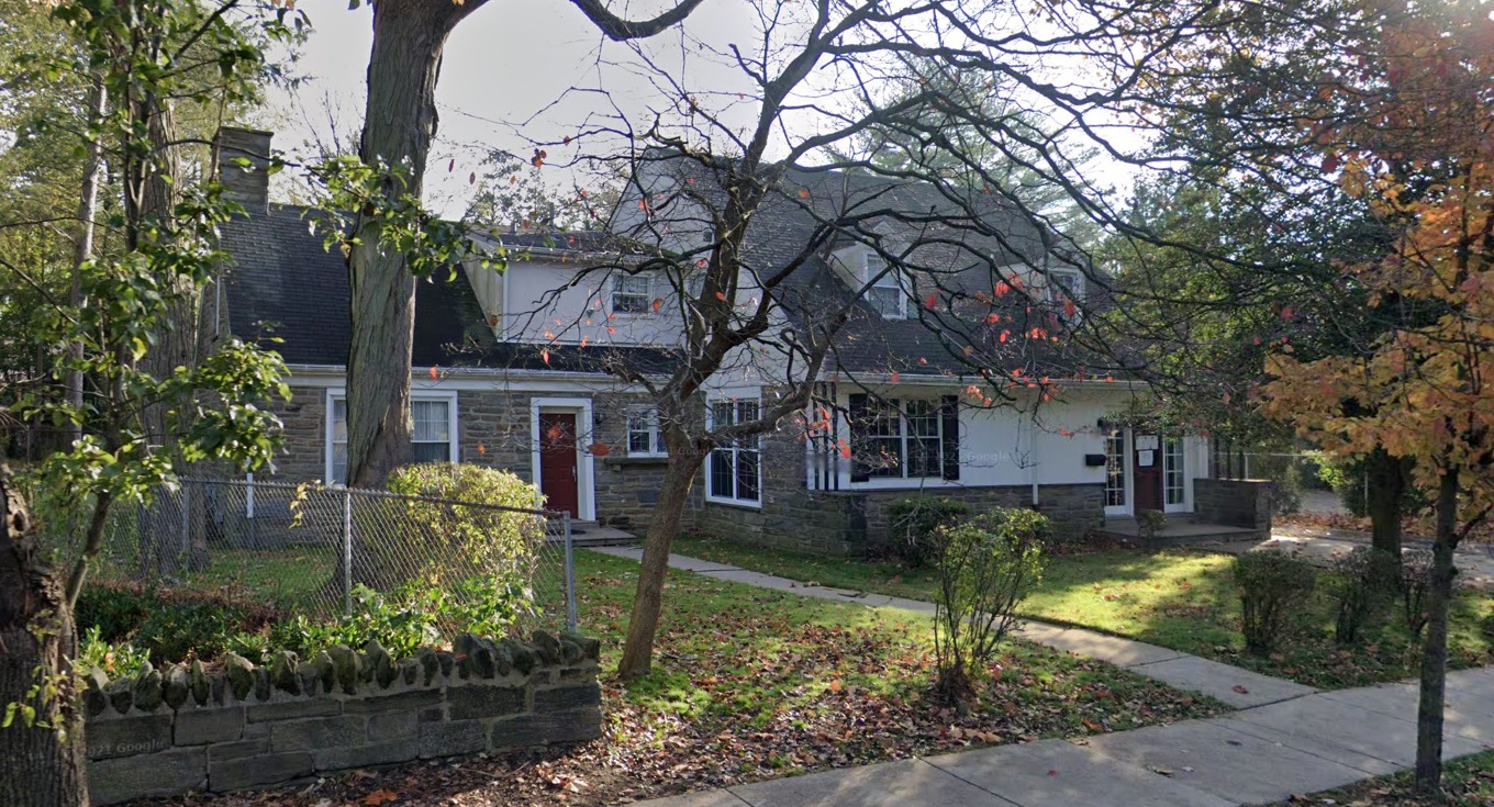
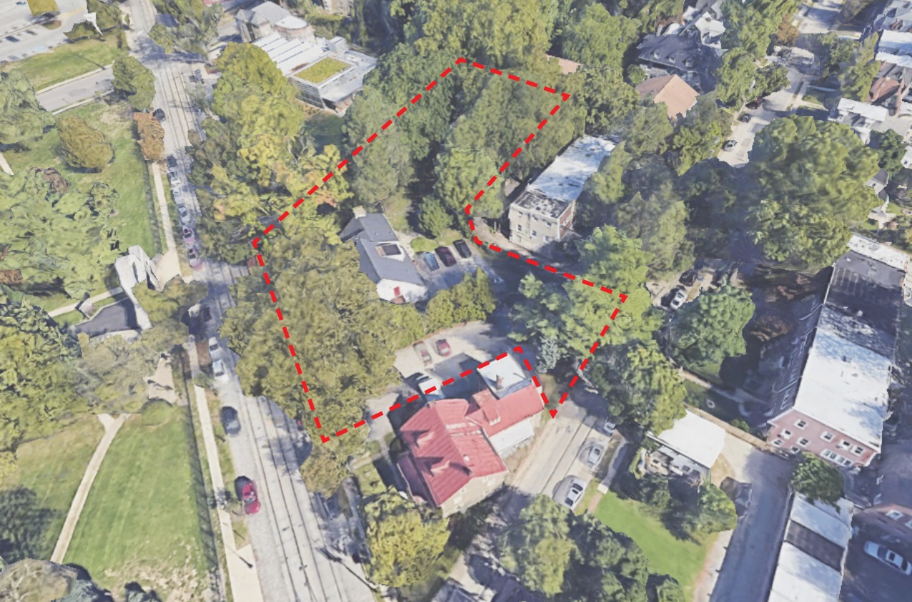
The plans here were big, calling for 72 units to go up in a mixed-use building, which would include car parking for 24 accessed from Gorgas Ln., with a commercial space along Germantown. A rounded, green building was proposed, butting up within five feet of the historic structure. As this was a first proposal to the Architectural Committee of the Historical Commission, we speculated we might see a change or two to this bold design from developers TierView and architects Canno. And wouldn’t you know it, we did in fact predict the future.
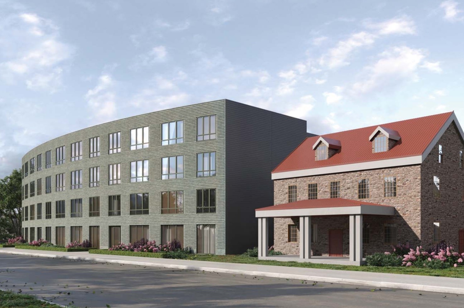
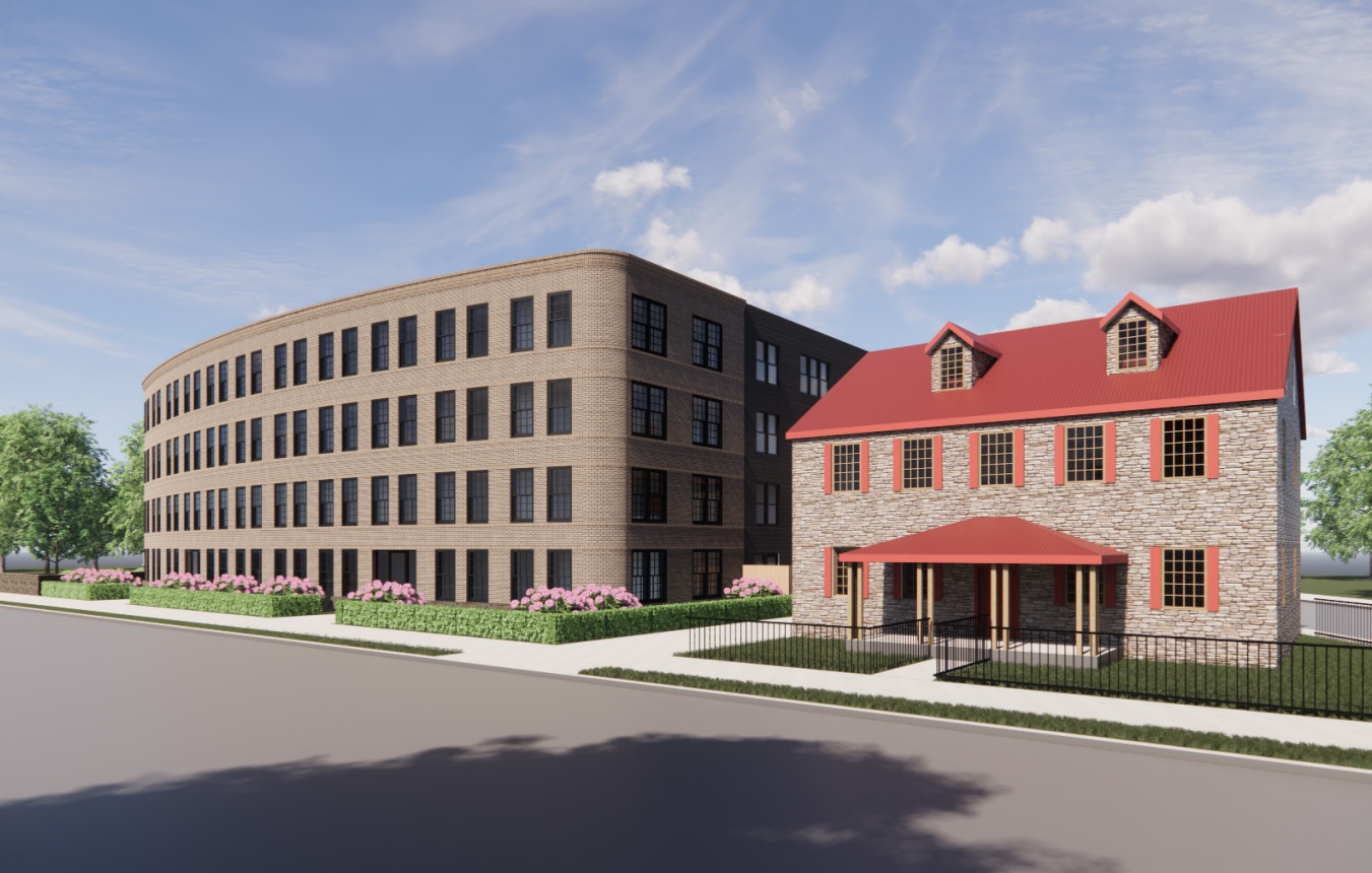
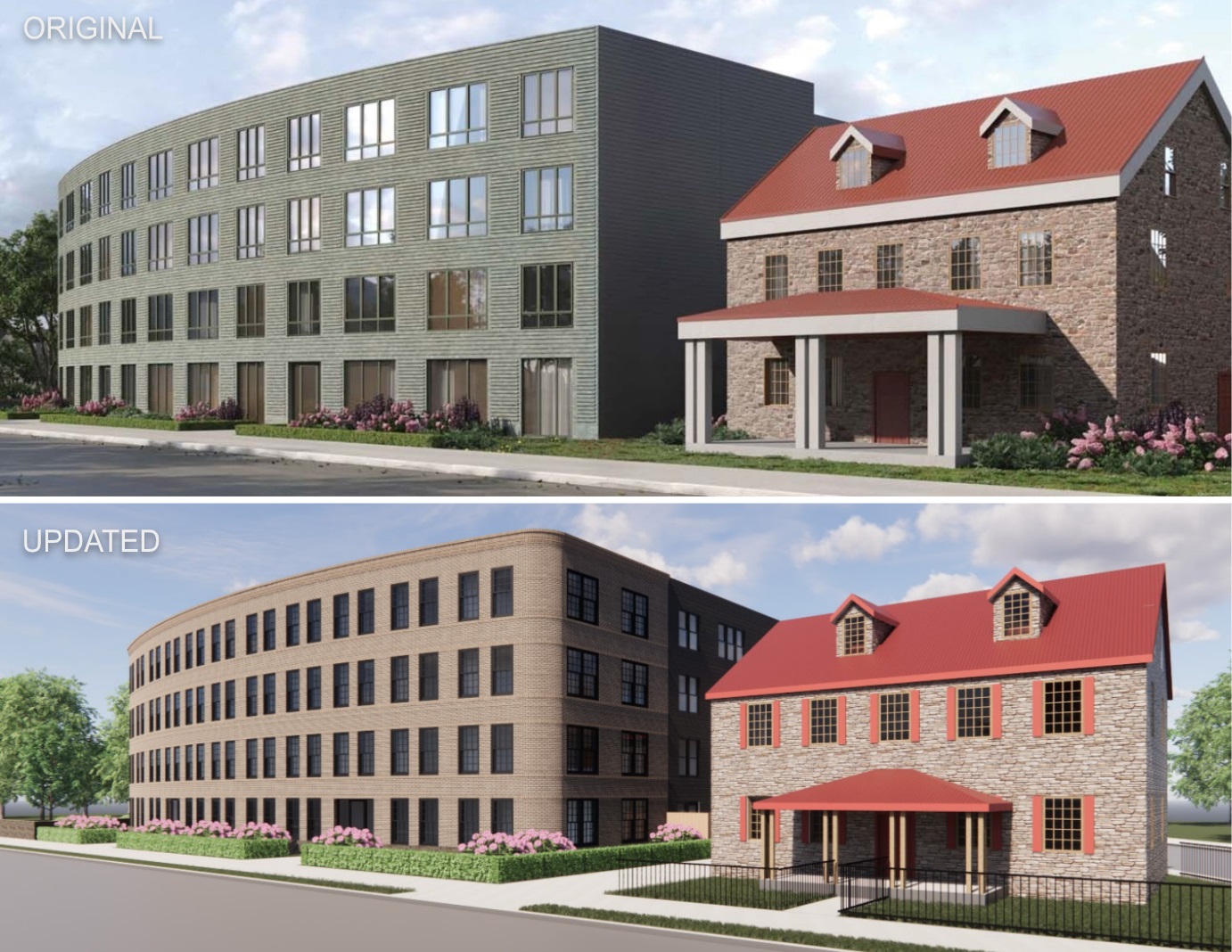
Shortly after we reported on the plans, the design team went to the Architectural Committee, which had a bevy of feedback (discussion starts at 2:38:20), most notably around the interaction with the historic structure. Public feedback was also not in love with the plans, noting that the proximity to property lines was not to scale. As such, the original plans were denied, meaning a new approach was mandated. It seems like the designers took all of this feedback to heart, as the new look does a good job of softening the hard edges of this proposal – literally.
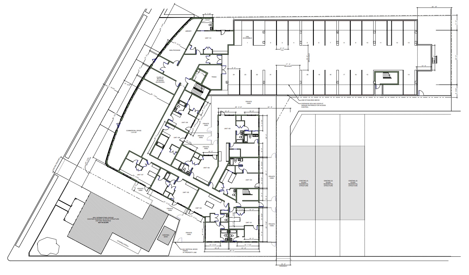
First, from a layout perspective: the unit count, commercial space, and parking are all to remain the same (save for a slight reduction to the commercial size), along with the four floors. The shape of the building is adjusted slightly, stepping back further from the house than before, while providing a rounded edge that also includes more windows on the party wall. With a few tweaks to the unit layout, the count remains the same, providing more space for the Gorgas abode to breathe in the leafy air.
Secondly, from a look perspective: bye-bye green, hello beige! We often believe in the “bold is beautiful” approach to buildings, appreciating a design that takes some chances. However, the turn to tones that match the house make the entire project blend in more gracefully. The windows also change slightly, feeling less industrial and more suited for a domestic scale. A cornice is also added, offering a nod to the historic architecture that surrounds the area and once again fitting in way better than before. Let’s scope out some before-and-afters, shall we?
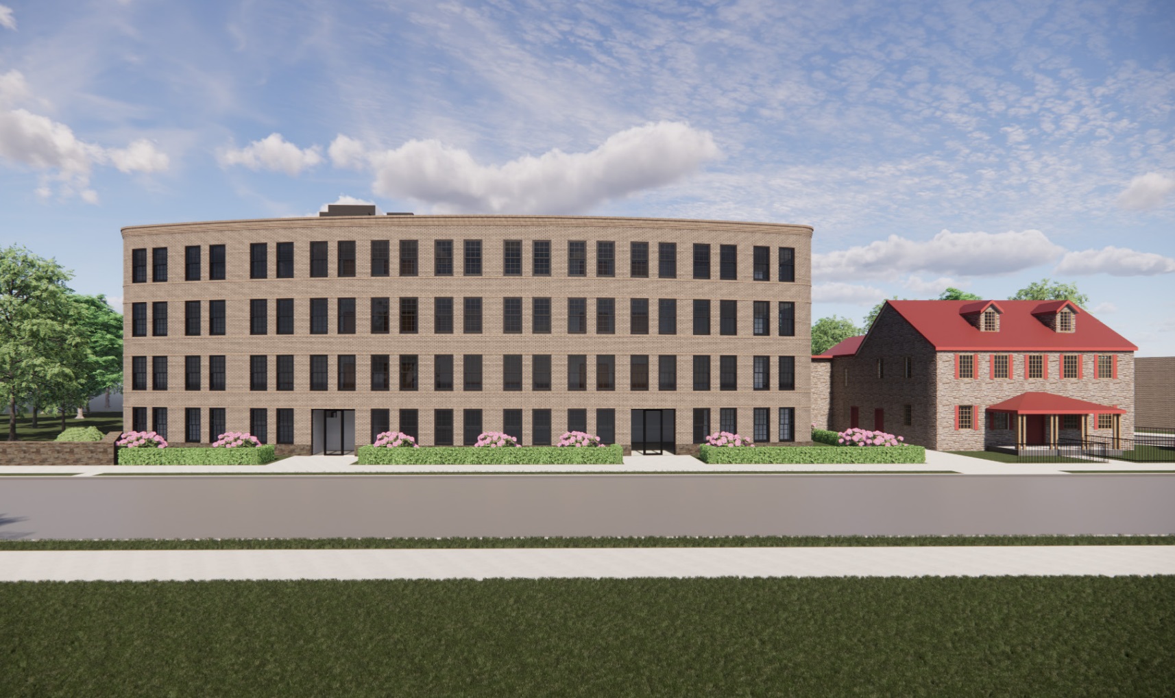
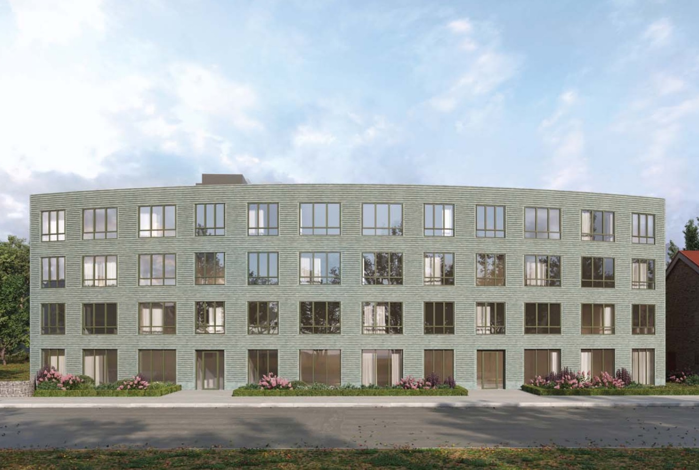
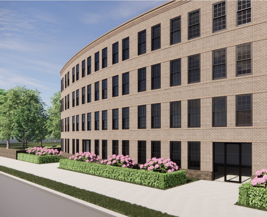
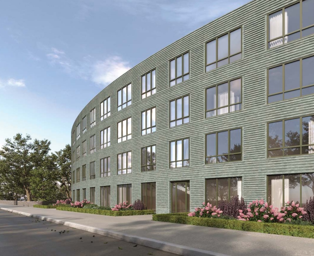
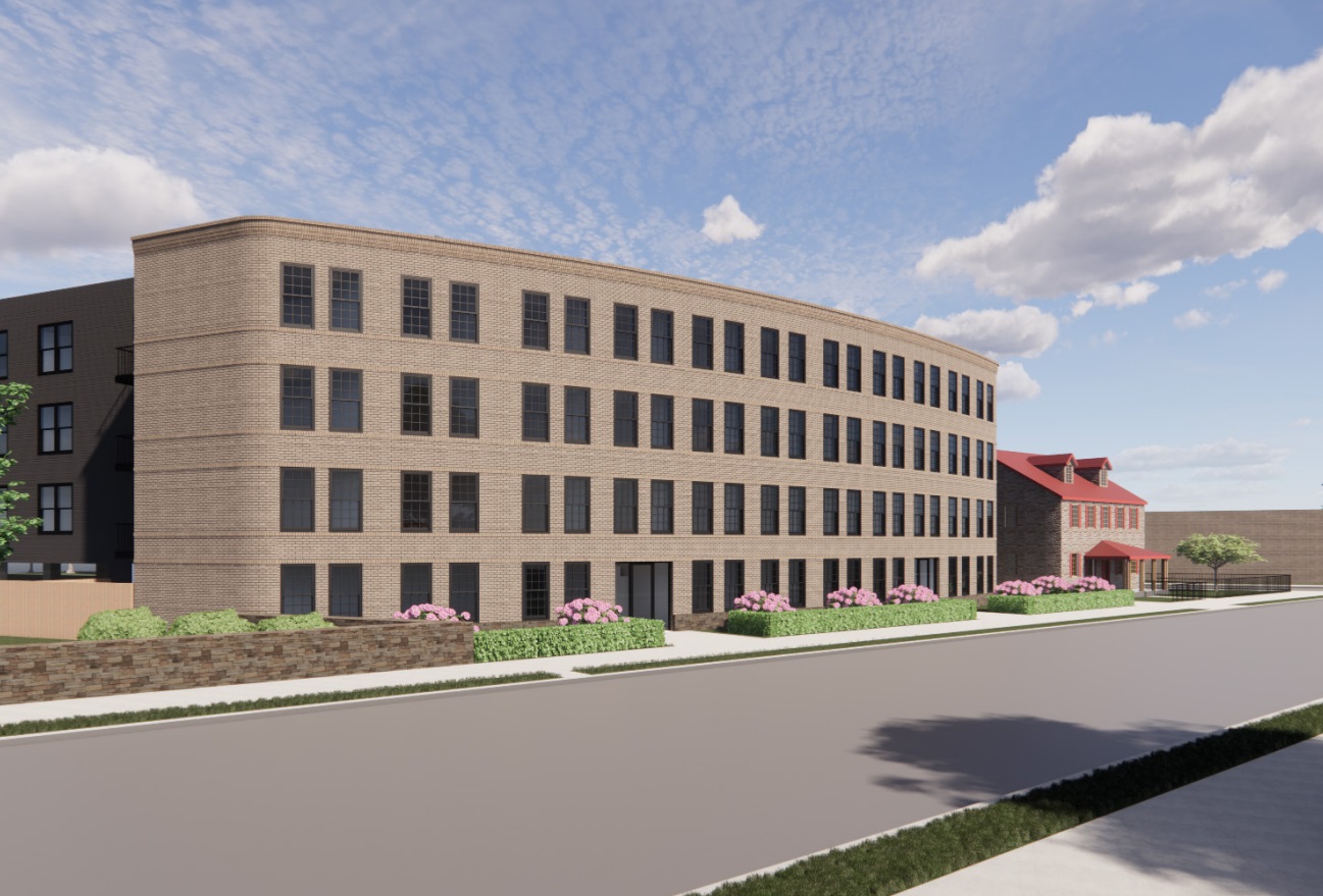
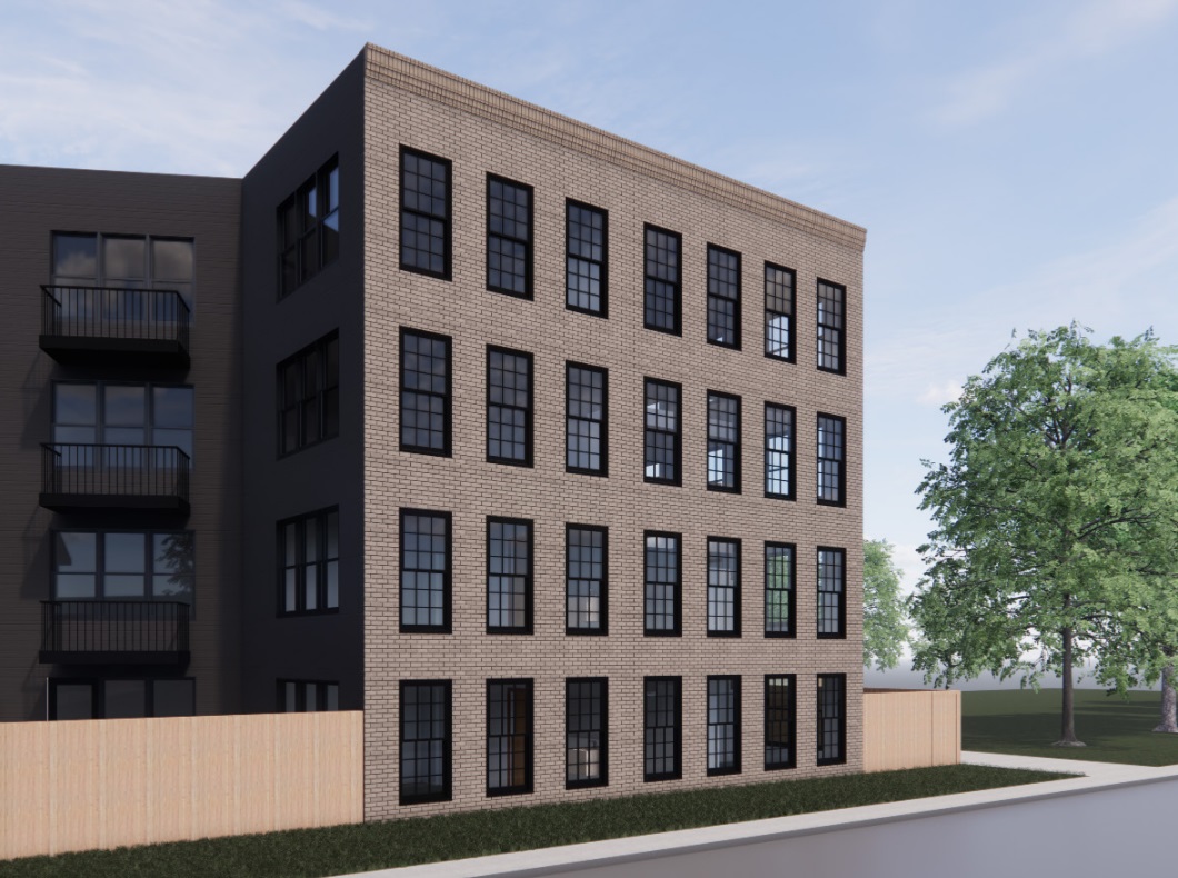
While those who weren’t fond of the density will likely have a similar feeling as before, we think this new look is a huge win. The building just feels more friendly – perhaps an odd way to describe an apartment, but we’re sticking to it. The windows facing the Gorgas House make it seem like they are neighbors as opposed to enemies, while the slight stepback takes away much of the looming feeling. We aren’t in love with the remaining curb-cut and driveway in this design, but perhaps the next round of changes will see this continue to evolve into an even more successful project. Those adjustments are likely to come soon, as the Architectural Committee meets again next week. Or who knows, maybe removing the green was just a way to show displeasure after that awful showing last night.

