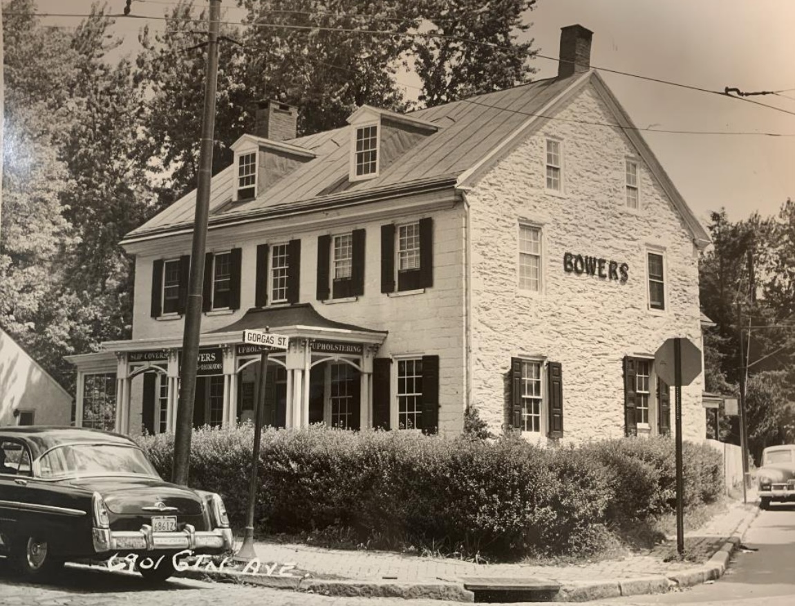
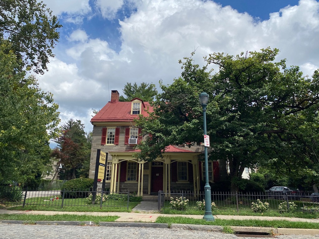
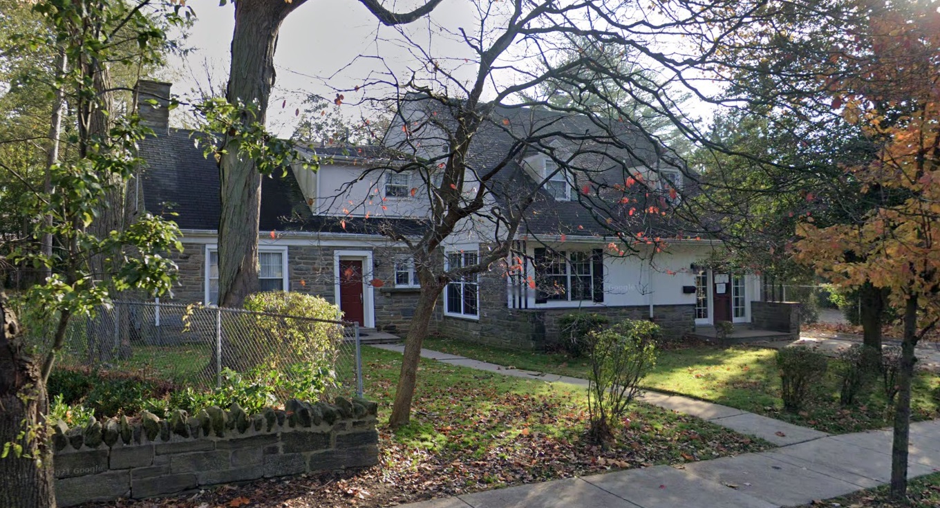
We don’t need to tell you that Philadelphia is steeped in history in every corner of its expanse. One place that fits this description is 6901 Germantown Ave., also known as the Gorgas House, which was named for the family that built the home back in 1798. This handsome but understated residence sits right at the corner of Germantown Ave. & Gorgas Ln. (of course) and looks pretty much the same today as it did back in the 1950s, when it was placed on the local historic register.
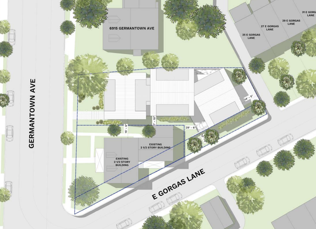
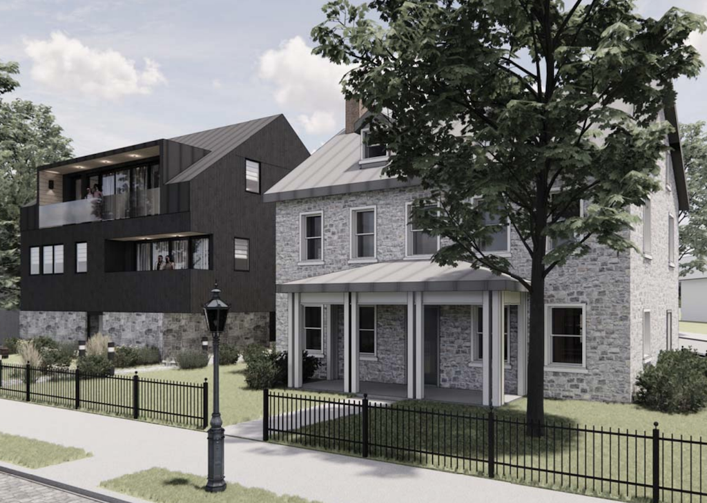
A few years back, plans were presented to the Historical Commission that called for a five-unit, three story building to rise on the parking lot which surrounds the house. The approach from LO Design was quite a stunner, with its modern-farmhouse vibe looking pretty darn good to us. Oddly, this project also called for eight parking spaces for the five units, but those plans appear to be a thing of the past.
While we are sad to see such a good design fade away, we are excited to see a denser approach being pitched. That’s right, TierView Development has plans to make a return to the Historical Commission, with a project that ups the density over 14x, jumping from 5 units to 72 units. And while you might guess that means much more height, it’s actually due to the property getting larger: 6915 Germantown Ave., a more recently built single family home, is now part of the plans, combining with the parking lot to create a much bigger footprint for development. And per a story from this summer, said building already has received permits for demo, meaning this new proposal can cover a much larger area.
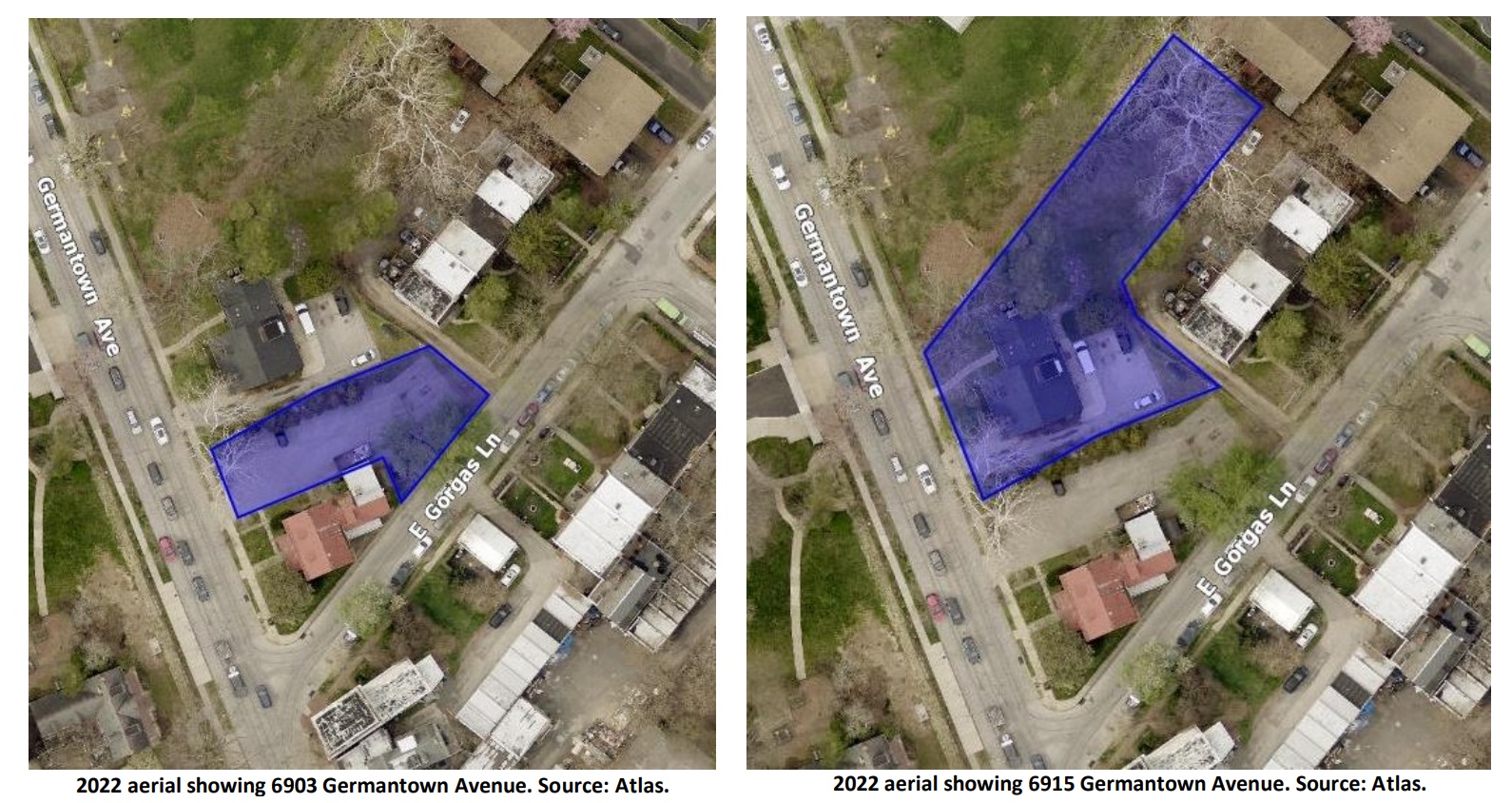
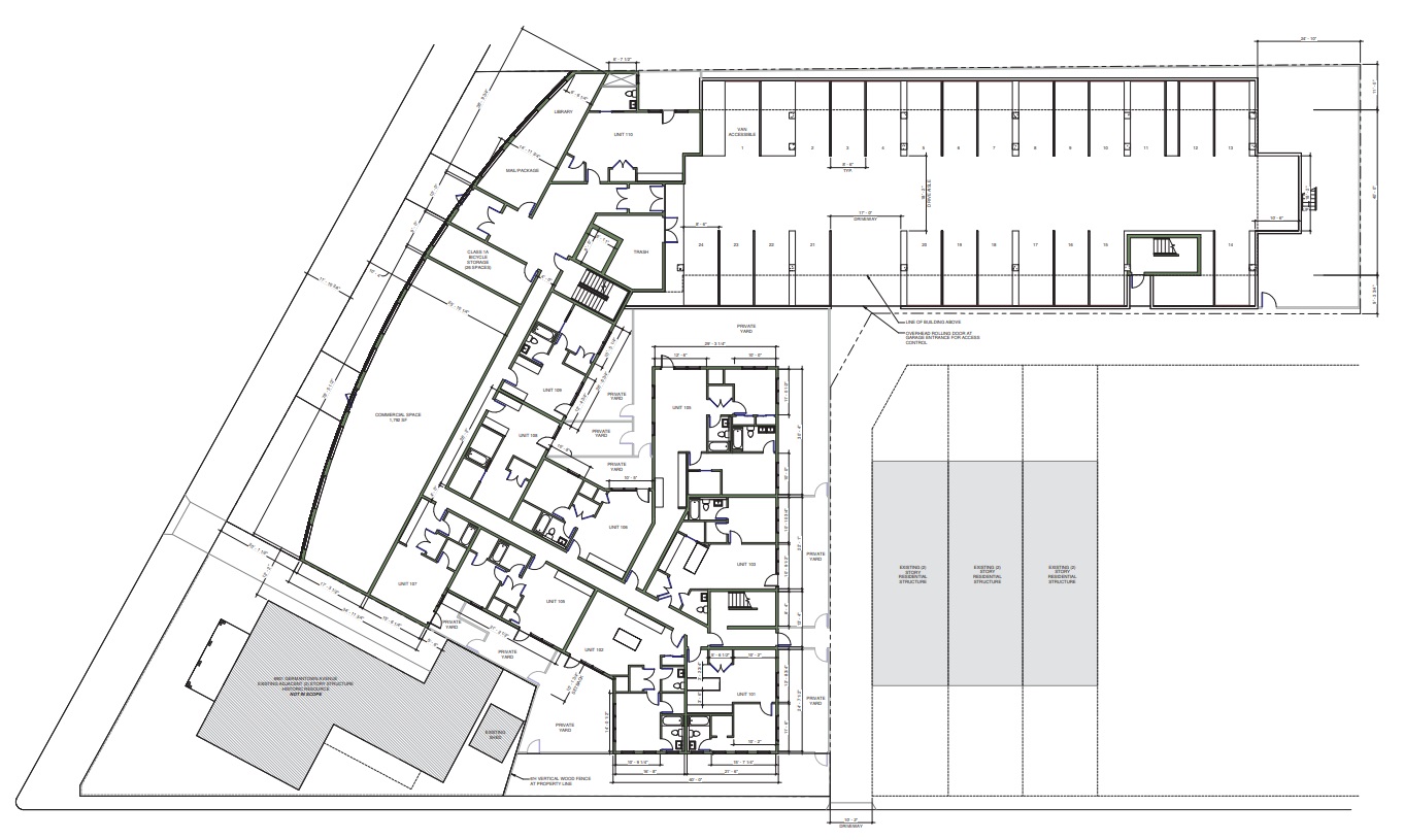
That’s right, we now have a four-story, 72-unit proposal from Canno Design. Documents show a building that packs in the units for this CMX-2 property, which received zoning permits for the lot consolidation just a few weeks back. 24 ground-floor parking spaces are planned for the back of the building, with the Germantown Ave. facade featuring both residential units and a commercial space. The most notable feature of the design is without question its bowed front facade, bulging out towards the sidewalk from its position slightly further back, allowing for views of the historic structure next door. Green brick is used on the most prominent facades, with dark gray paneling on the other exterior walls. A symmetrical pattern of windows punctuates the four floors, with landscaping softening the heavy geometry at the base.
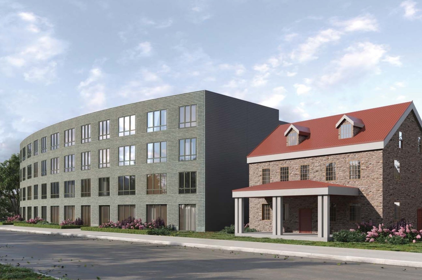
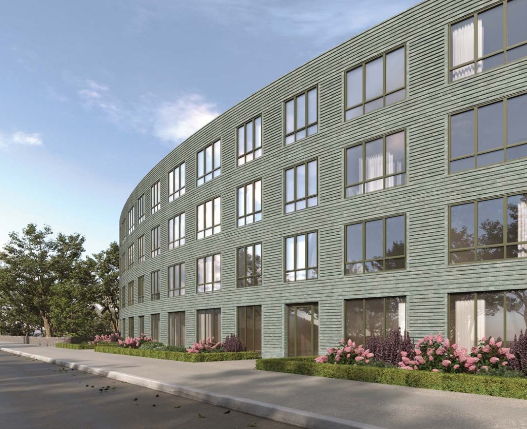
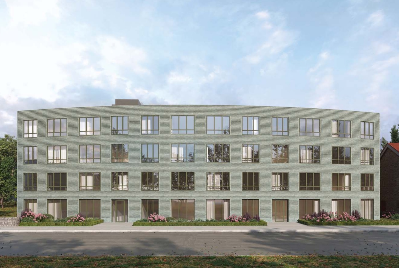
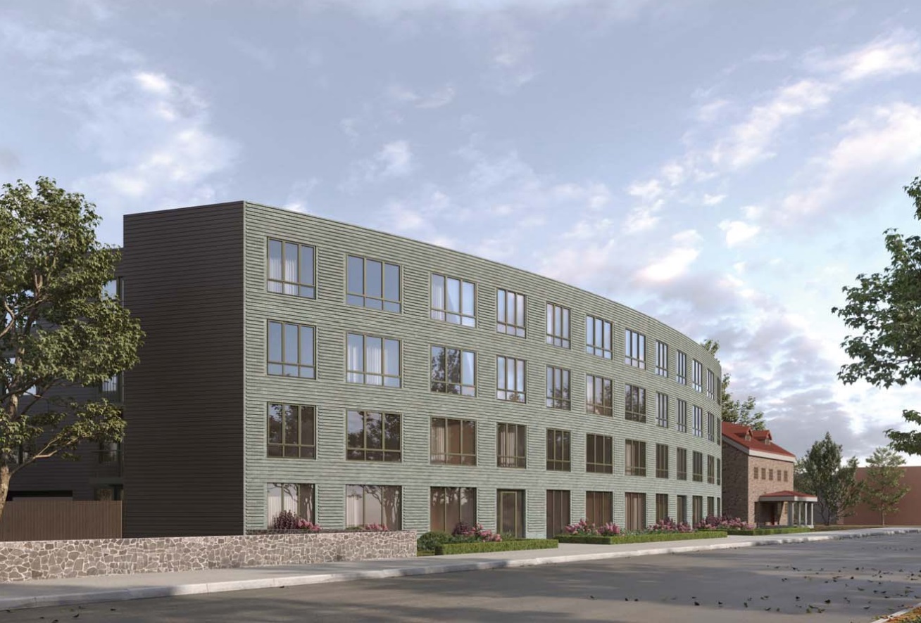
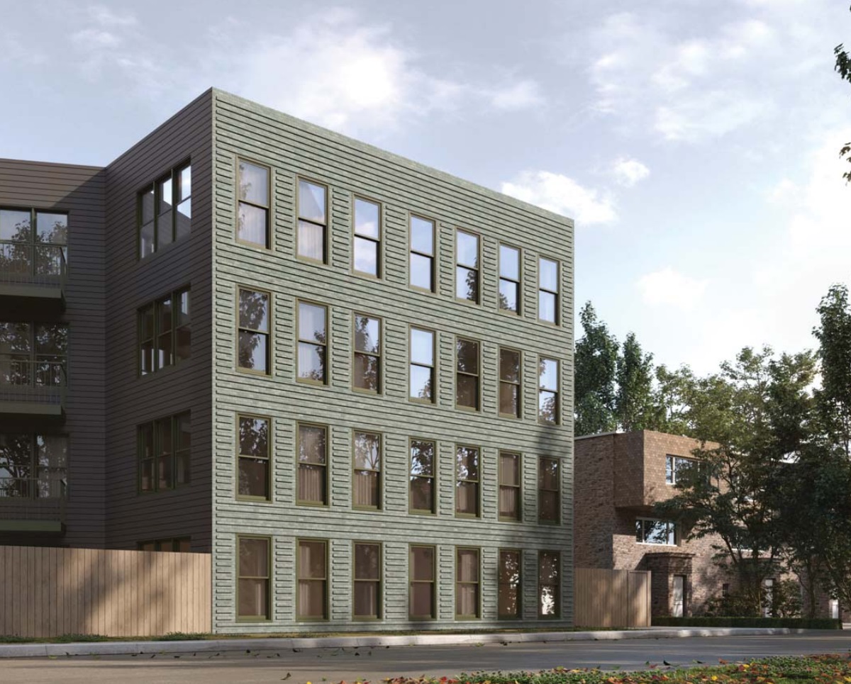
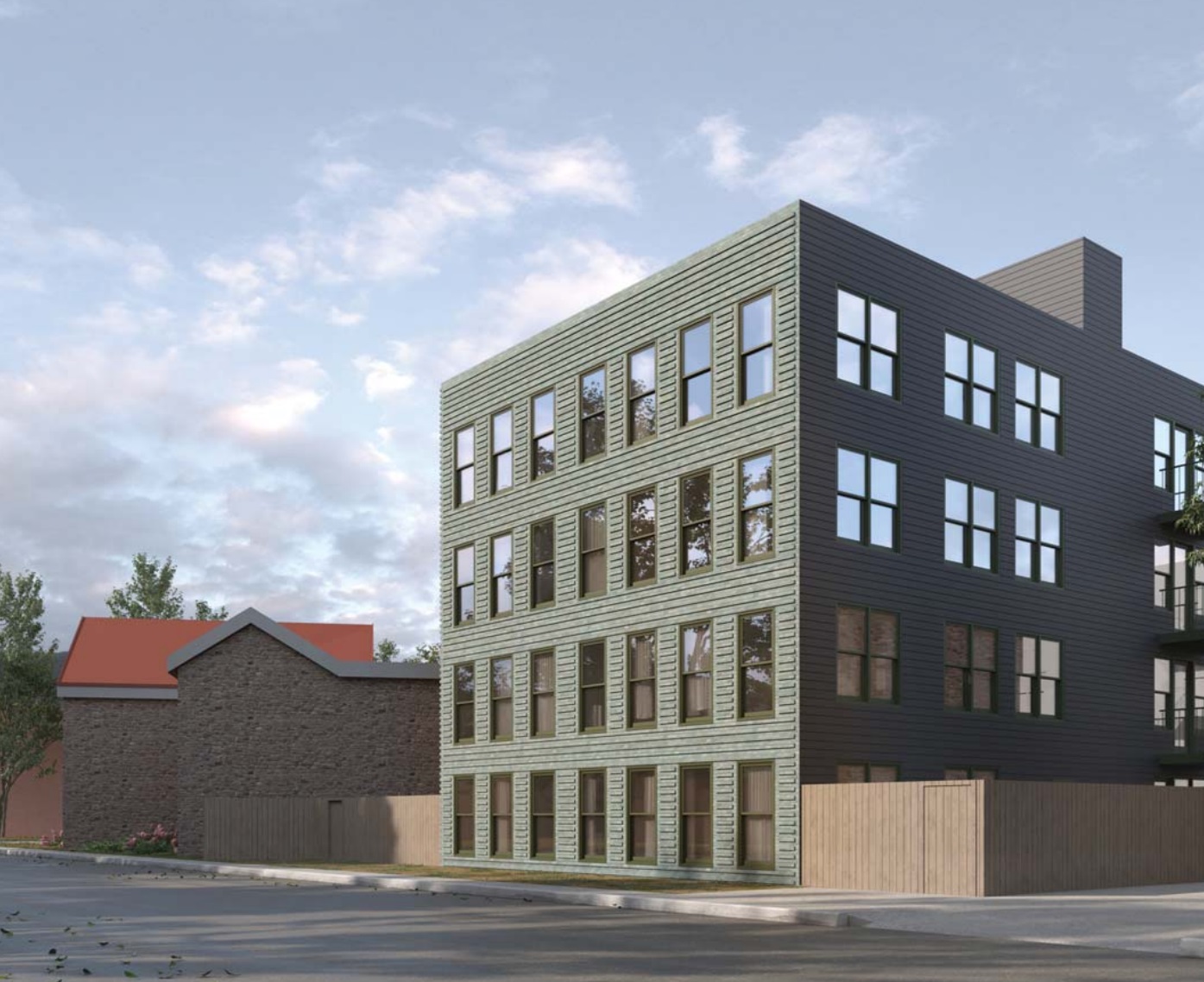
We are really enjoying the additional units here as well as the commercial space, but the design leaves us a little cold. In the abstract we actually really like the look of the proposed building, but at this location, next to the historic Gorgas House, we wish for something that relates a little more to its surroundings beyond the brick color choice. Perhaps our biggest issue is the blank wall of gray paneling directly facing the Gorgas House, which feels like a missed opportunity for the new building and the old building to have some kind of interplay.
With a trip to the Historical Commission set for next week, we’d imagine that the commissioners and the general public will have some opinions. In all likelihood, this design will go through at least one, maybe two, possibly ten more iterations before it moves forward. The good news is that from what we can tell, the proposal is by-right, so the density seems likely to remain intact. As the property is historic, the design elements are firmly in the purview of the Historical Commission and are very much subject to change since the project can’t proceed without sign-off from the Commission. As this is the case, we’ll check back with you in the coming months on how the final design measures up.

Leave a Reply