Sometimes when we’re covering projects, they dramatically change in design or approach, barely resembling the first version proposed. In other instances, not so much. While some changes are more obvious than others, those sorts of finer details can be the thing that takes a project from being forgettable to memorable, from awkward to graceful. Beyond appearances, functional improvements can often be missed, despite their more valuable contribution than a change in paneling color.
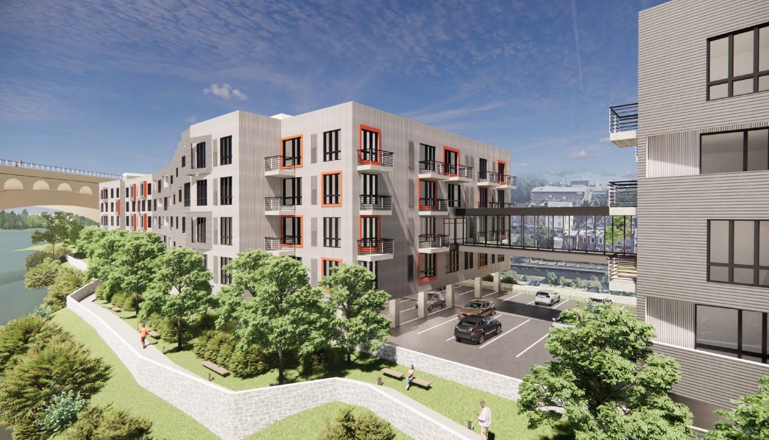
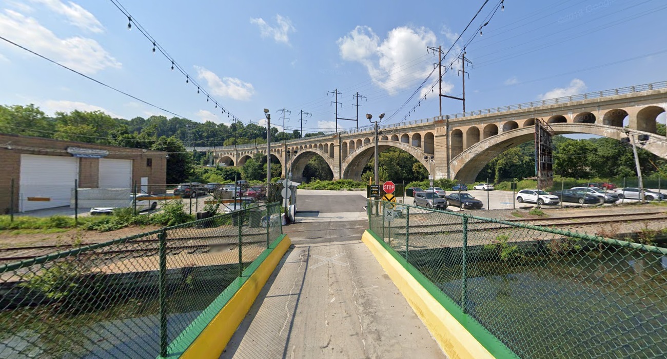
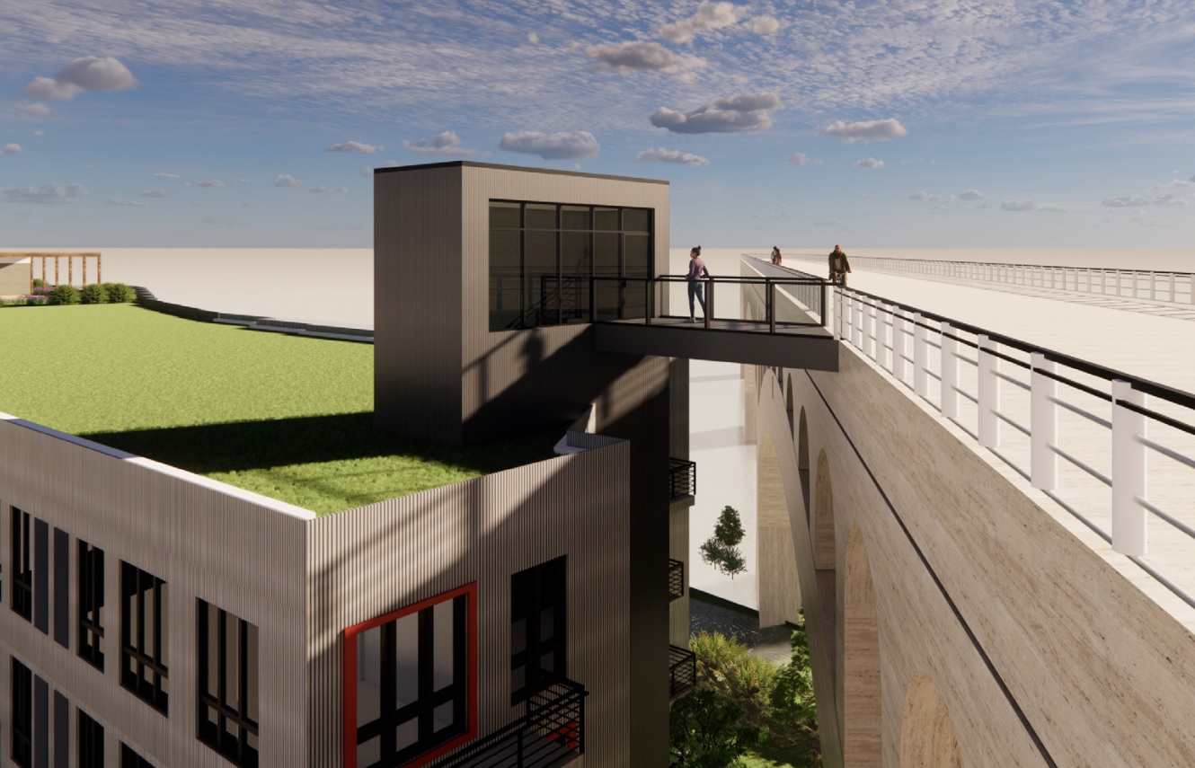
We make our way to the northwest of our fair city to visit two such projects, the first of which is at 4436R Main St., on a parking lot/auto detailing shop that sits on Venice Island at the base of Manayunk Bridge. This parcel includes frontage along the main stretch of Main Street, which is where we find the biggest change to this large three-building project that we covered back in October. ROCK Urban Development and JKRP Architects just made a return trip to the Civic Design Review (CDR) committee, where this 213-unit project remained mostly the same, save for the alteration of the entrance to the project, which formerly consisted of a side-entry for cars. The new design creates a grander gateway and separates the residential and commercial uses, which also allows for a more streamlined pedestrian connection from the island to mainland Manayunk. The rest of the design is unchanged from what we can tell, save for the clever-but-unlikely addition of a connection to the bridge overhead. The CDR process concluded for this, so we expect to see this project move forward sometime soon.
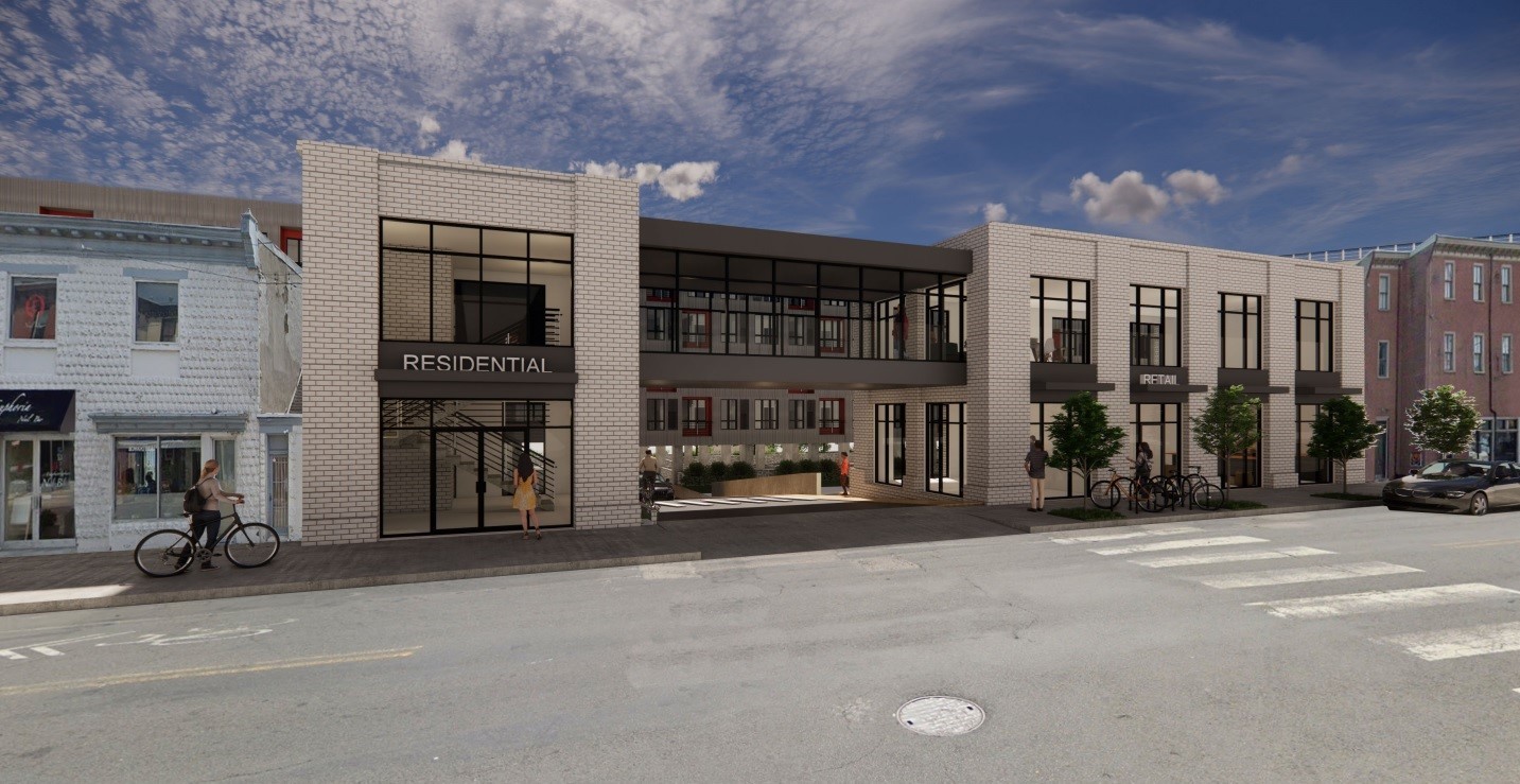
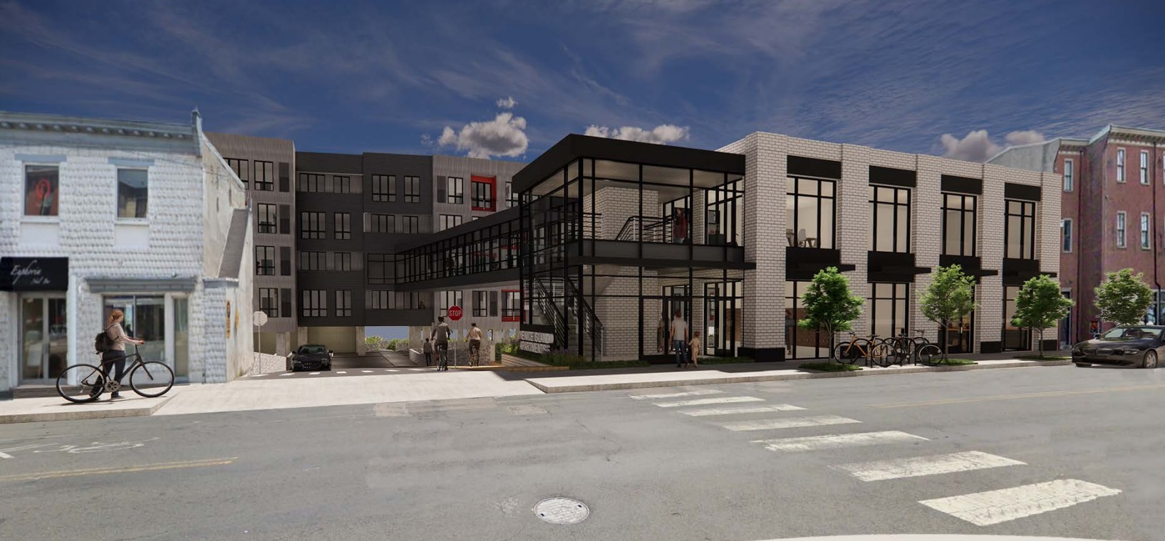
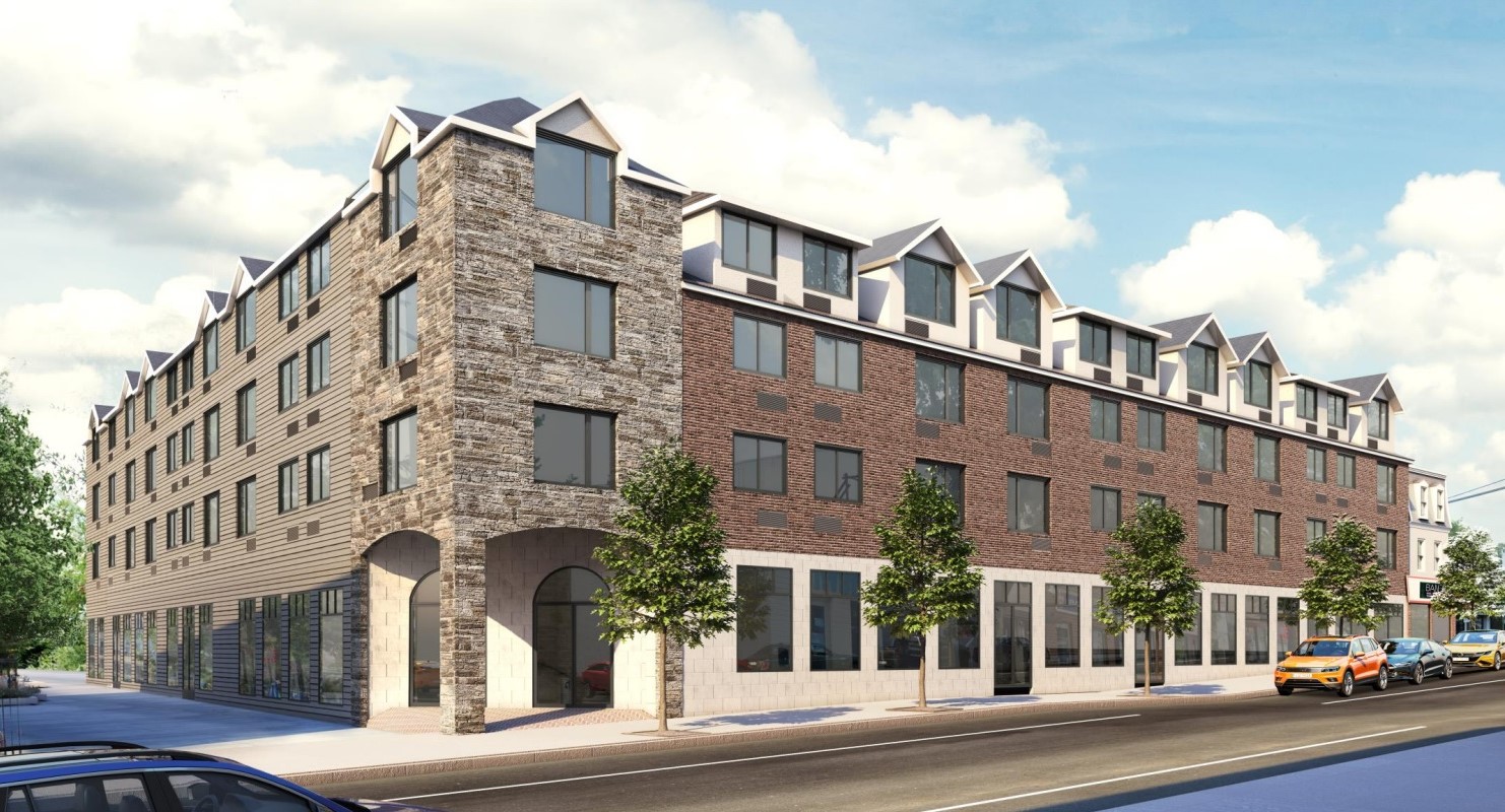
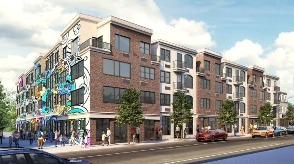
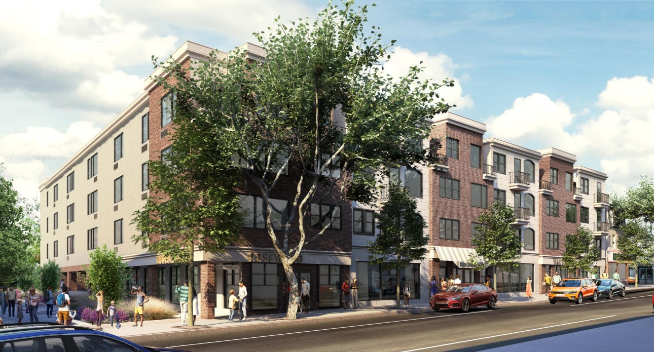
Jumping to the Roxborough neighborhood, another multi-family project has made its way through round two of the CDR process. 6174 Ridge Ave. has gone through a couple of rounds of updates, with an original proposal for 84 units now settling on an 82-unit approach. The formerly pointy roofline has been updated to a more rectangular design that harkens to the rowhome-like commercial spaces that currently make up the site. The most recent version adds back the awnings to reflect the existing architecture while setting back the ground-level residential space further back from the pocket park immediately adjacent to the project, which often hosts public events. Over 17K+ sqft of commercial space jumps from the originally proposed 7K sqft, somewhat making up for the demolition and displacement of the current buildings and businesses. The design from Ingram/Sageser also eliminates all car parking from the design on this CMX-2 zoned lot, down substantially from the original 25 car spaces originally proposed.
While perhaps not world-changing, we think these new updates make for two improved projects. The multiple rounds of review in these cases have led to more thoughtful projects that not only respond to CDR concerns, but also look better, in our humble opinion. Increased bureaucracy and mandated feedback sessions don’t always work out, but perhaps the upcoming big game has us in better spirits as we tip our hats to all parties involved to get to a better built environment for all.
And – most importantly of all – GO BIRDS!!!

