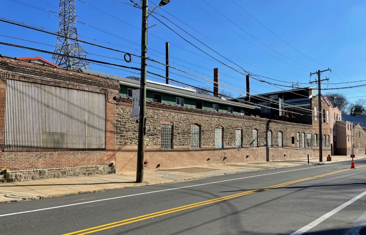
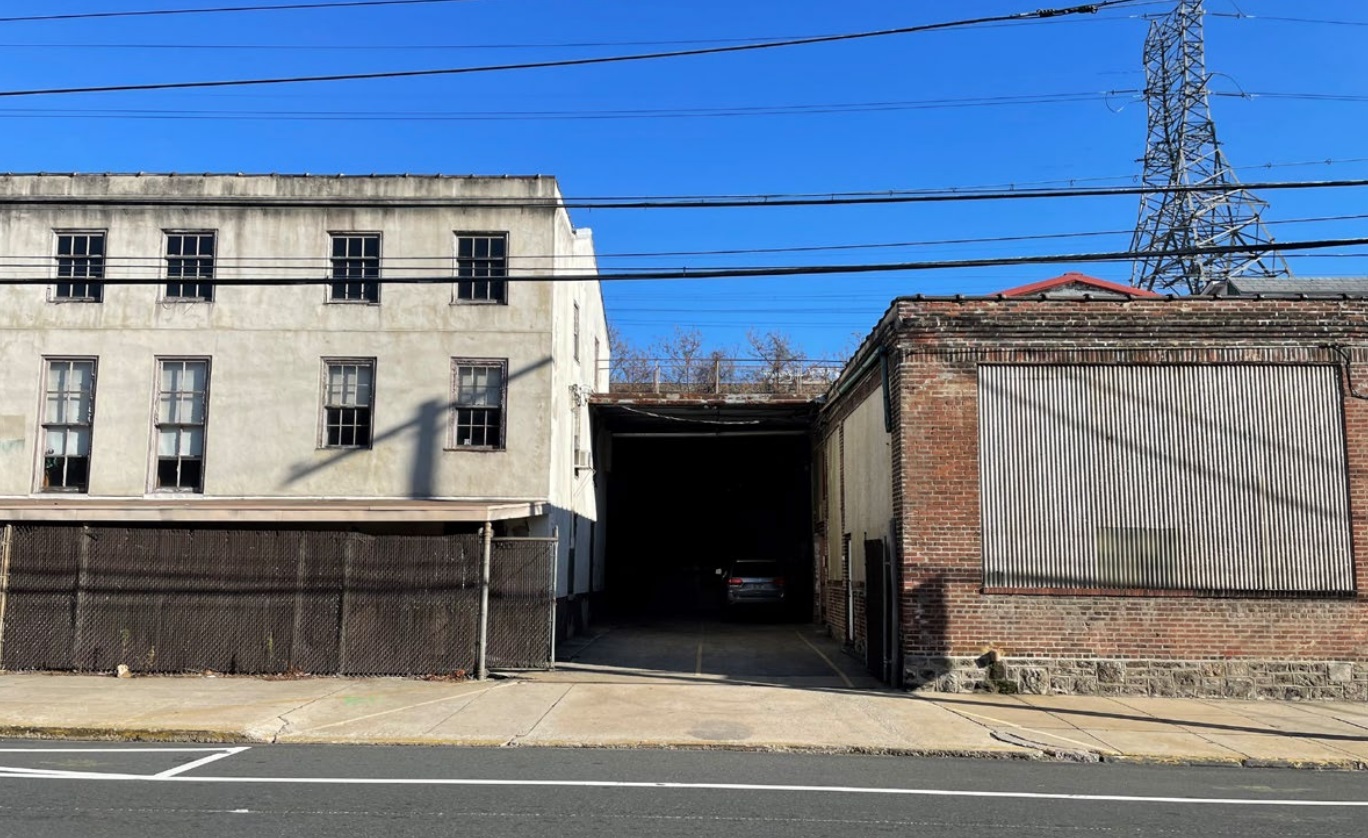
Littlewood & Co., Dyers and Bleachers had been operating at the complex of buildings at 4045-61 Main St. since the 1860s. Sitting just past Manayunk’s main entertainment and commercial strip, you may actually be familiar with this hodgepodge of structures if you’ve strolled along this stretch in the past. While the buildings are not individually designated as historic, the property is protected thanks to the Main St Manayunk Historic District in which it stands. What you may not know is that this spot had been actively used as a dye plant until just recently, when Mother Nature decided to throw a curveball to the long-time owners.
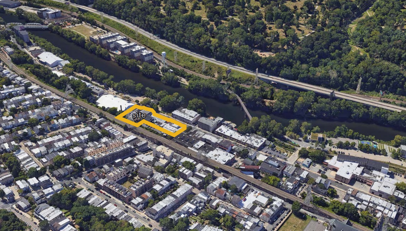
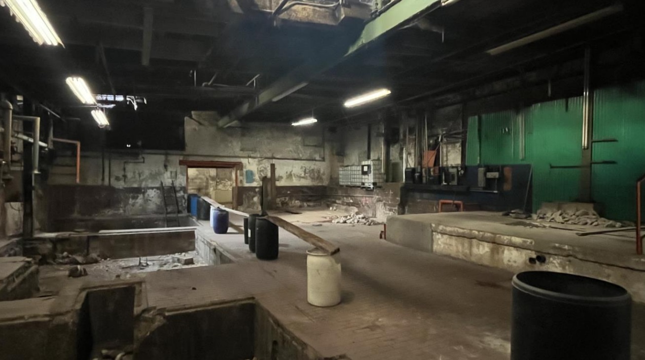
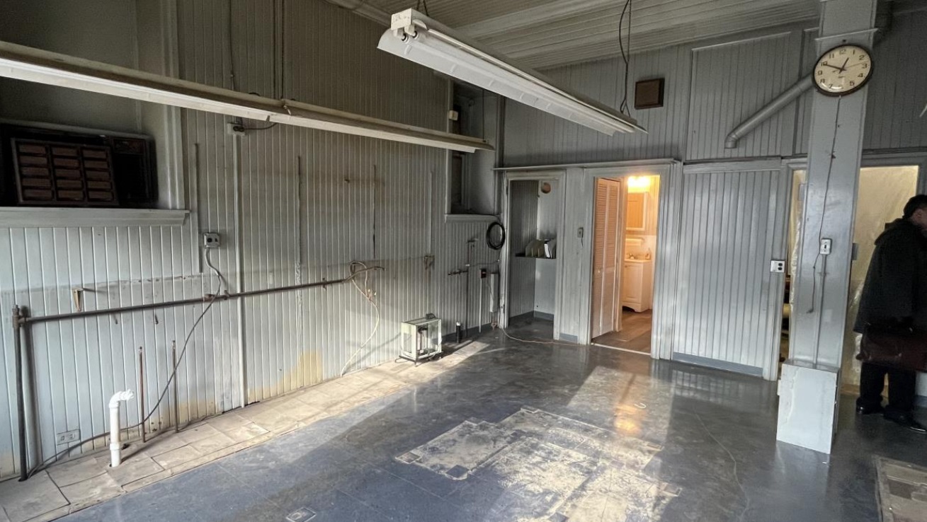
In September 2021, Hurricane Ida caused some of the largest recorded floods ever along the Schuylkill River, which sits just steps away from these buildings. As we learned in this incredible recounting of the situation, despite past steel installation to handle flooding issues, the barriers for the facility were breached, causing catastrophic damage to both the building and to the materials inside:
“When we approached, water and mud were draining out of Littlewood’s facilities. WOW… All the doors and windows were open to admit both air and light. Power was not yet restored. The water had clearly reached a few feet high on the second floor walls.”
Just a month later, Littlewood decided to close their doors permanently after over 150 years.
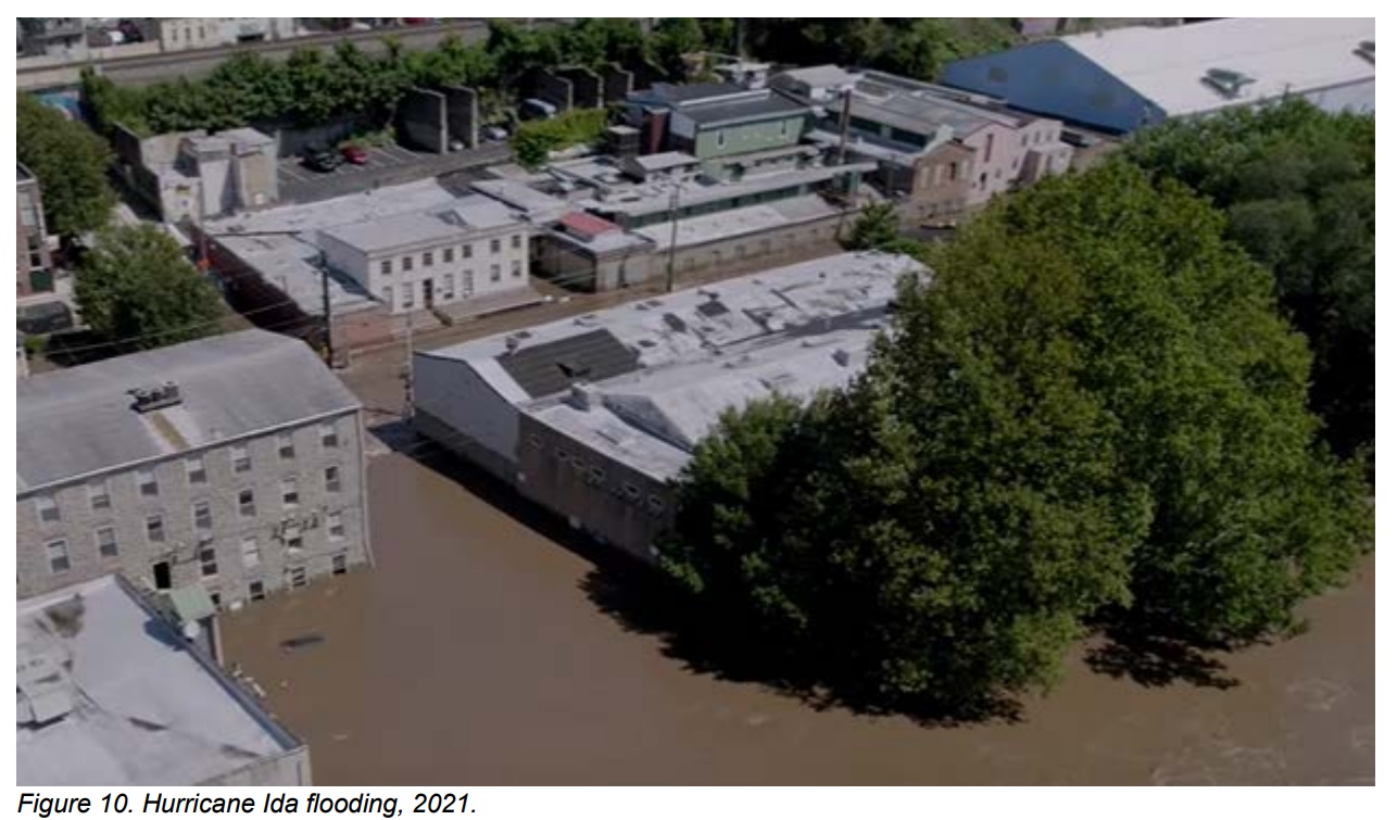
While we wish we could make like Cher and turn back time to bring this plant back to life, it seems as if the owners are looking to move on from the past, thanks to a submission to the Historical Commission. It can be a bit difficult to tell from street level, but this mishmash of buildings contains a slew of structures with varying roof heights, connecting at odd angles as the complex has grown over the years. As such, the owners are looking for something that we have seen just recently in another part of town: permission to demolish the site due to financial hardship. In this instance, however, some of the existing stone walls along Main St. will be retained, as you can see below.
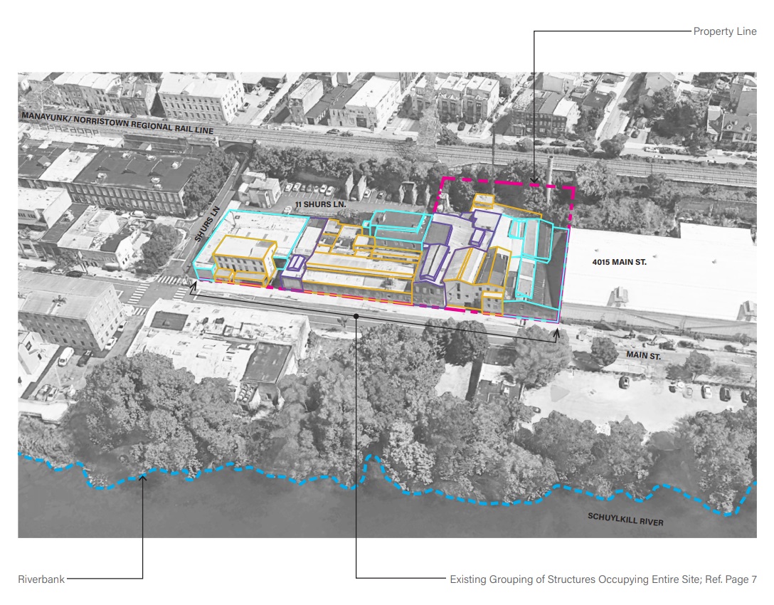
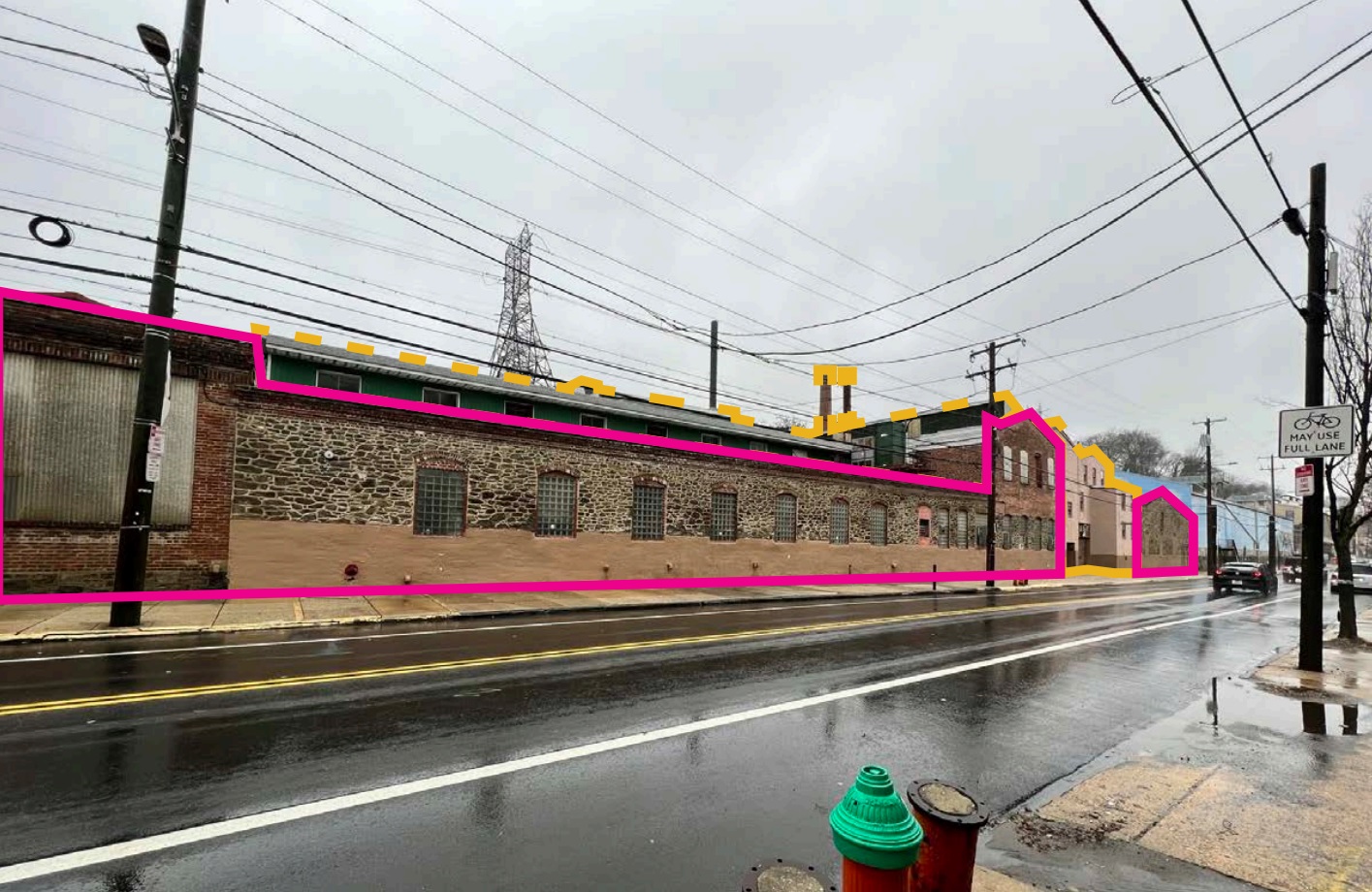
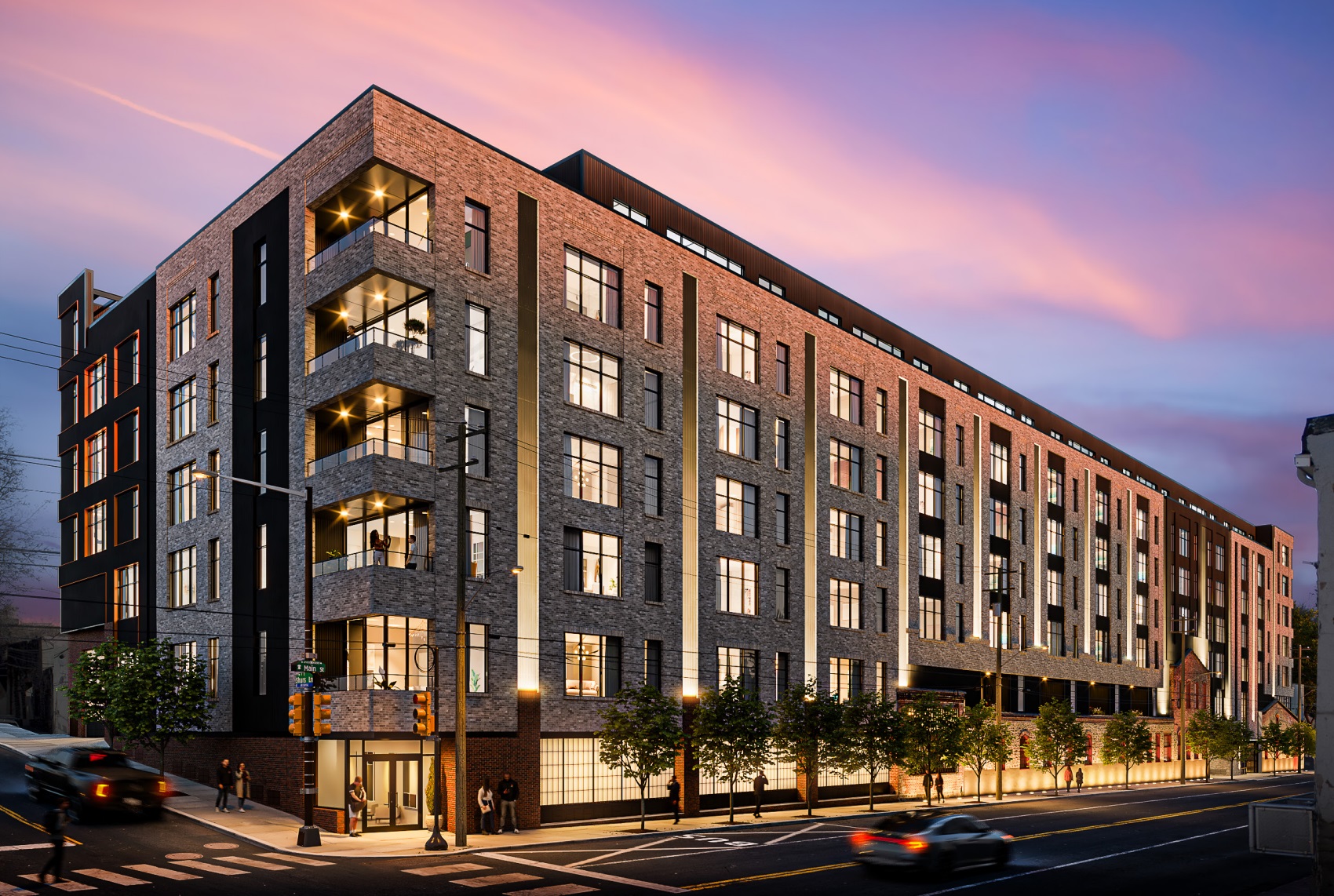
So, what’s proposed to rise above these historic walls? A seven-story, 167-unit apartment building developed by Urban Conversions and designed by CBP Architects. Let’s get a tease of a rendering before diving into the details.
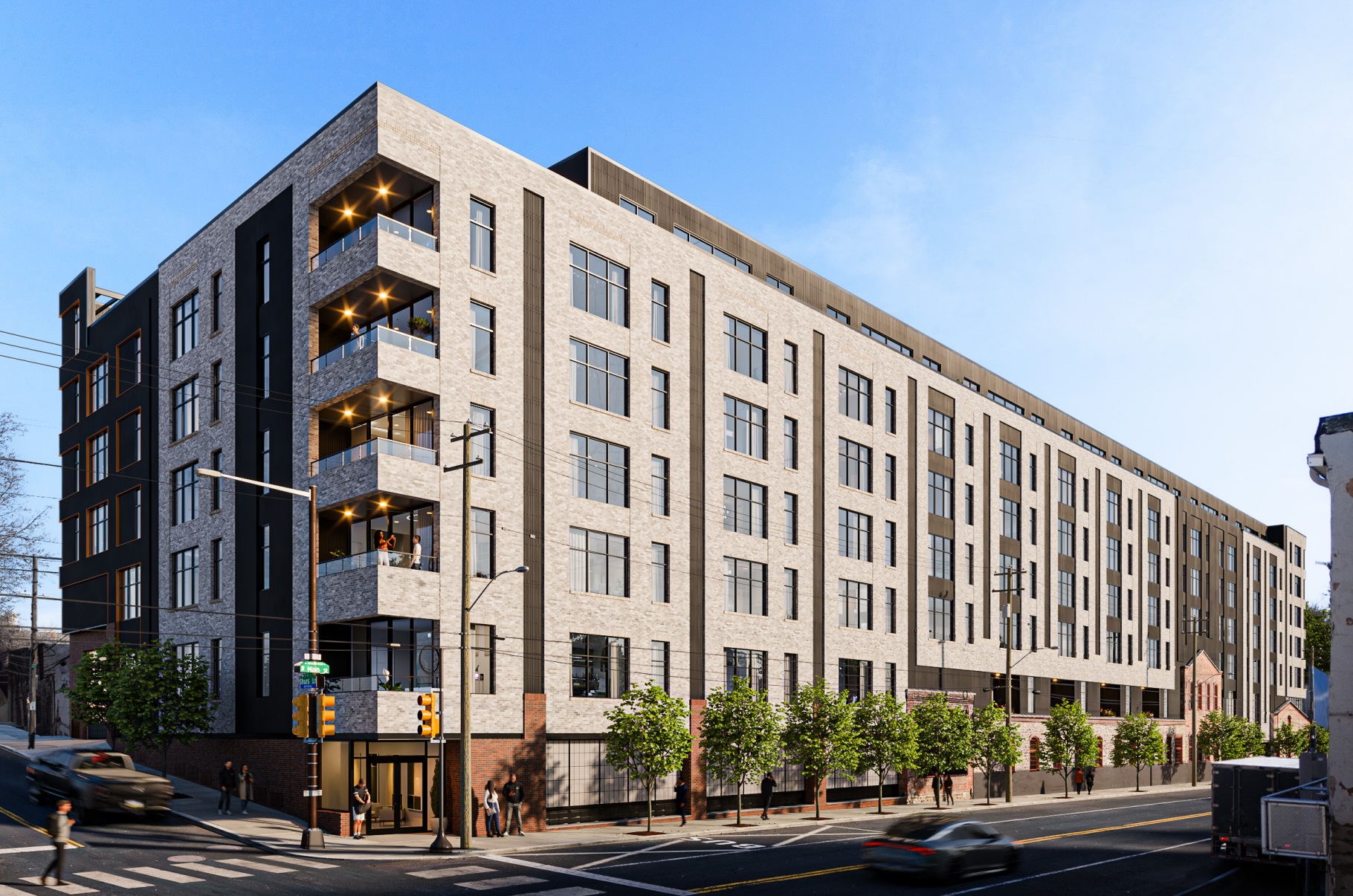
First, how we got to this scenario: we’ll save you from reading the entire 131-page document, but a number of experts from architectural, engineering, and commercial real estate firms all provided reports stating that redevelopment either as a commercial space or a repurposed residential/retail space was not financially feasible. As such, the plans call to clear away the entire property, save for those remaining brick and stone walls, to make way for those 167 units, along with 160 parking spaces and a loading dock. Given the location in the flood plain, the ground floor is slated to be parking only, with studio, 1- and 2-bedroom units on the upper floors.
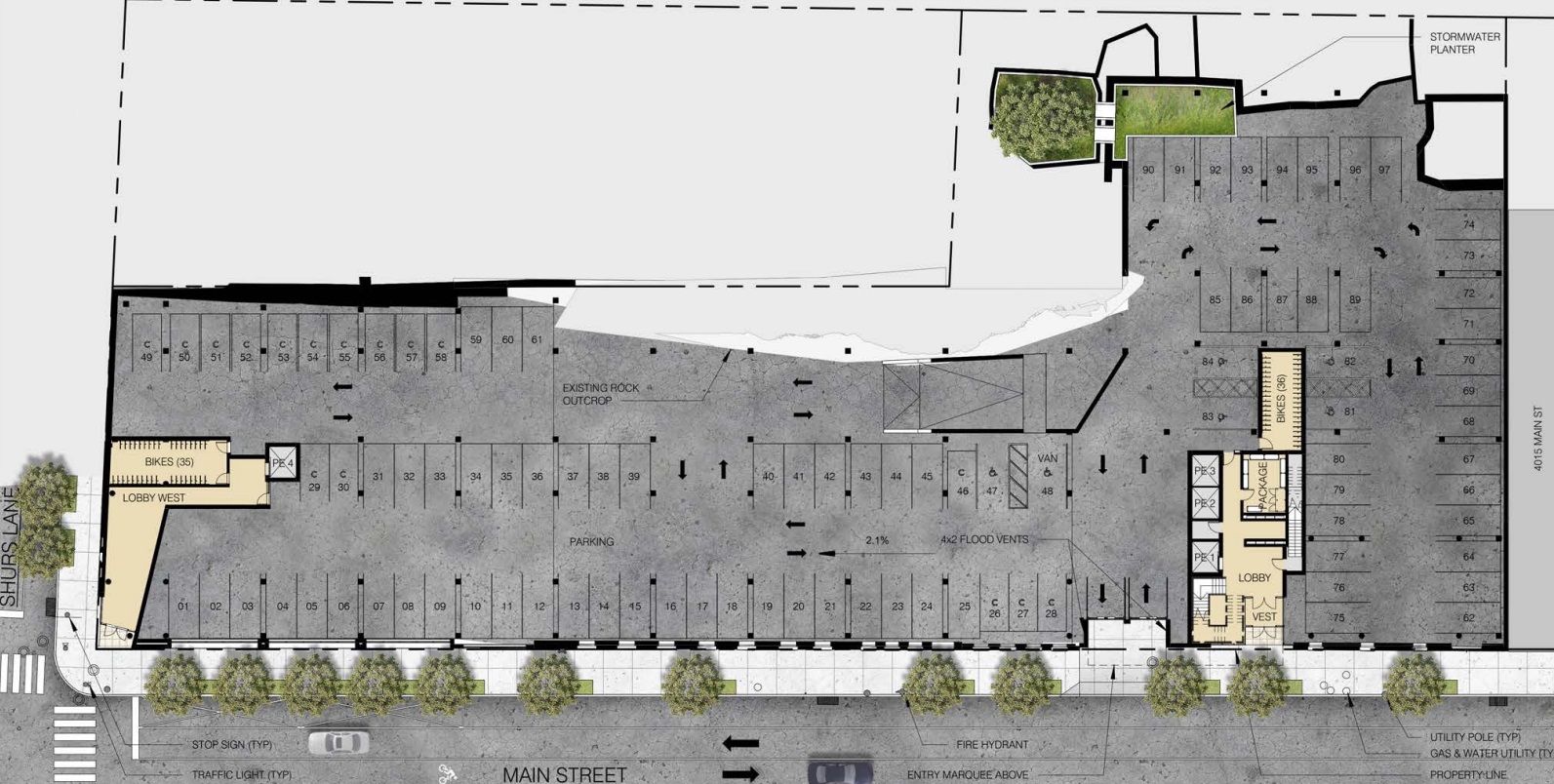
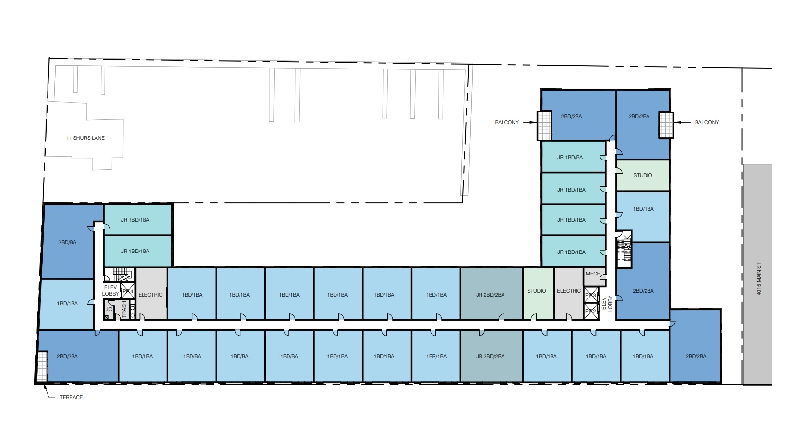
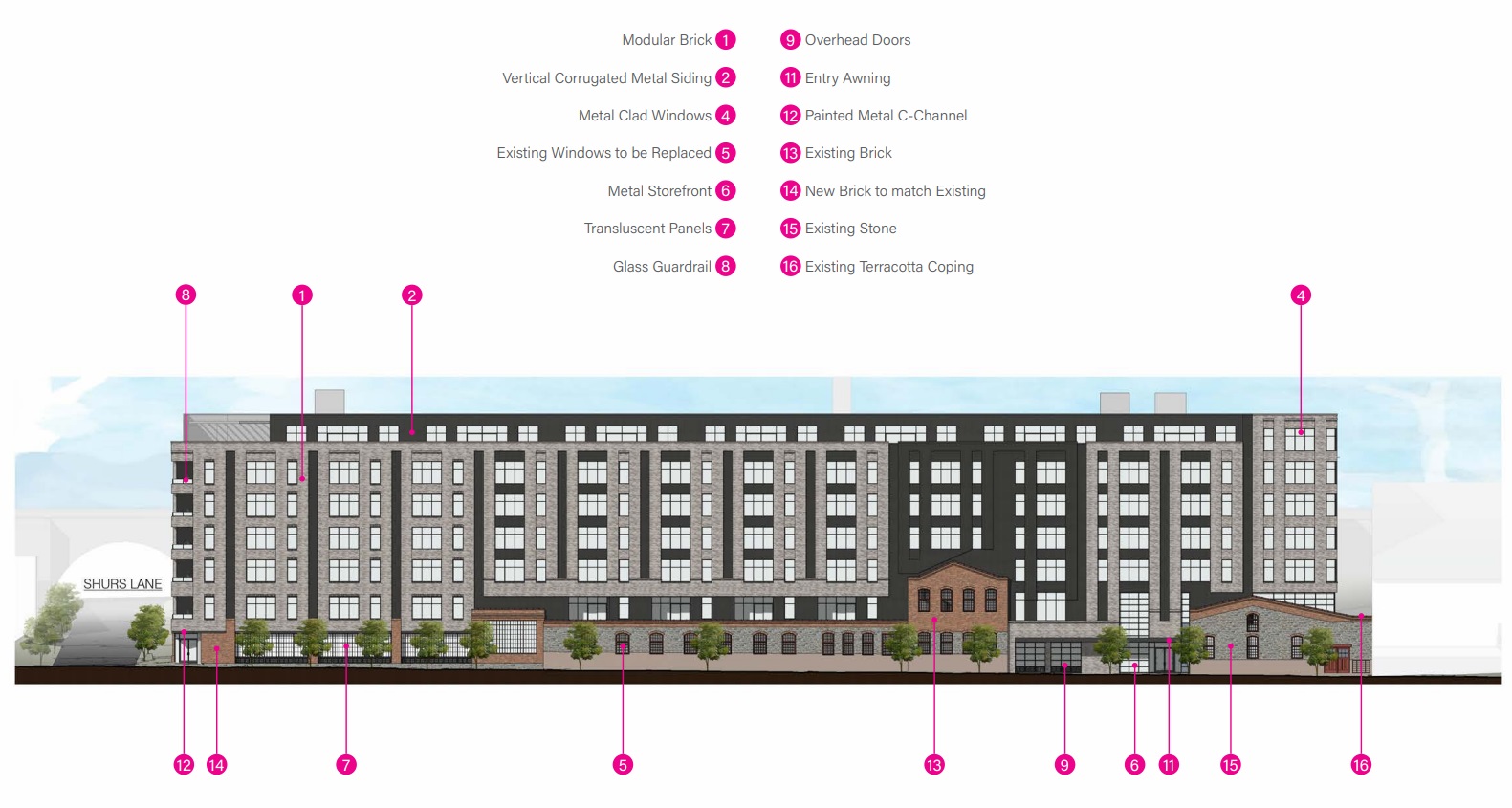
The design itself is pretty darn nice given the unfortunate circumstances. This is a long, rectangular property, but the design does a good job of breaking up the massing while not over-complicating matters. Tan-gray brick will rise to the sixth floor, where a step-back will lessen the impact of the building on the near neighbors. Large windows along the front mimic the feel of older industrial buildings, minus the typical pane configuration. The back of the building (which will face the adjacent train tracks) consists mostly of paneling, with an elevated outdoor space providing some landscaping for the residents to enjoy. Additionally, about a dozen new street trees are to be added, helping green up this formerly dusty stretch.
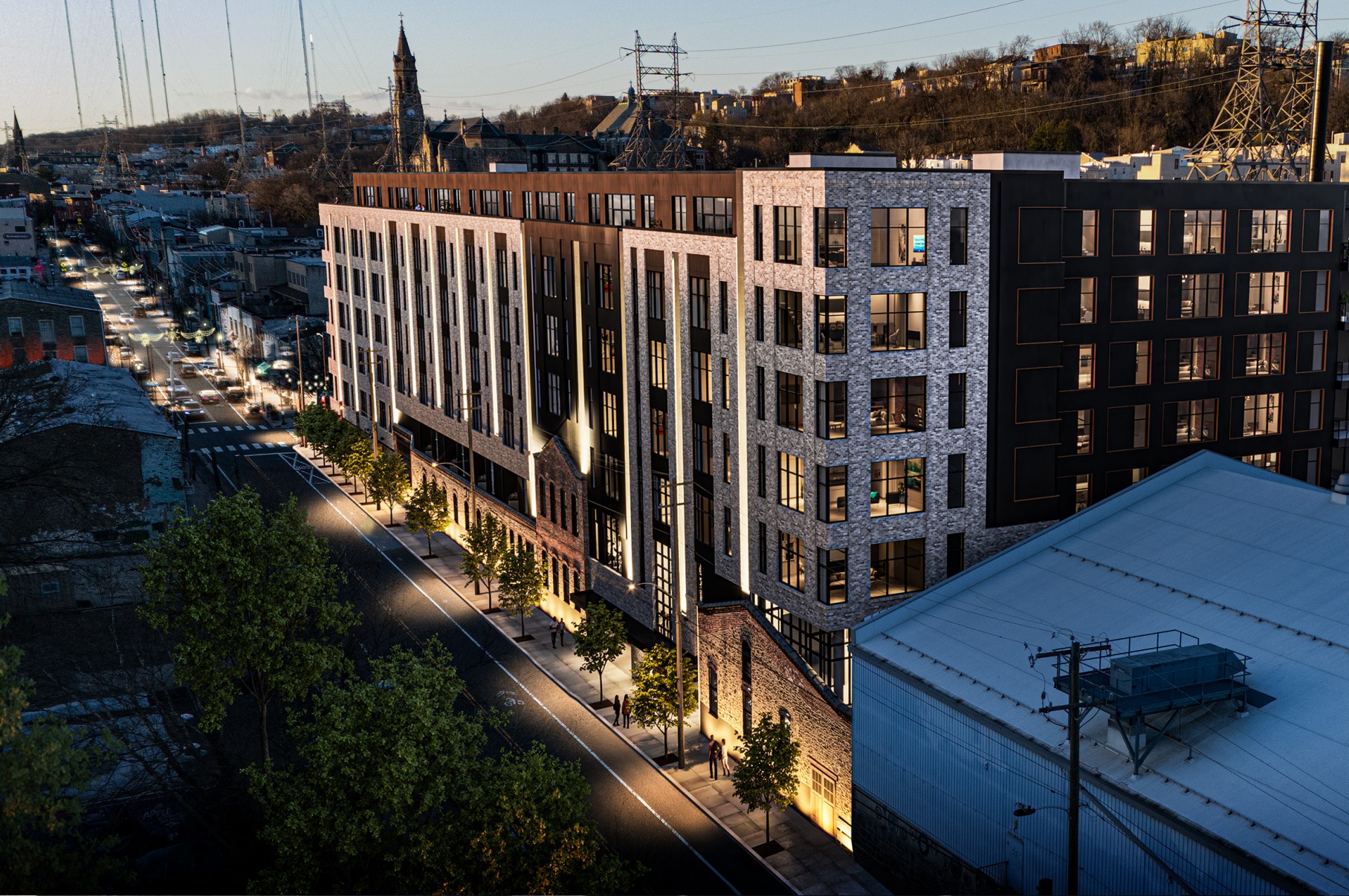
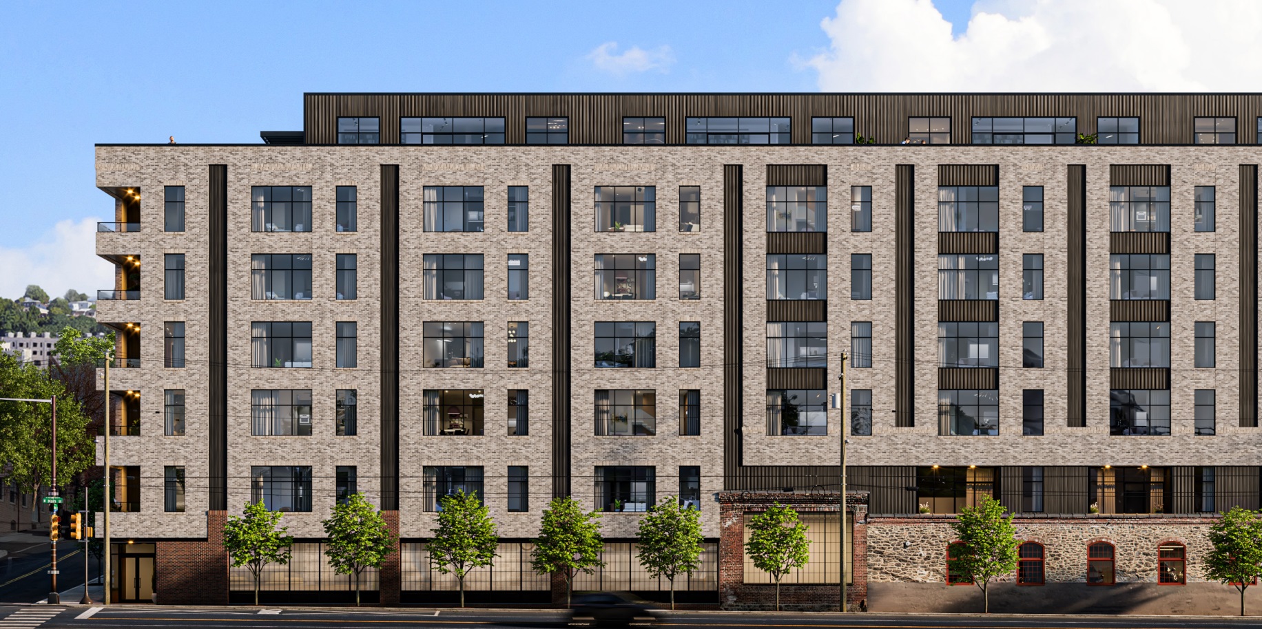
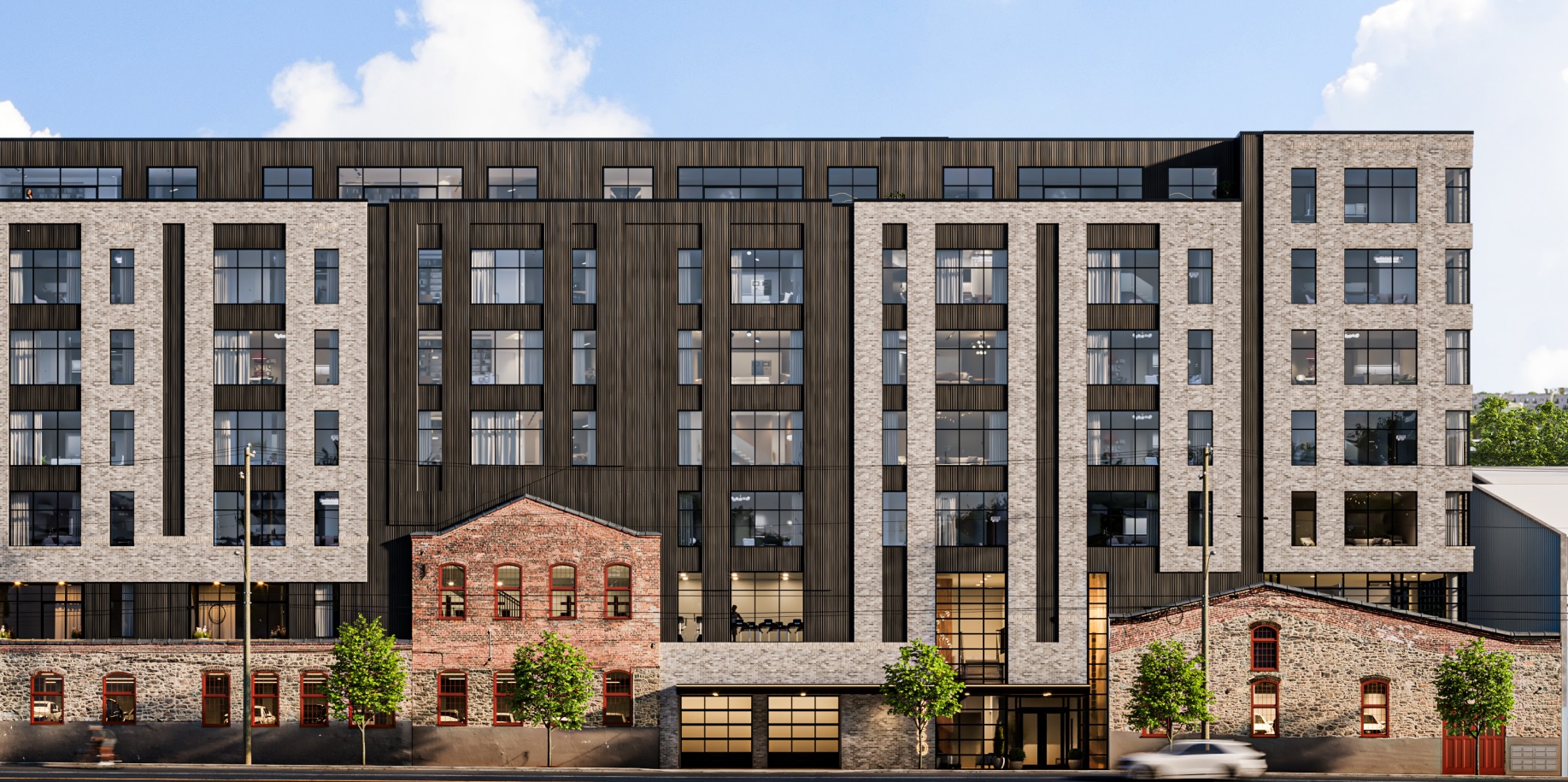
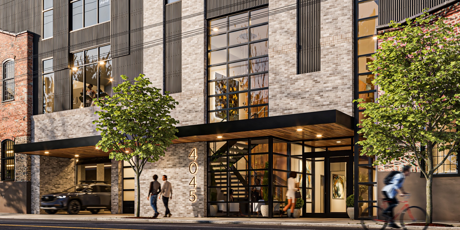
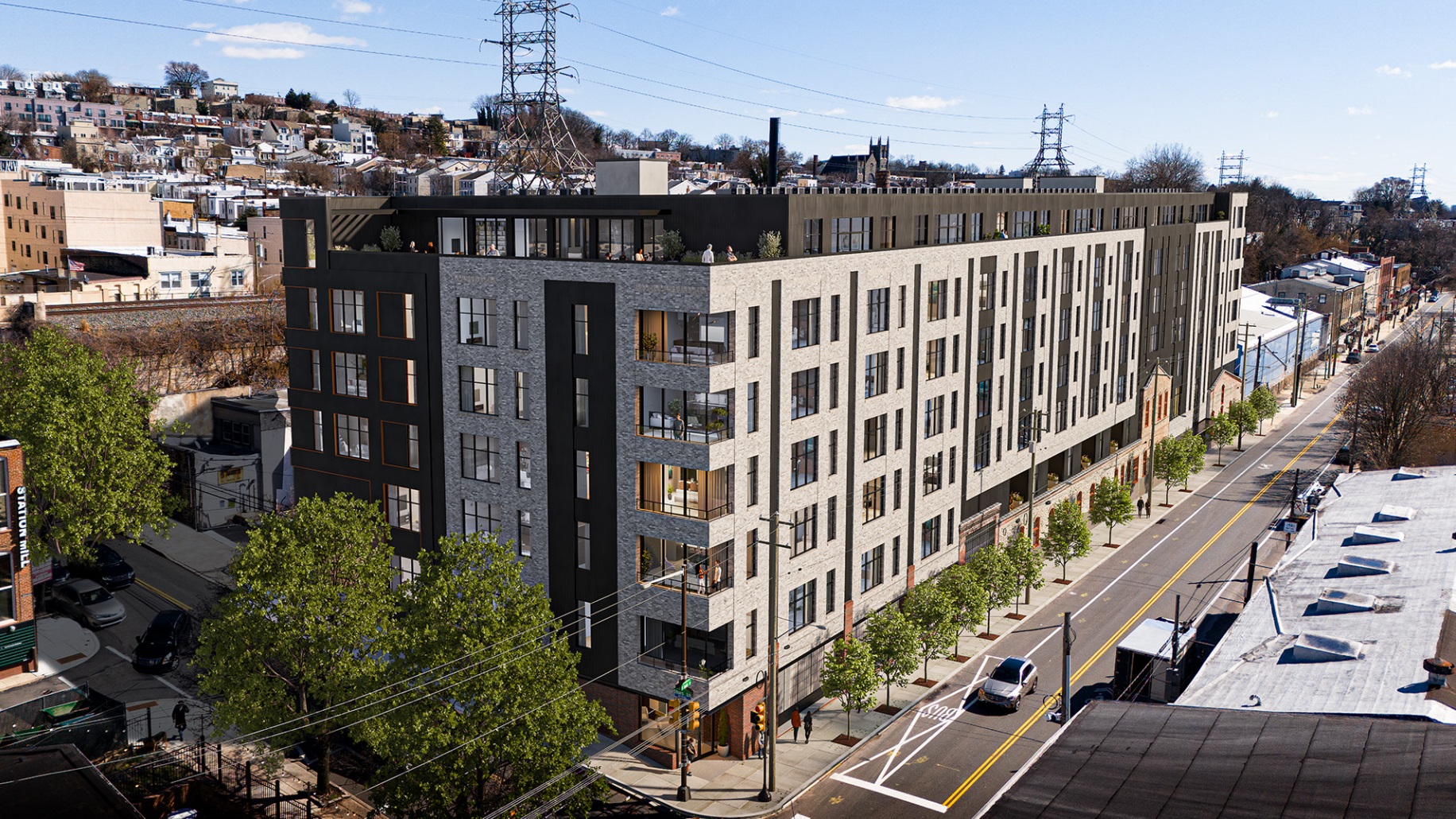
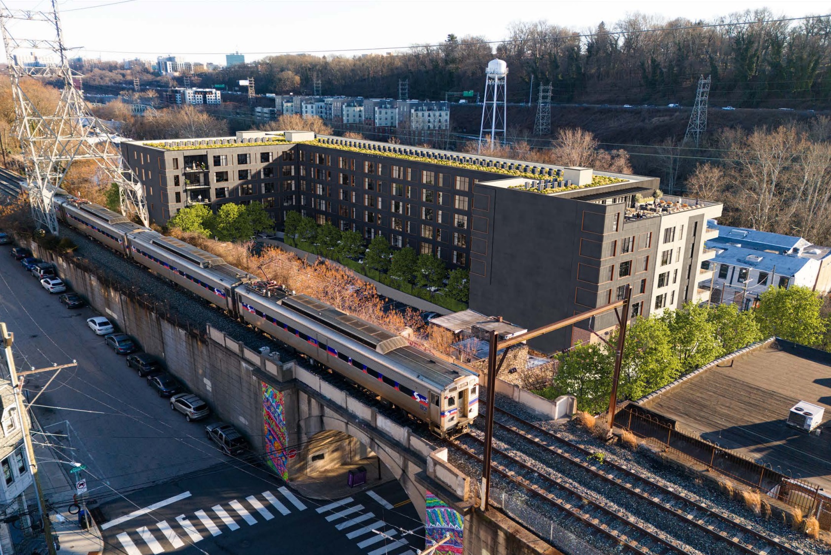
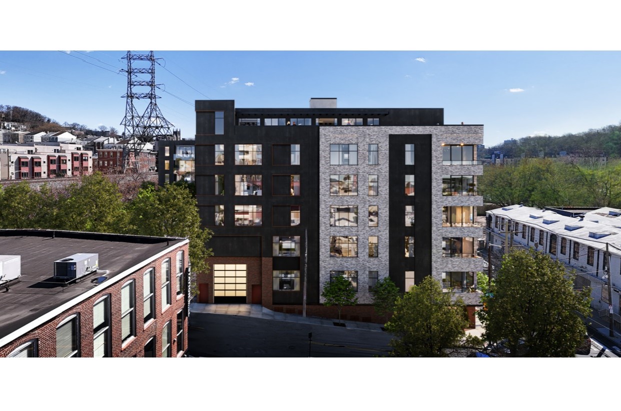
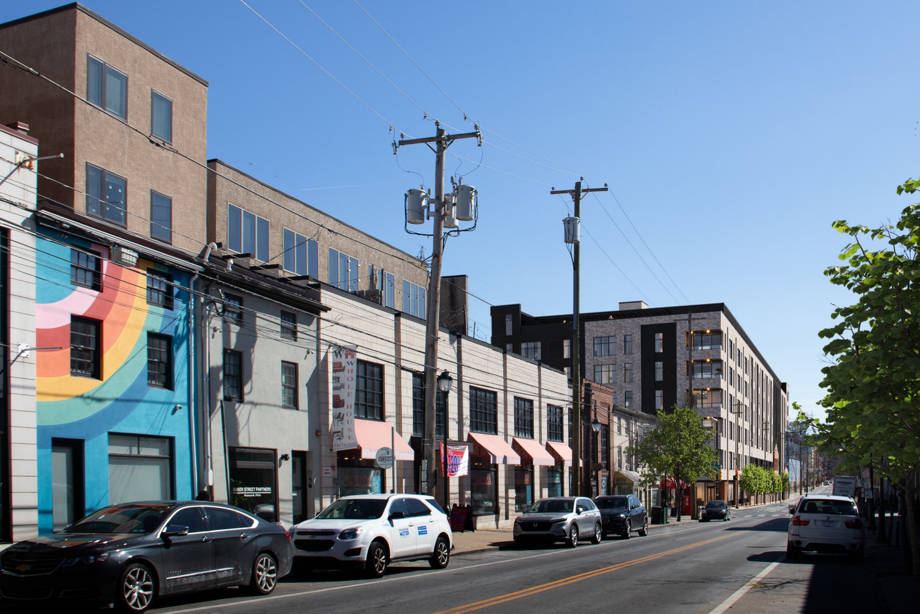
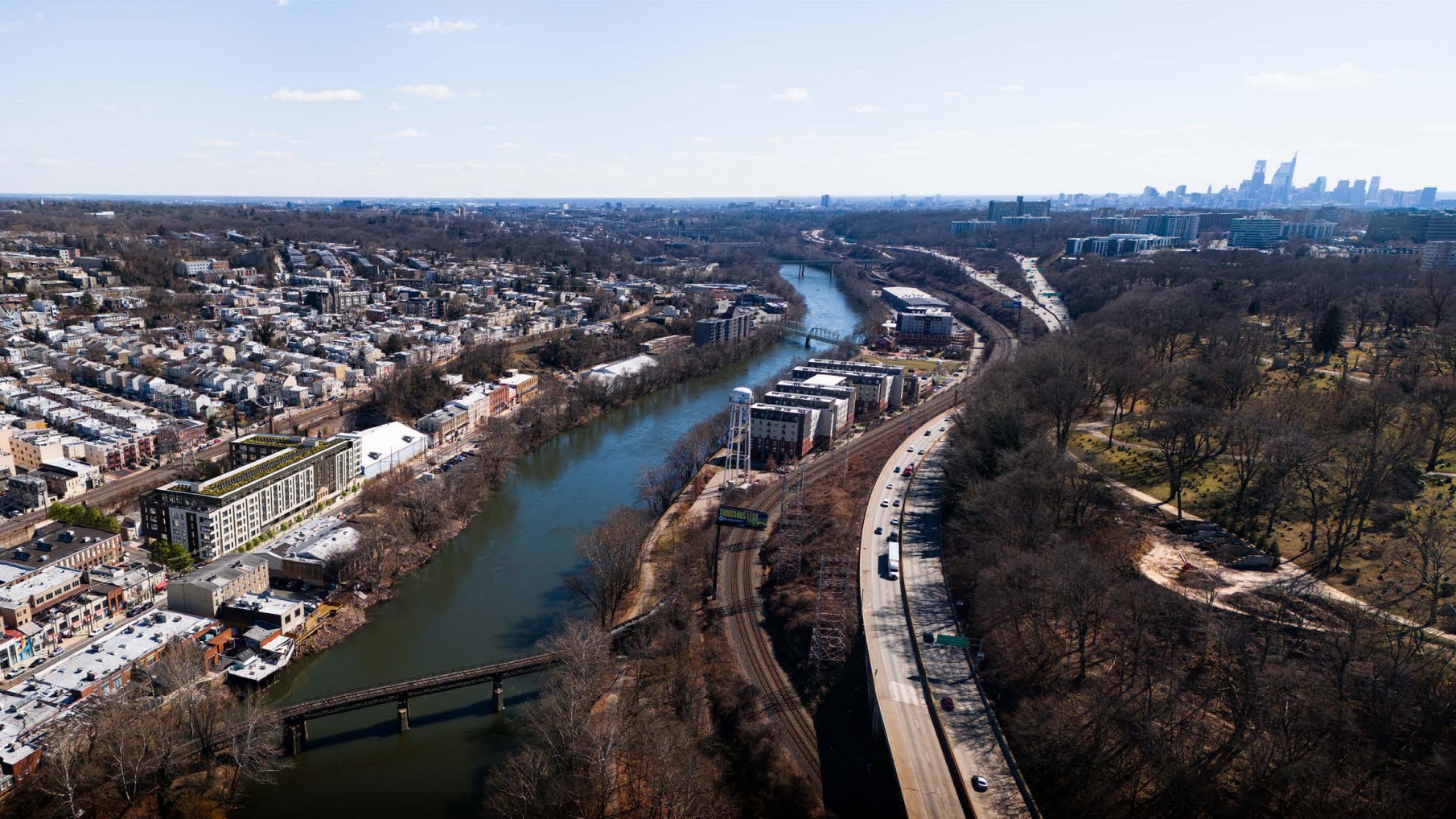
While we aren’t in love with the curb cuts along both Main St. (residential parking) and Shurs Ln. (loading) or the lack of commercial space, we think this design is actually quite successful. The brick works well with the portion of the building to remain, with the subtle black accents not trying to do too much. The uplighting and vertical elements also add interest for what could easily be a bland box. Punchouts on the corners also help soften the edges, creating a more welcoming approach to the intersection.
Oh, and a huge step for this becoming a reality happened just this morning: the financial hardship hearing just wrapped up, with the presentation ending with the forlorn realization that trying to salvage these damaged old buildings would be much too expensive to be practical. As such, the voting was unanimous in approving the demolition of all but the front walls, opening the path for this project to move on. This decision will be revisited by the full Historical Commission later in May, so we might still see a change of heart. There will also be future meetings with the Civic Design Review, as a project of this size will once again get feedback (non-binding in the coming instance) from the City.
While we understand the huge financial impact that was suddenly thrust upon the owners, we still feel a bit conflicted. The Historical Commission is becoming an even more important entity as the city continues to build and expand, oftentimes reutilizing the lovely built environment that dots every neighborhood of Philadelphia. And keeping those building upright and functional requires a lot of money. Even with tax credits available to lessen the blow, governments from Federal to Philly will need to reassess how they value their history if they hope to see these physical reminders of the past remain.
UPDATE (4/3/2024): We initially reported that this project received approval for demolition; this only received recommendation for approval by the Financial Hardship Committee and will be revisited by the full Commission in May. The post above has been corrected with this updated information.

