To say that no two real estate development projects are alike would be quite the understatement. Some are smooth sailing, some are jam-packed with unforeseen issues. For some, the completed structure looks exactly like the very first design that’s proposed. For others, like 6174 Ridge Ave. in Roxborough, the design sees more twists and turns than an M. Night Shyamalan movie. A quick rewind: several low-rise commercial buildings along the commercial strip have had plans for demo, with a mixed-use apartment building rising on this site next to the Roxborough Pocket Park.
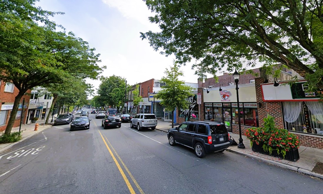
But like we said, this design has seen numerous iterations, the most recent being an 82-unit proposal (down from 84 units originally), with 17K sqft of commercial space and zero parking (also down from the originally proposed 25 spaces). But thanks to a presentation posted by the Central Roxborough Civic Association, we know that a new, larger plan is now in the works. Let’s step our way through the design history before we dive into the new details.
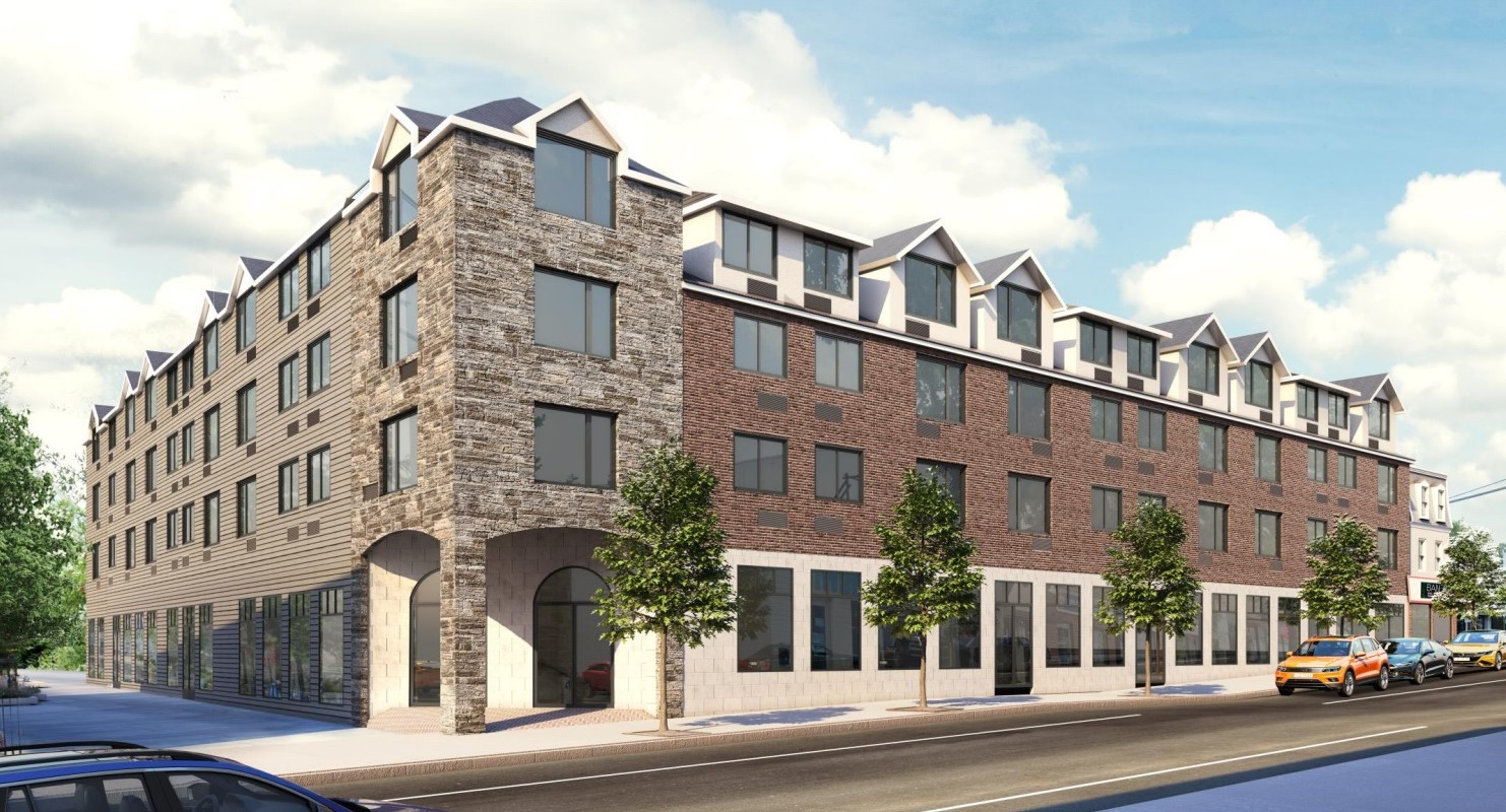
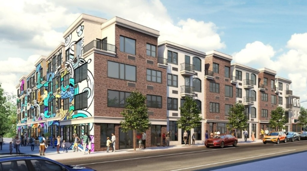
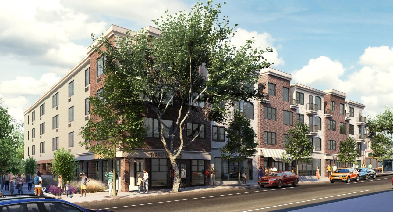
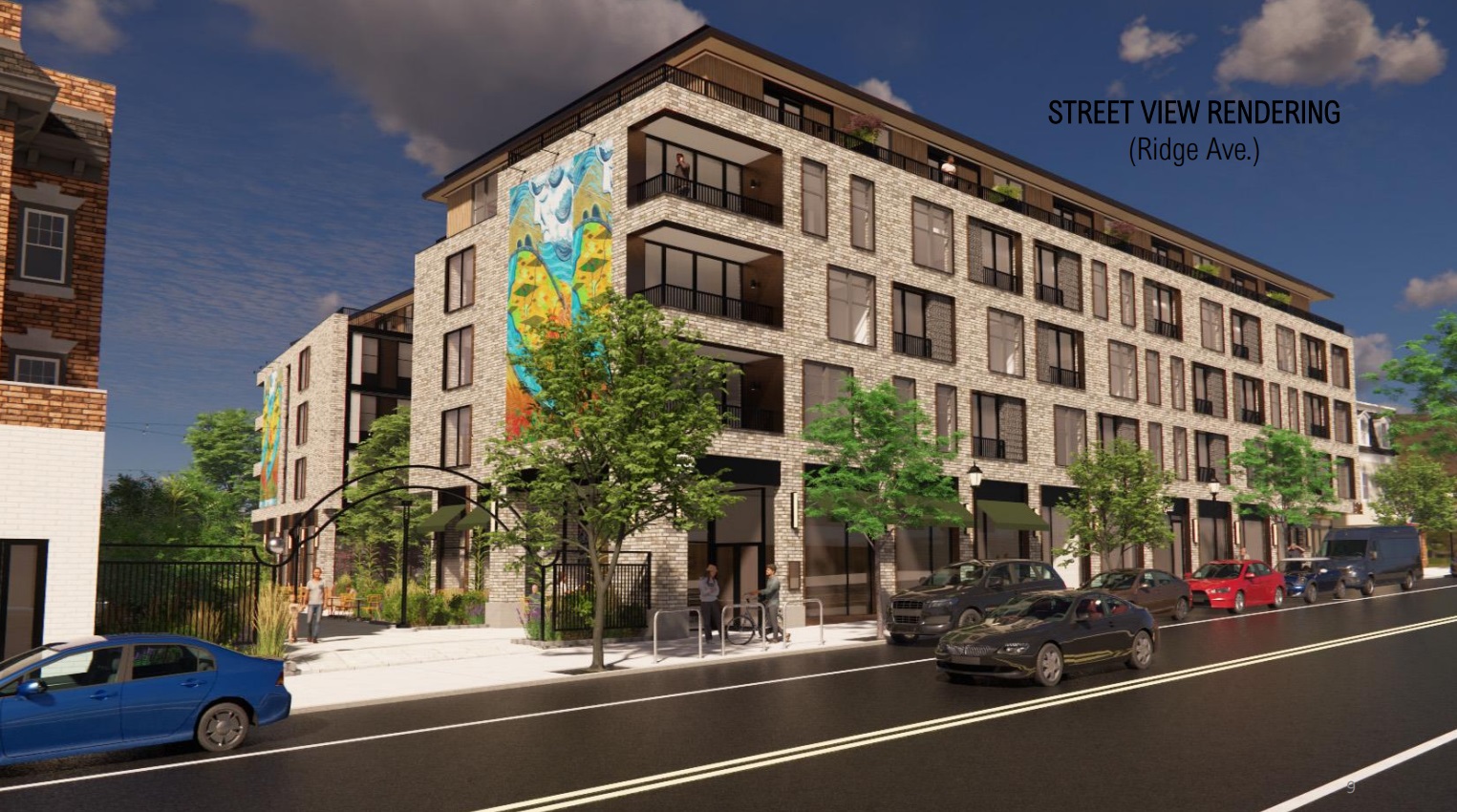
The newest iteration is novel in many ways. First, Stokes Architecture has been brought in to revamp the look and the concept of this project. Secondly, the size has been increased, with the height being bumped to five stories and the unit count jumping up to 94. Additionally, the parking which had been eliminated has returned, with an underground garage for 71 cars and 36 bicycles now part of the plans. The commercial space has also been sized up, with a 2,700 sqft commercial space along Leverington and a 19K sqft space along Ridge Ave. – a very sizable spot.
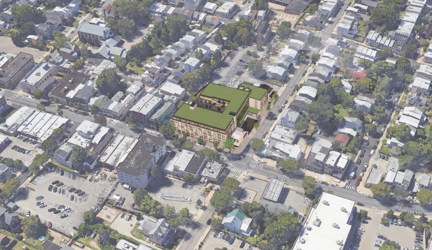
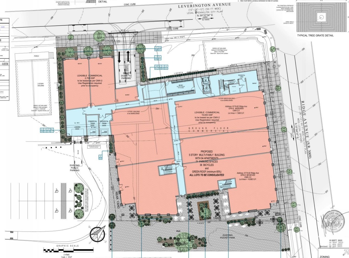
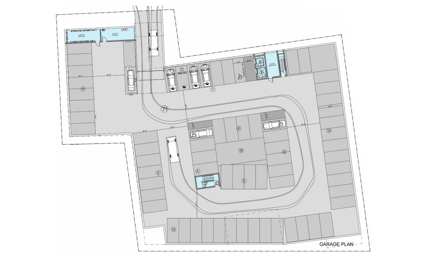
The design also takes a much more modern approach, with light brick and black metal looking sleeker as compared to the past plans. The mural facing the pocket park also makes a return, offering art and landscaping adjacent to the public space.
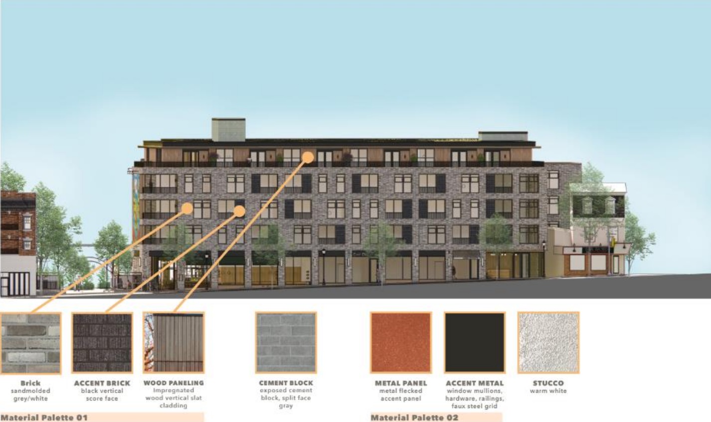
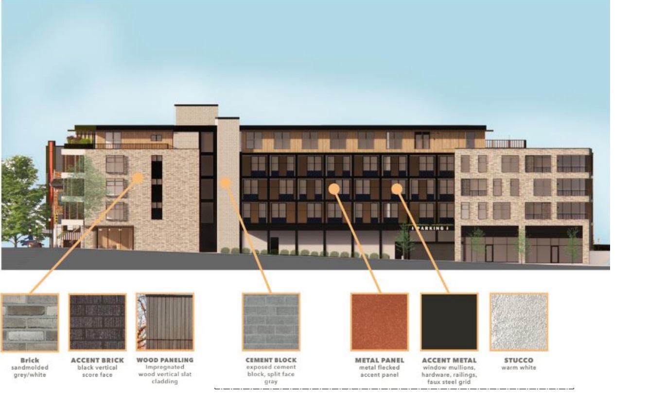
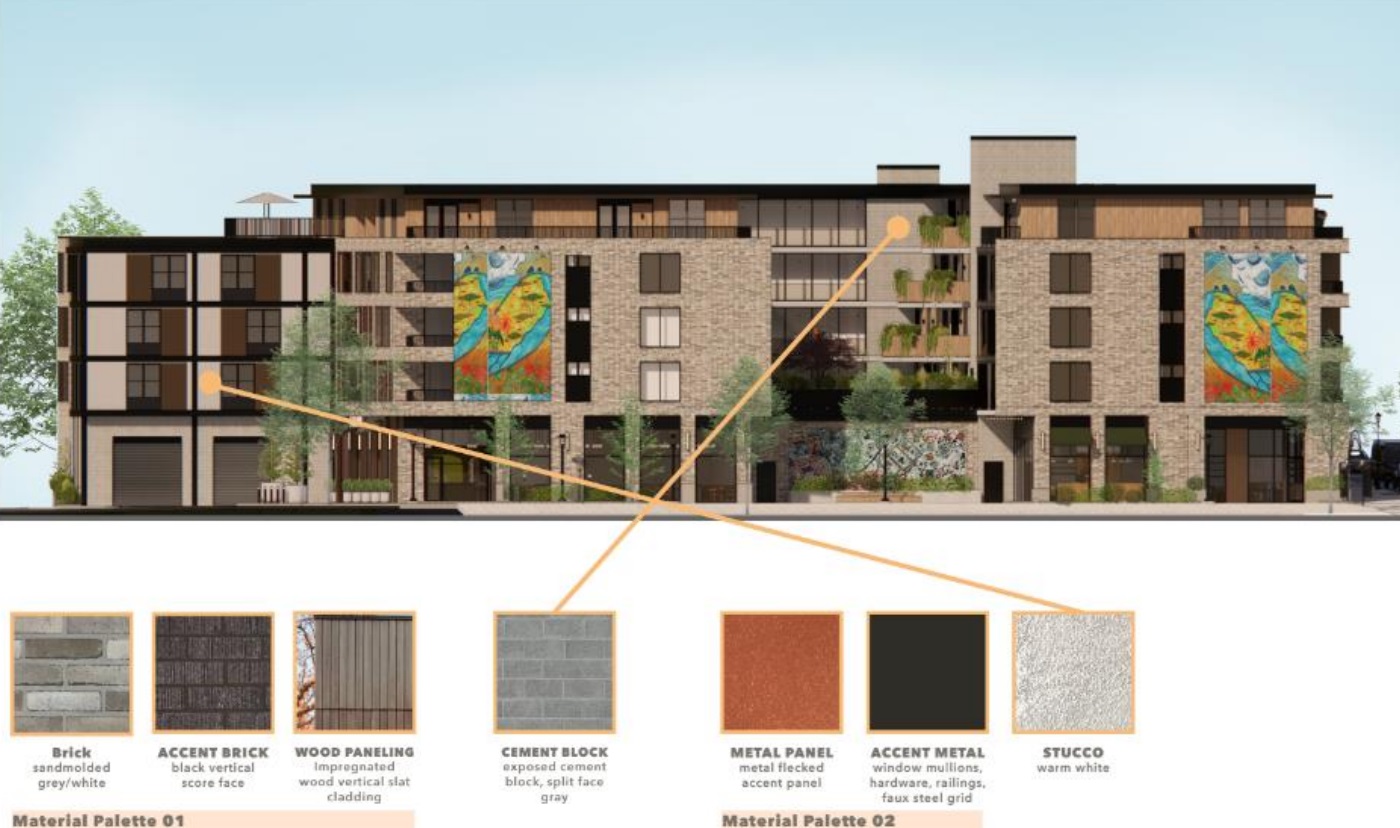
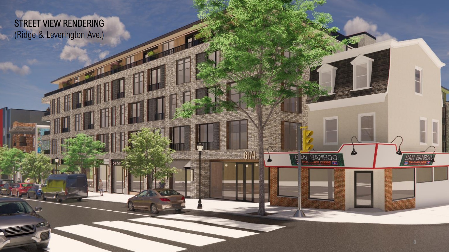
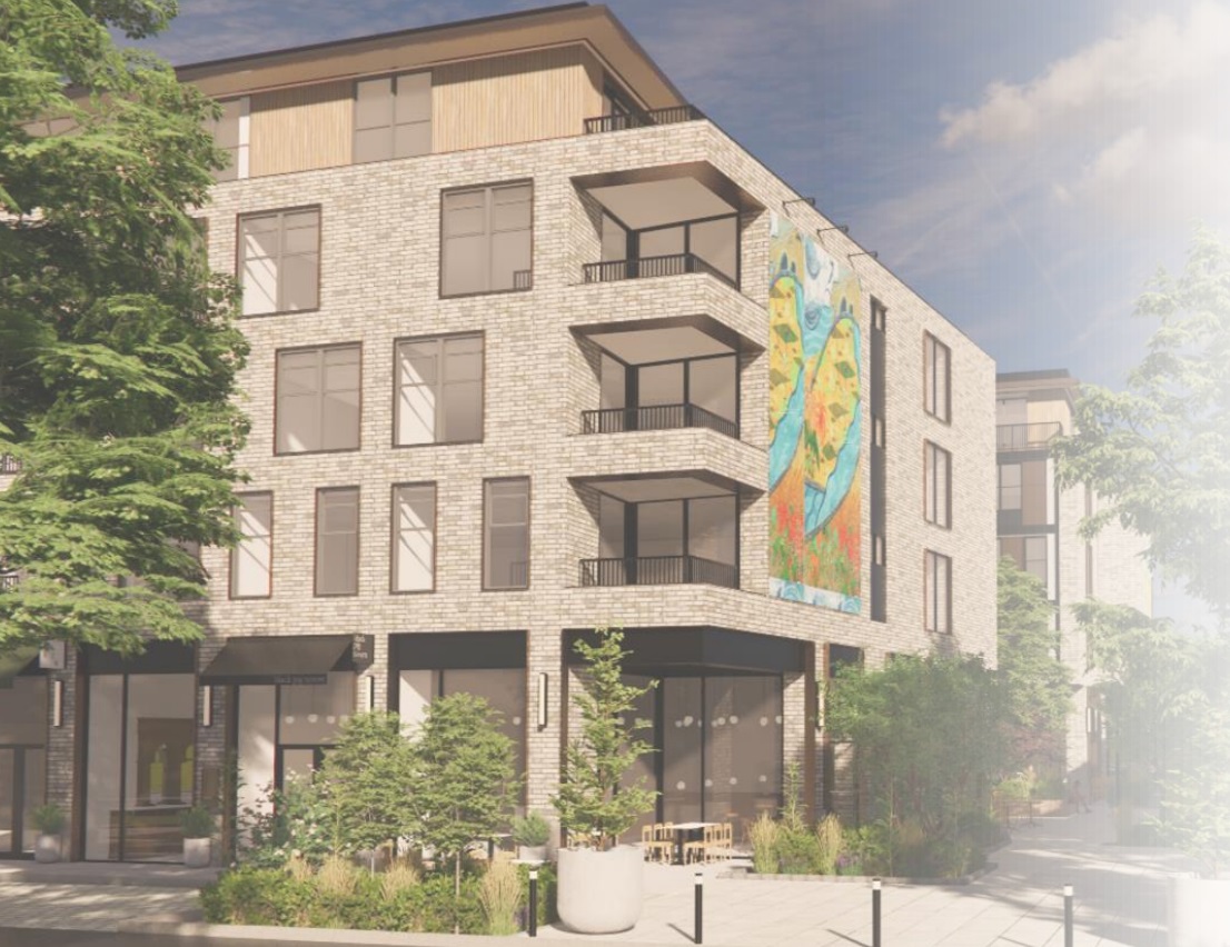
Overall, we think these new plans look nicer, though we are extremely intrigued by how they are received by the neighbors. This is an interesting instance where the developers are trying to appease everyone, providing more parking, more commercial, while also adding density to help make those decisions pencil out financially. We’d imagine that the increased density and height will cause some tension, but overall, we think this is a solution that should (hopefully) work for everyone. We certainly aren’t in love with the return of so much car parking, but we completely understand it given the closest train station is about a mile away.
Will this new design reopen the can of worms, with even more iterations coming our way in the future? Perhaps, as the community will have the chance to weigh in on the design before a return trip to the Civic Design Review at an unknown future date. Either way, we’re pleased to see the look here continue to be refined the fourth time around.
