Over the winter, we told you about plans for Whole Foods to move out of their too-small, parking-nightmare location at 20th & Callowhill to a new facility to be constructed at 22nd Street and Pennsylvania Avenue, currently the site of a Best Western Hotel. We knew that this would be a mixed-use development, and that it would be massive, but we’d gotten relatively few specifics about this project. Until now, that is. A couple of weeks ago, the developers presented the project to Civic Design Review, providing all sorts of info and pretty pictures too!
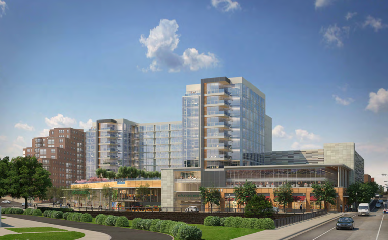
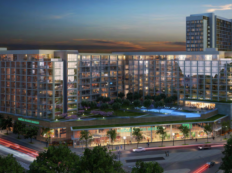
We present to you, Rodin Square!
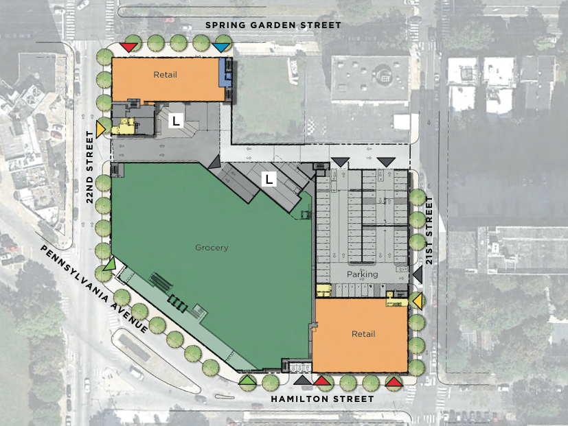
This glittering edifice, designed by MV+A Architects, will include a 55K sqft Whole Foods as well as two additional retail spaces with tenants to be determined. The grocery store, which will front Pennsylvania Ave., will have a designated underground parking area with room for 172 cars. Check out this site plan to get a clearer idea of how things will lay out:
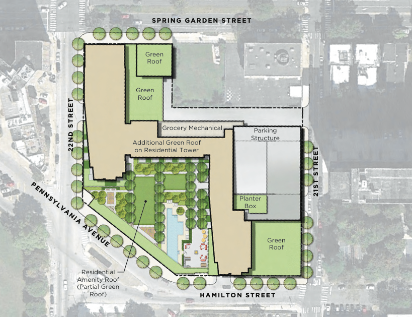
In addition, the development will include 293 apartment units over nine stories. These residences will have parking in an adjacent garage, which will also have parking for bicycles. In addition, there will be a huge amenity space for folks who live here, located on the roof of the Whole Foods. There will be a swimming pool, green roof areas, and spots for meeting and exercising.
Not only will this project represent a tremendous upgrade for Whole Foods, but it will be a huge improvement over what’s there today. The hotel has held down this corner for decades, and it looks the part. A much taller project was proposed here several years ago which was met with some significant opposition from the community, but we can’t imagine that the project we’ve described above will meet with much resistance. Not only is the design appealing, but the massing isn’t very tall and it will provide clear amenities to the surrounding neighborhood.
How do people feel about this project? Clear upgrade over what’s there and what was previously proposed, or not so much? Do folks like the contemporary design, or would they have preferred something a little more traditional? Is the height appropriate, or should the developers have proposed something taller and more aggressive? Or, <gulp> shorter?
We think this project looks really great and can’t wait to see it get in the ground. Maybe it’s because we like shiny new buildings, maybe it’s because we’re eager for a new Whole Foods. Well, either way, we’re excited.


