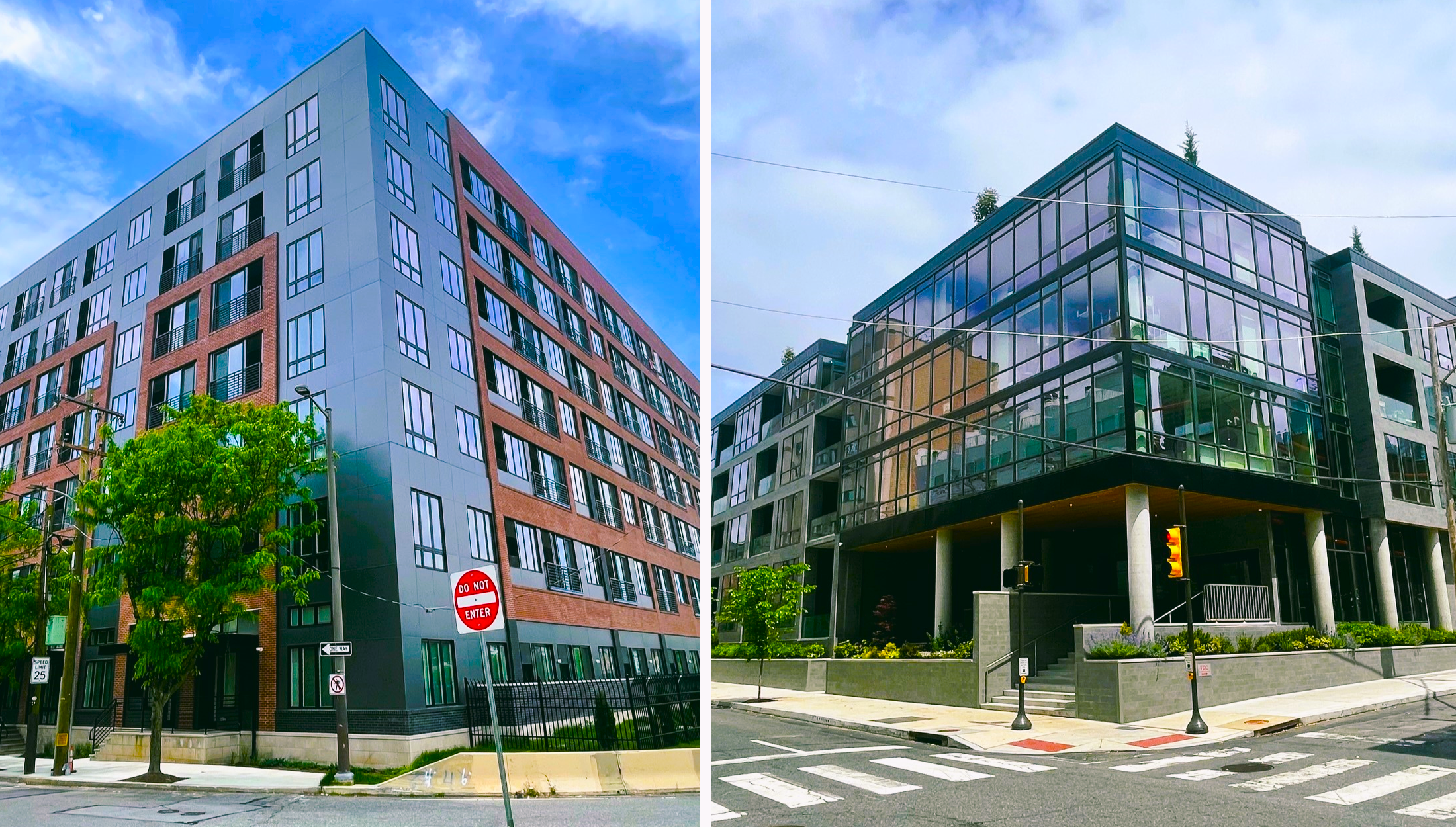
Every time a surface parking lot in Greater Center City meets its demise, we muster up our best urbanist celebration as we toast to a higher-and-better use than surface parking. Two such lots in the Logan Square neighborhood – one at 23rd & Summer and another at 23rd & Cherry – have us dancing in the street, though not literally, as we are pretty close to one of the more harrowing exits from 676. Let’s take to the air to revisit the two surface lots that look much, much different today than they once did.
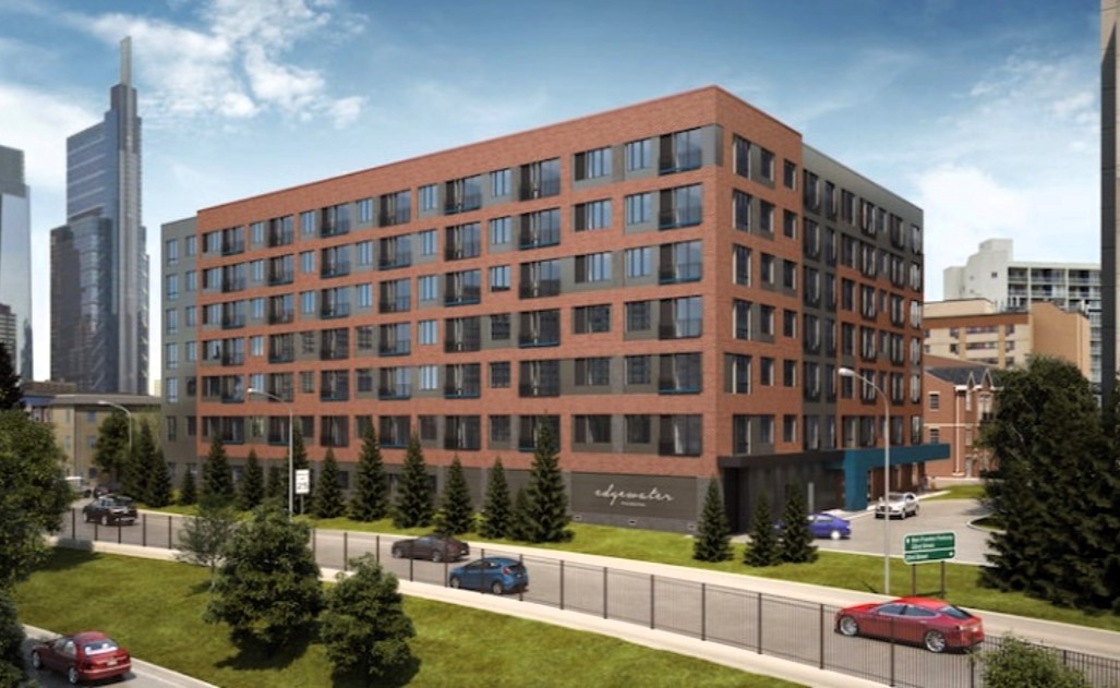
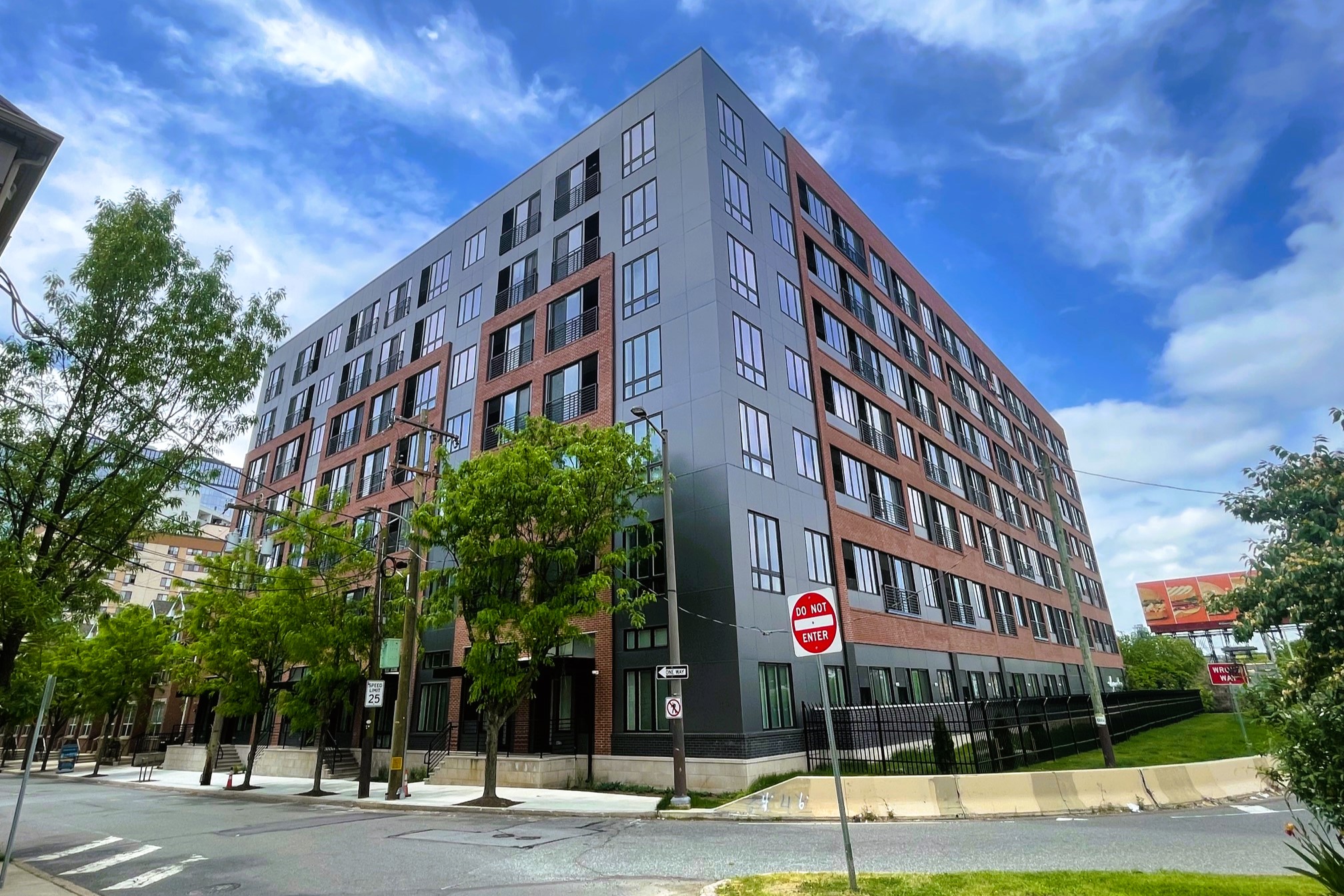
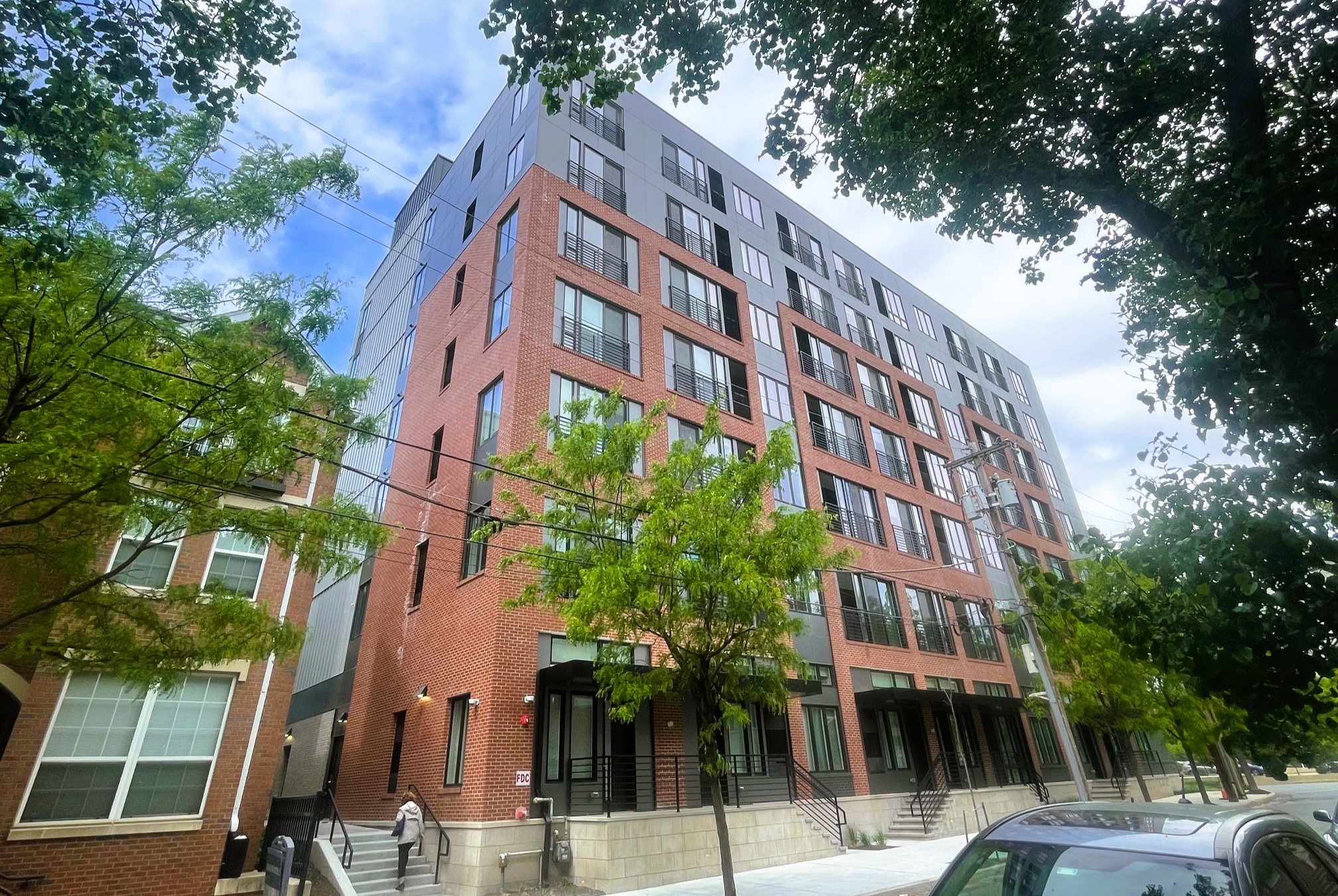
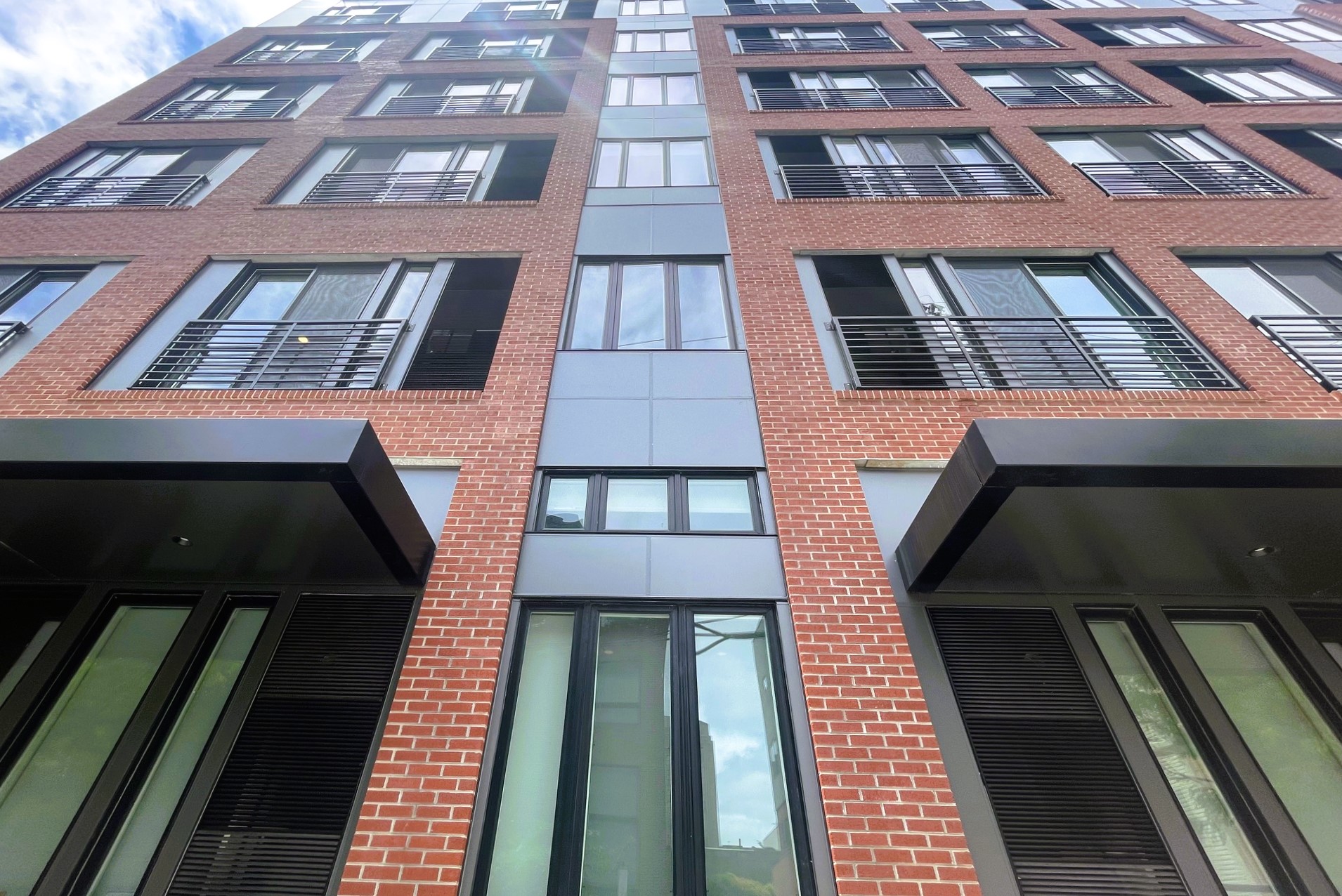
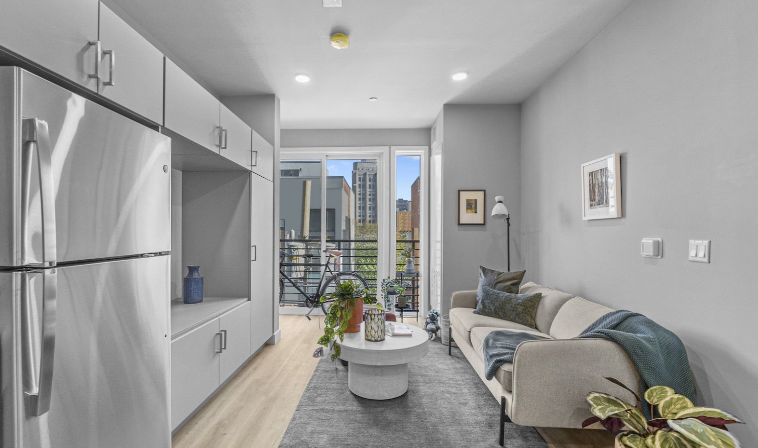
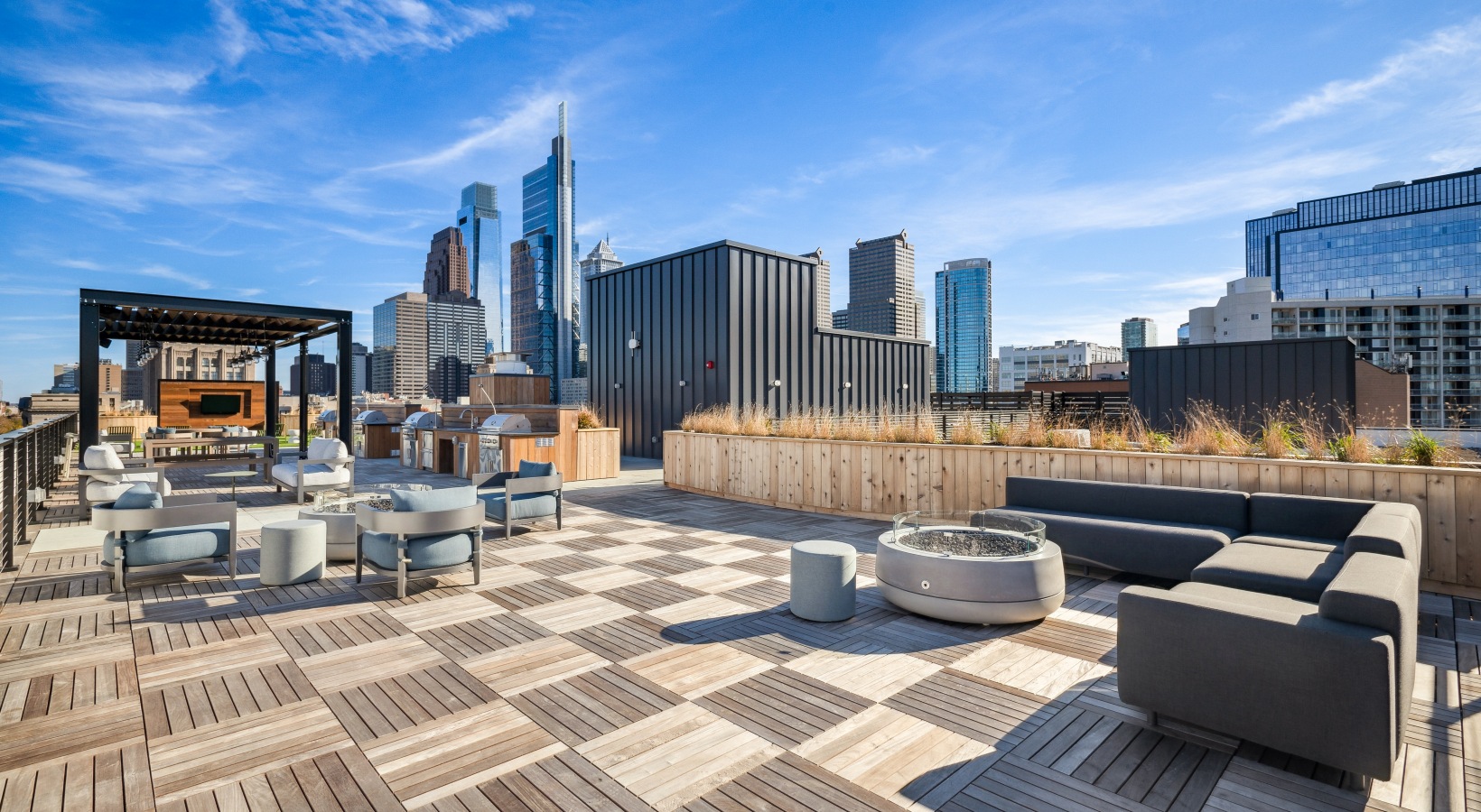
Let’s start with the northern of the two projects, the now completed Edgewater II. This modular construction was in progress at our last visit in the fall of 2022, when the second phase of this long-coming project was finally rising, though at a shorter height than initially anticipated. As we said, the building designed by JKRP is now complete, with the seven-story, 180-unit apartment welcoming guests to their new, modern digs. A pool and a roof deck are also available to residents here, offering some pretty cool views of Center City. We are happy to see so much brick here, which works with the gray paneling to hide any obvious signs of the modular build approach, though we would have been OK with a bit more facade articulation.
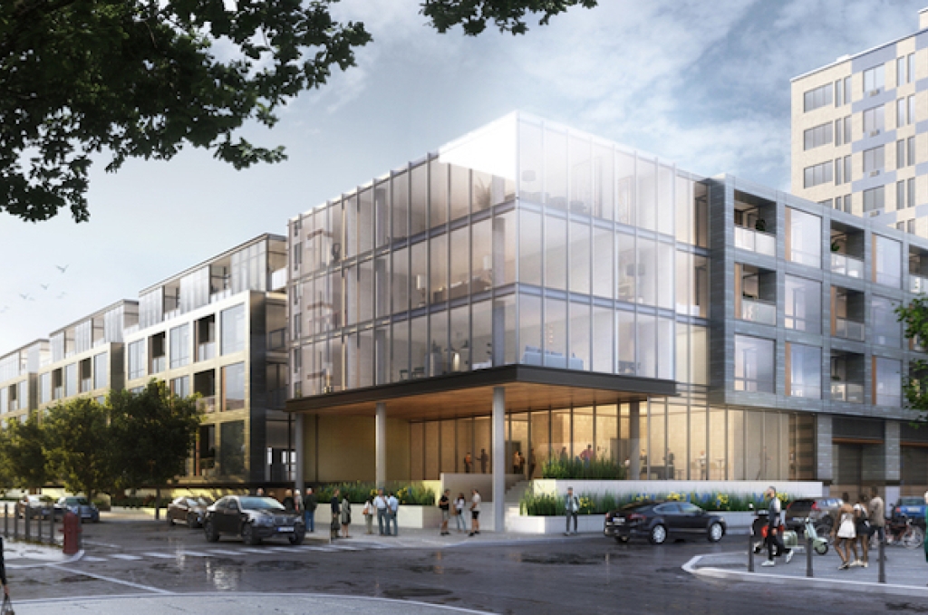
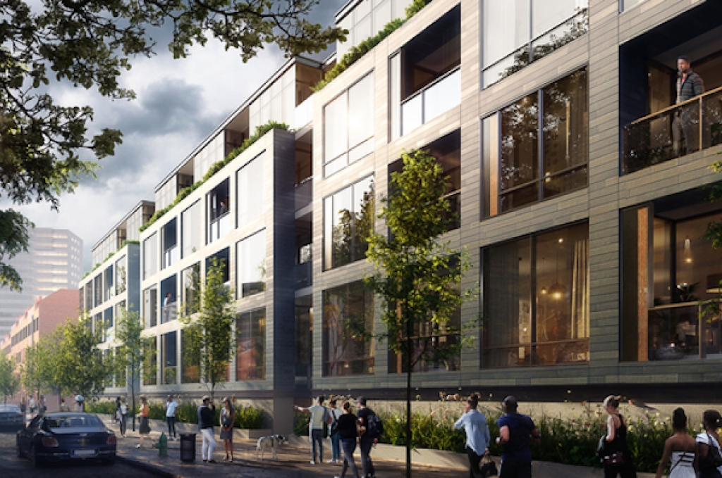
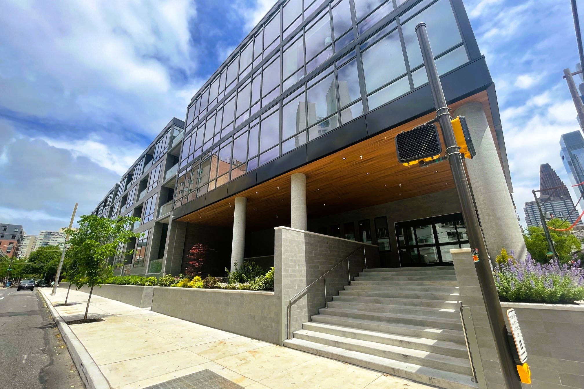
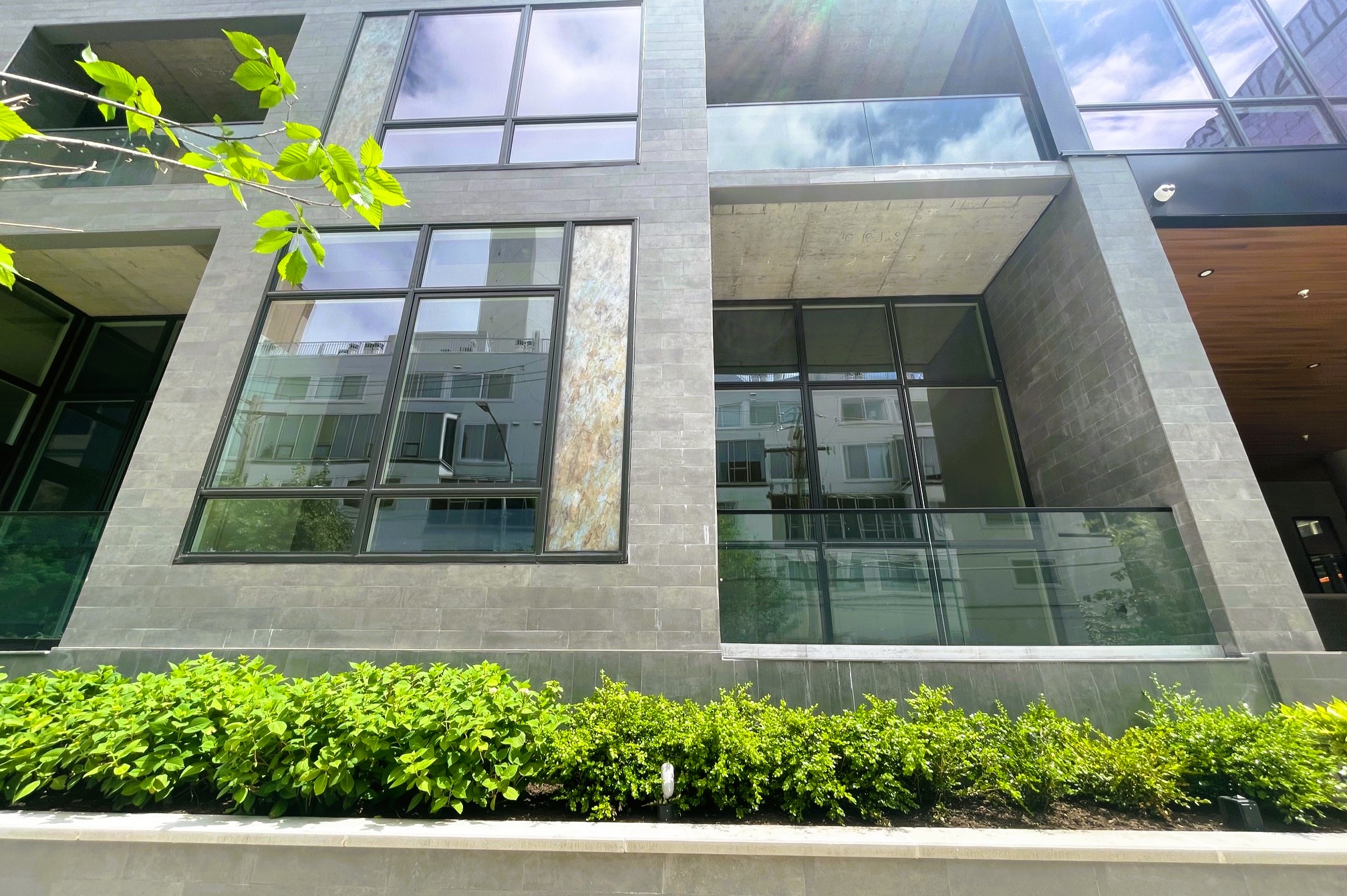
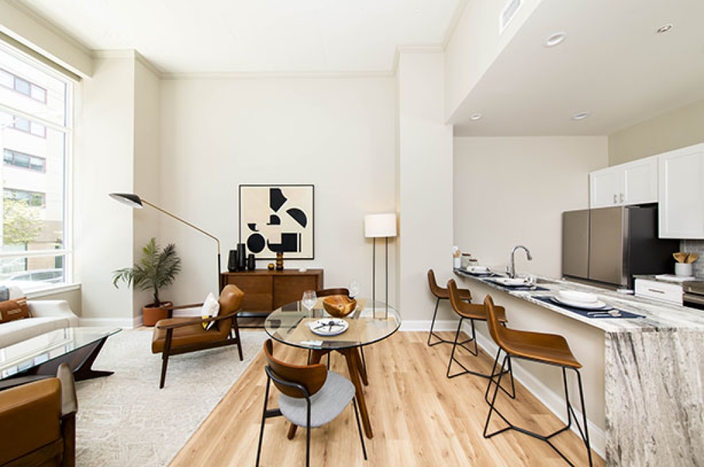
Skipping just a block or so to the south, we come to another project we checked out in Fall 2022. This one comes to us from developers PMC, who took an approach here that we were not expecting. With their Riverwalk project towering high overhead across the street, PMC went much lower here, with 115 units across the four-story structure. Surprisingly, steel and concrete were used here – along with a crane – creating a very solid structure. As for that structure, that modern design comes from SCB, offering a glass-heavy look along with abalone-like paneling, which stands out less than you’d expect thanks to the dull gray tile that provides a bit of a muted look. Thankfully, the landscaping around this building lessens the grayscale effect, creating something that most definitely looks different than what we normally see.

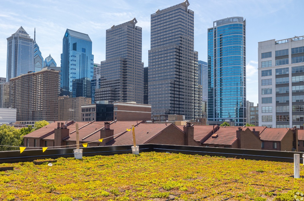
That’s just under 300 new apartments for these two quiet blocks. We’re not necessarily enamored with either design, with some of the cost considerations coming through in the final look. However, it’s no surprise to us to see these properties move from parking to people, as Center City continues to see more development despite (supposed) population decline overall. No matter how you feel about what’s happening across the city, there’s no denying that people are still clamoring to live in walkable, central locations – even if means managing an off-ramp.

