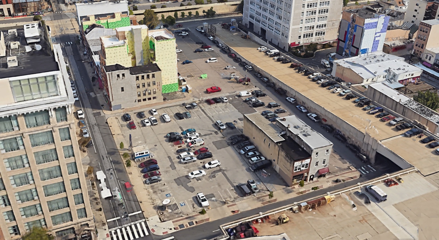
The northeast corner of 12th & Race is home to one of our least favorite surface parking lots in town. There’s a hotel immediately across the street to the west. The Convention Center sits across the street to the south. And yet this parcel has been used as a surface lot for decades. Looking back in time, this property was once used for residential purposes and was home to a collection of row homes and trinities, located on a since vacated little street called Short Court. Things took a turn for the commercial and toward vacancy in the middle of the 20th century, and the underuse has only become more pronounced as the years have rolled along.
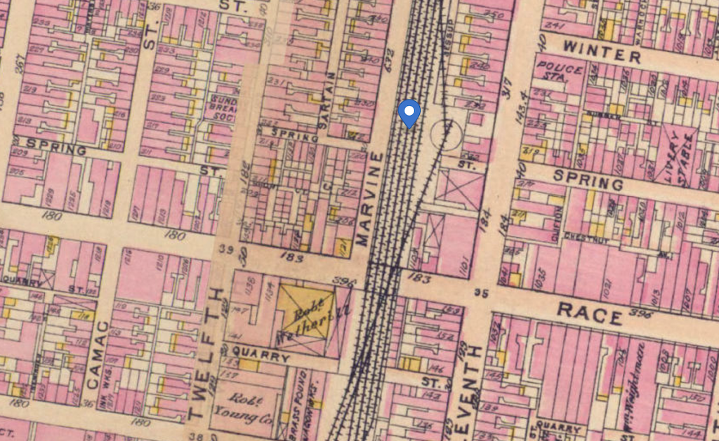
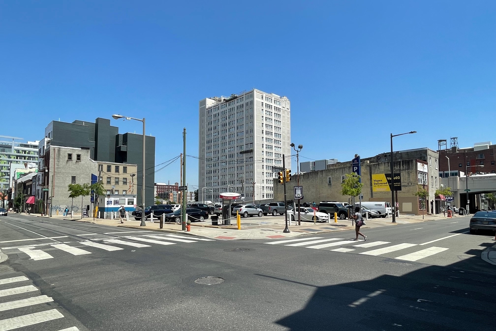
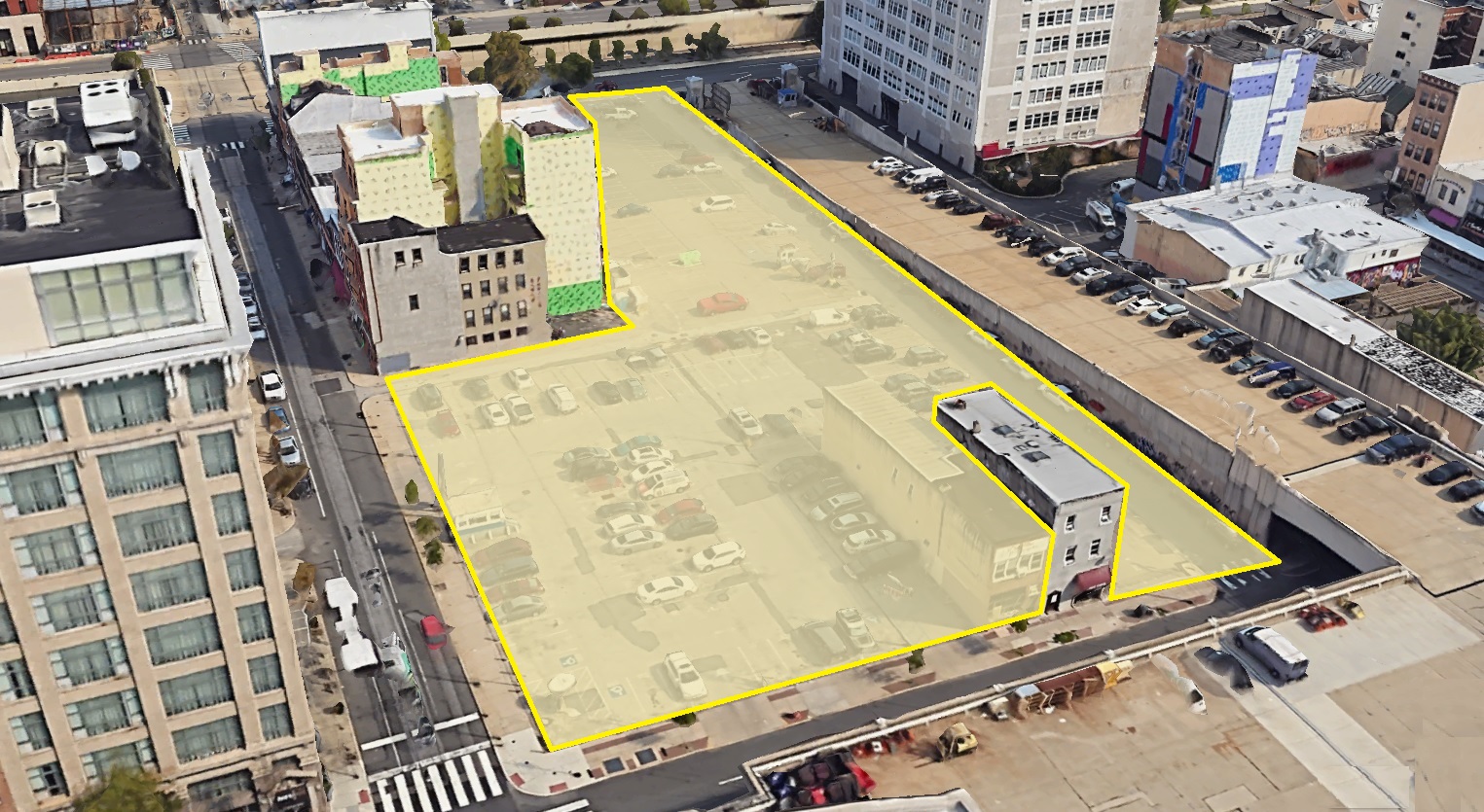
The property, which forms something of an L-shape, is not one that stands out, except for the fact that it sits immediately to the west of the ramp that leads to the Convention Center (replacing that old Reading viaduct). Parkway has owned and operated the lot as surface parking for decades, but those days are likely coming to a close, with redevelopment seemingly on the horizon. And in a twist that screams Philadelphia, one of the buildings on the soon-to-be-consolidated property – 1123 Race St., home to Lollipop Massage Spa – decided to stick around and not participate in the upcoming change at this corner.
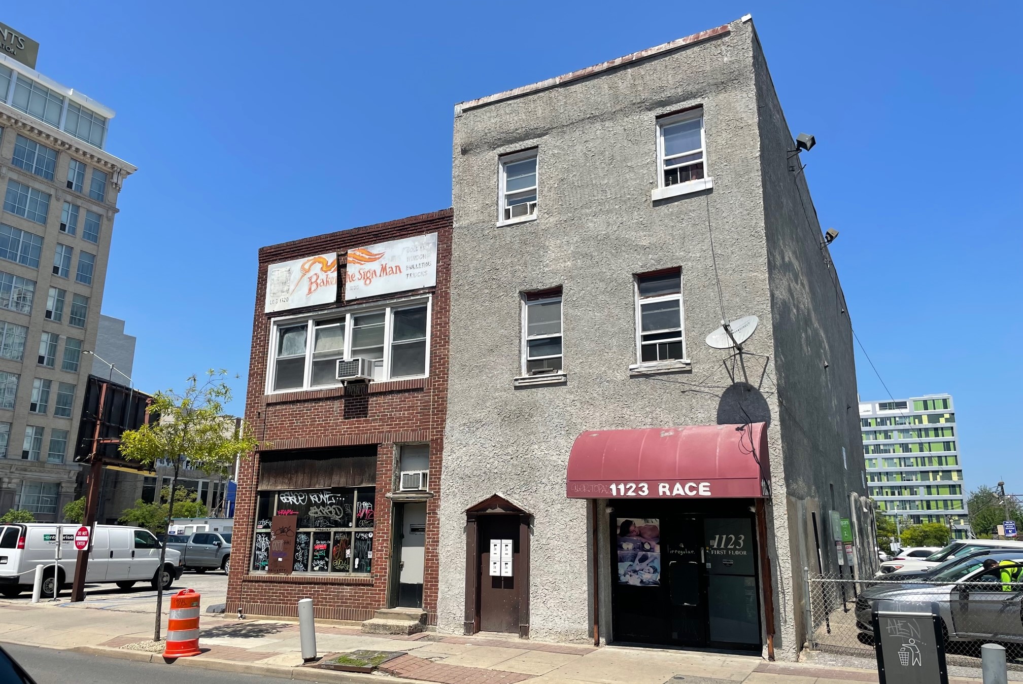
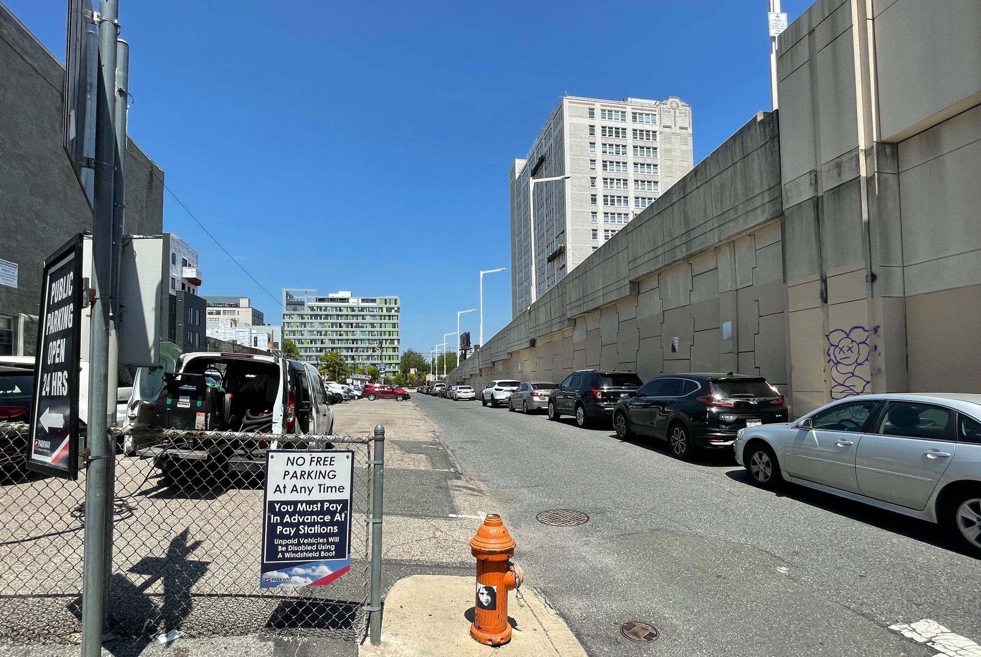
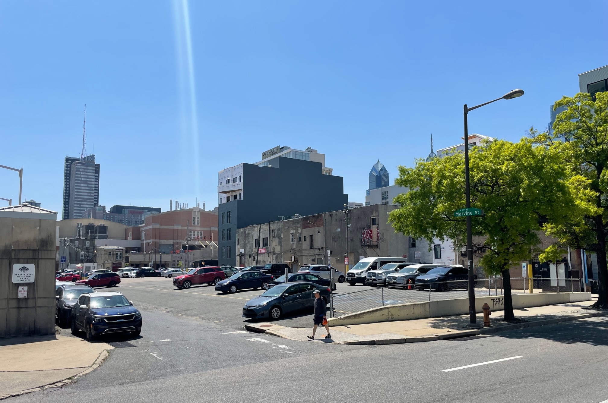
A public zoning meeting of the Philadelphia Chinatown Development Corporation took place last week, only referring to the intersection in the agenda description. We’re sure glad we attended, because we have big news. Linden Street Investments, who are also developing The Keystone in Northern Liberties, have recently purchased the property, with some rather interesting plans. The site is zoned CMX-4, seemingly in line for a tallish tower with ground floor commercial space. However, the design from Bernardon poses an interesting program in its place.
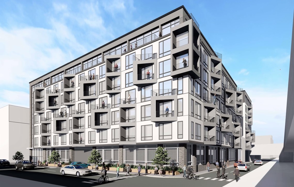
Plans call for a seven-story apartment building, with a ground floor that will consist almost entirely of…parking. That’s right, the development team decided to go with an approach that would keep approximately the same number of parking spaces on site, all of which would be available for public use, with Parkway managing the garage. The building itself would take up almost the entire site, including removing Marvine St. to the east and Summer St. in the middle of the property. Parking would be accessed from both 12th St. and Vine St., with the lobby entrance taking up a small area along 12th St. as well. And while the plans are still conceptual, the renderings certainly give us a taste of what the project team has in mind.
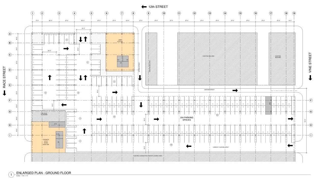
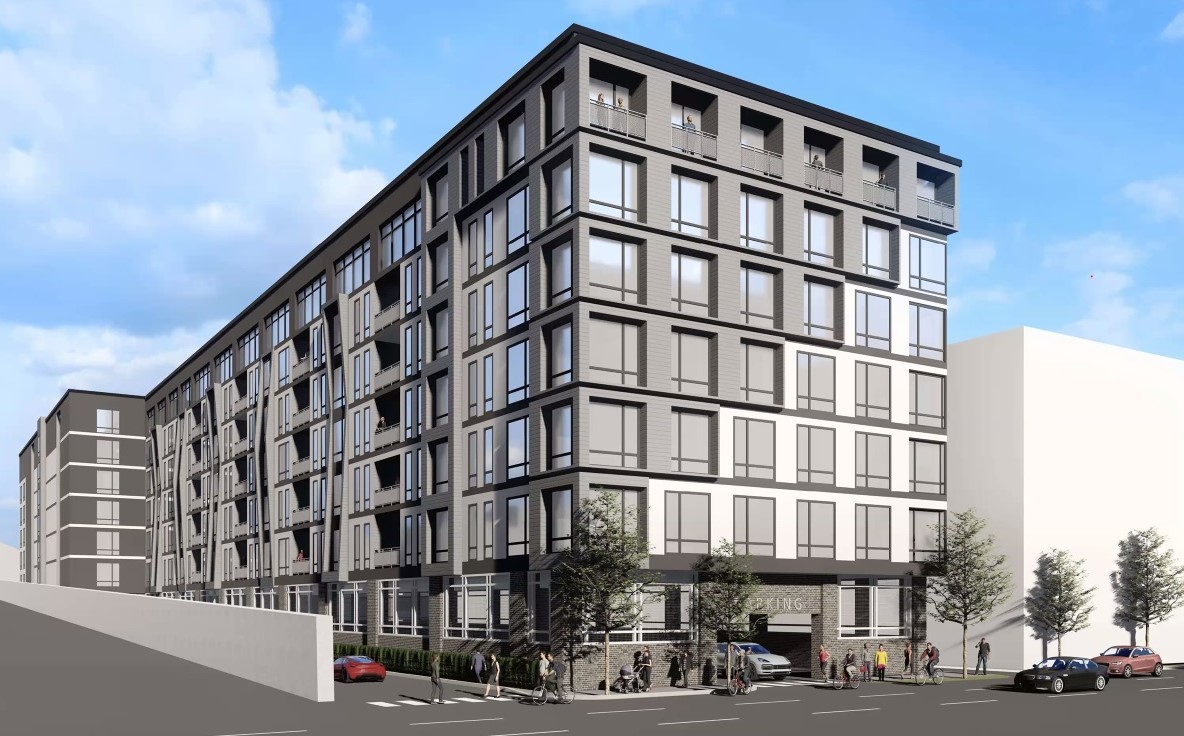
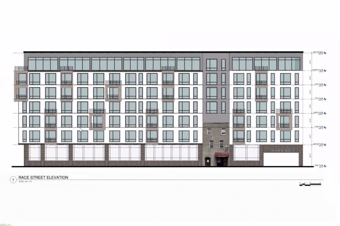
While not what we would expect or perhaps even what we prefer for the area, this project seems to make sense for all parties involved. The feedback from PCDC during the public portion of the meeting was quite positive, with Executive Director John Chin sounding in favor of the residential density to help support the local businesses in the area. There was some slight concern regarding the removal of the through streets, but these are really glorified parking strips that don’t add anything to the area.
Despite our desire for less parking and more retail space as a rule, we can get behind this one. As it moves forward, we hope that the design evolves to reflect the local architecture a bit more. This building could just as easily be found in Topeka or Scottsdale, with the facade offering little to no connection to the neighborhood in which it will reside. Adding more vibrant colors or design elements that reflect the rich history of the neighborhood could take this project from good to great, as the gray-on-gray feels a bit safe for our taste. The development team was very open to feedback, so we hope that there are some additional ideas on the way to make this project singularly of and for Chinatown.

