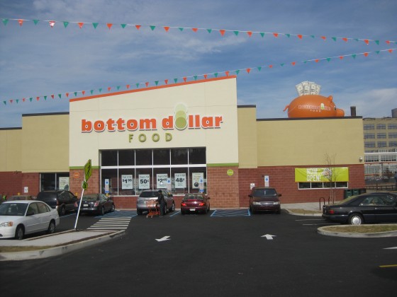
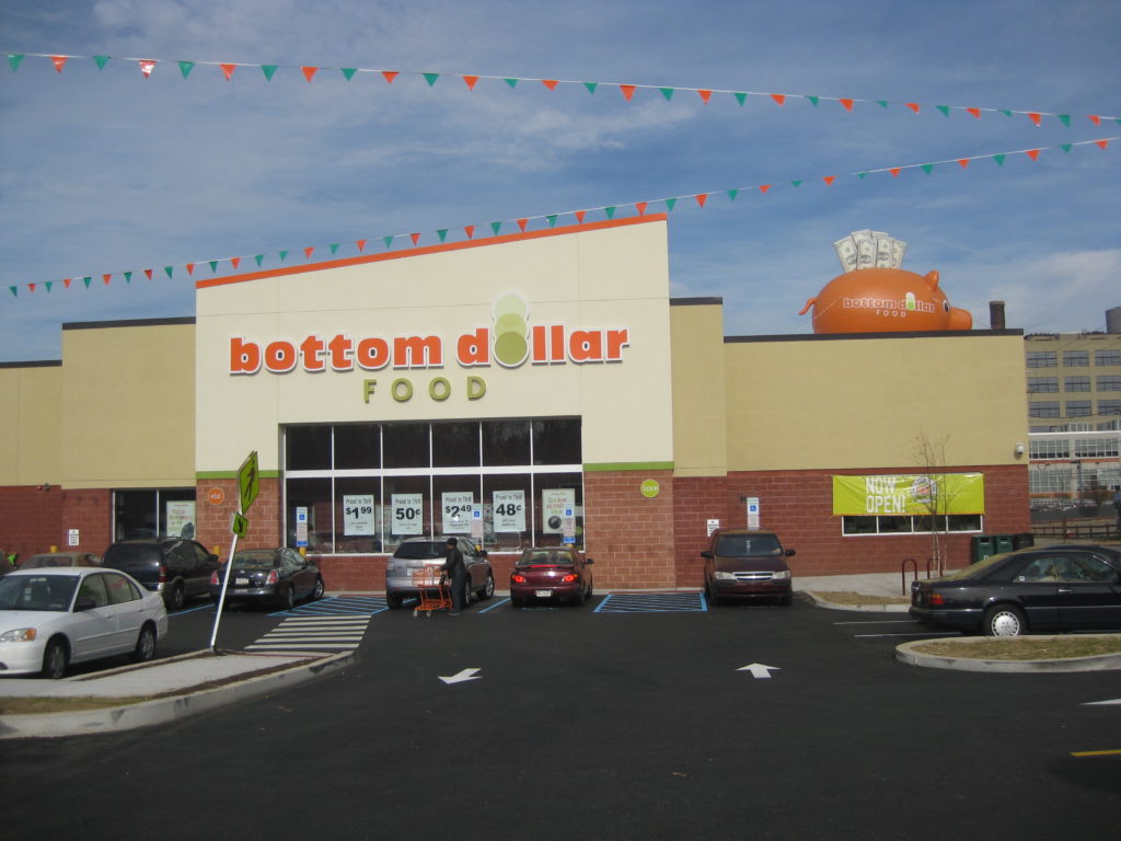
Less than five months after breaking ground, the new Brewerytown Supermarket at 31st & Girard opened its doors last week. Years in the making, this new Bottom Dollar location will provide locals with easier access to groceries than they’ve had in decades, and at reasonable prices, to boot. And since it has been built due to the collaboration of community groups, politicians, and developers, this is a particularly proud moment for many people.
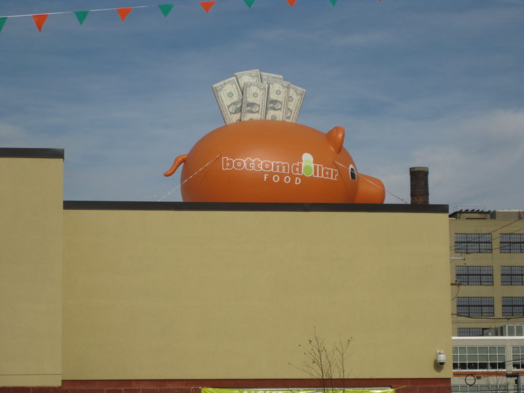
We don’t claim to be design experts here, but we can say without hesitation that the design of the project is terribly disappointing. And we’re not even gonna get into the orange pig curiously stationed on the roof.
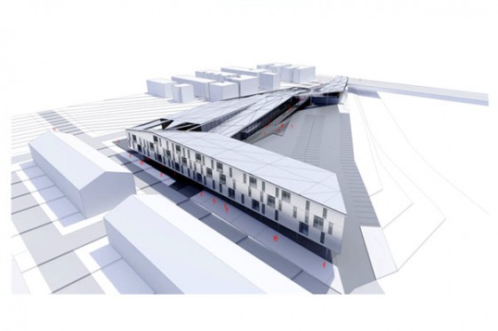
A few years back, Interface Studio Architects, and the Community Design Collaborative created plans for this site as a part of the Infill Challenge. That design was ultra-contemporary, using interesting materials and also featured a row of housing units onto the site as well. While the design we got fronts the parking lot onto Girard Avenue, the Infill design did its best to hide the parking on the western side of the development, next to the train tracks. Just check out these renderings of what might have been:
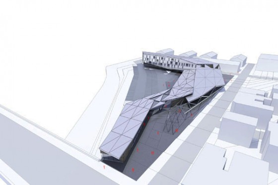
Pedestrian area and retail at Girard, market on the right side, next to parking, housing to the north of the lot
Now, we’re not suggesting that this proposal would have been financially feasible, nor would we have expected that this plan would have been followed to a tee. But couldn’t some of these design elements have been lifted, and inserted into the final design? Couldn’t the architects have opted for something a little less suburban, a little less cookie cutter, a little less awful?
People in the neighborhood should be ecstatic about their new market, and we believe that this amenity will make the area a friendlier place to live. But it’s going to be awhile before we’re done being caught up on the contrast between what we got and what might have been.

