Call us biased, but we believe Old City to be one of the more interesting neighborhoods in the city. While some may groan at the quaintness of Benjamin Franklin impersonators or get annoyed by the groups of tourists (that have thankfully made their return), it is undeniable how the layers of architectural history create a combination of styles seen in only a few places across America. Plus, it’s got Franklin Fountain, which is worth its weight in dairy deliciousness.
In July of 2021, we checked in on one of the non-historic structures that dot the neighborhood at 223-25 Market St., where plans called for an overbuild to a non-remarkable 1960s structure that received an addition sometime around 2001. This project was exciting, as it would increase the height and density for a prominently located building on a main drag in the neighborhood. We stopped by again earlier this year with things well underway and with an updated design in the works.
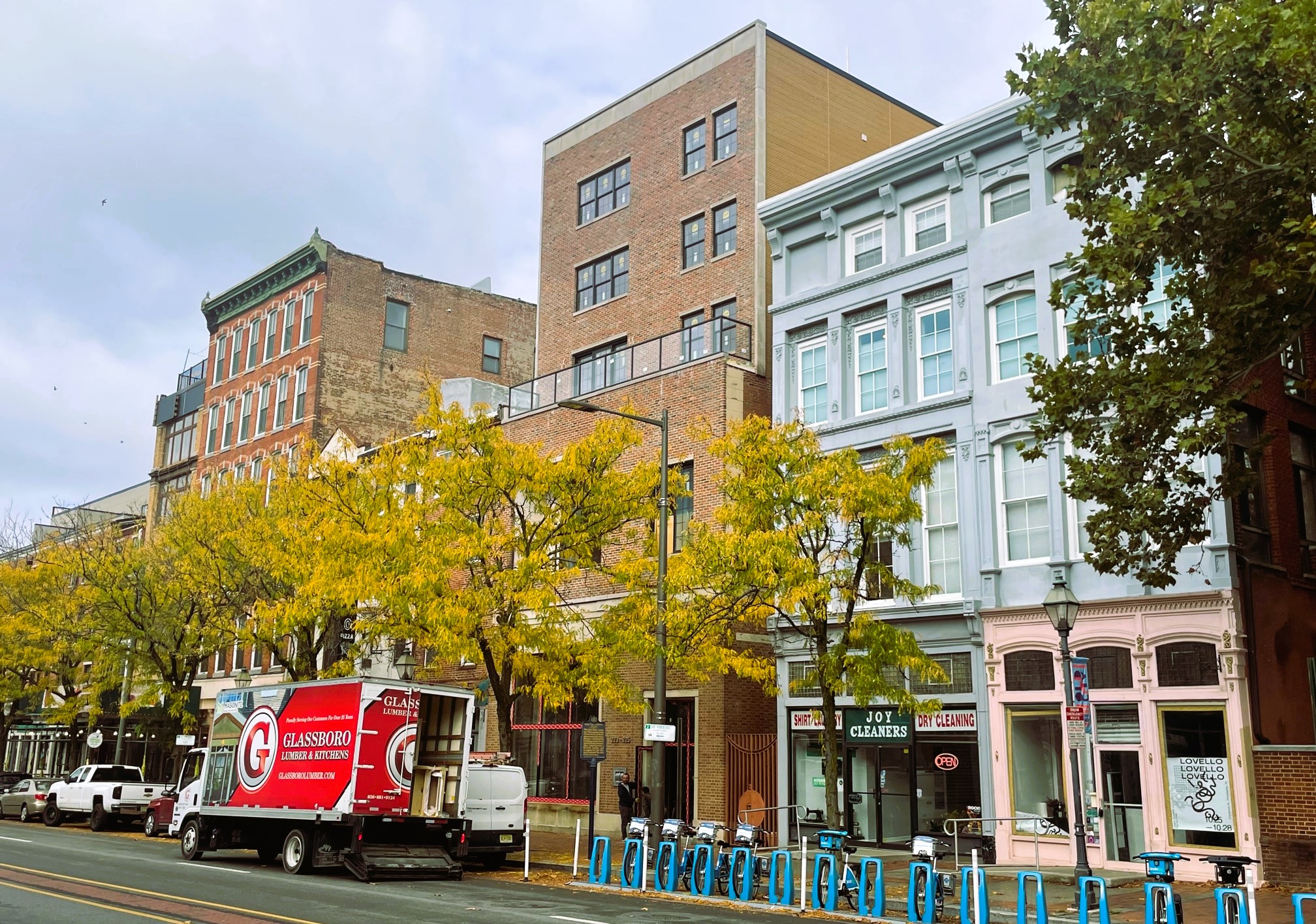
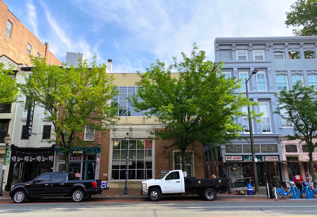
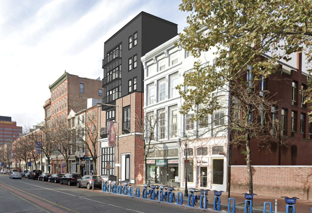
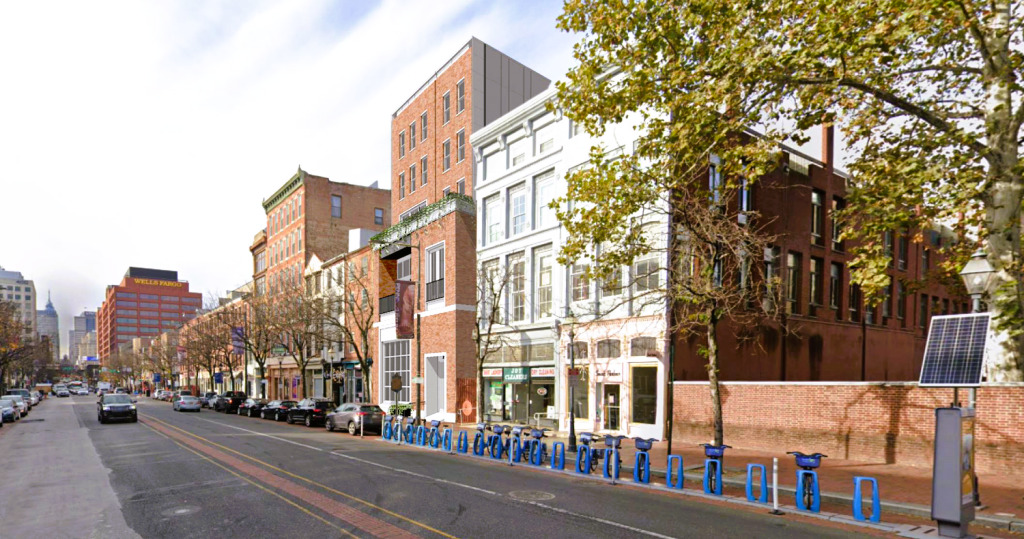
As you can see, things are moving right along, with the brick facade completed, with just some window work remaining on the exterior facade. This design from Atrium Design Group does an outstanding job of integrating with the surrounding buildings, blending in nicely instead of making a bold statement. You could argue that the cornice should be a little more elaborate, but we’re on board with the understated cornice, matching the feel for the rest of the building. And obviously the Historical Commission agrees, or else this thing wouldn’t be getting built in the first place. Expect to see 22 apartment units on the upper floors, with about 3,000 sqft of commercial space on the ground level.
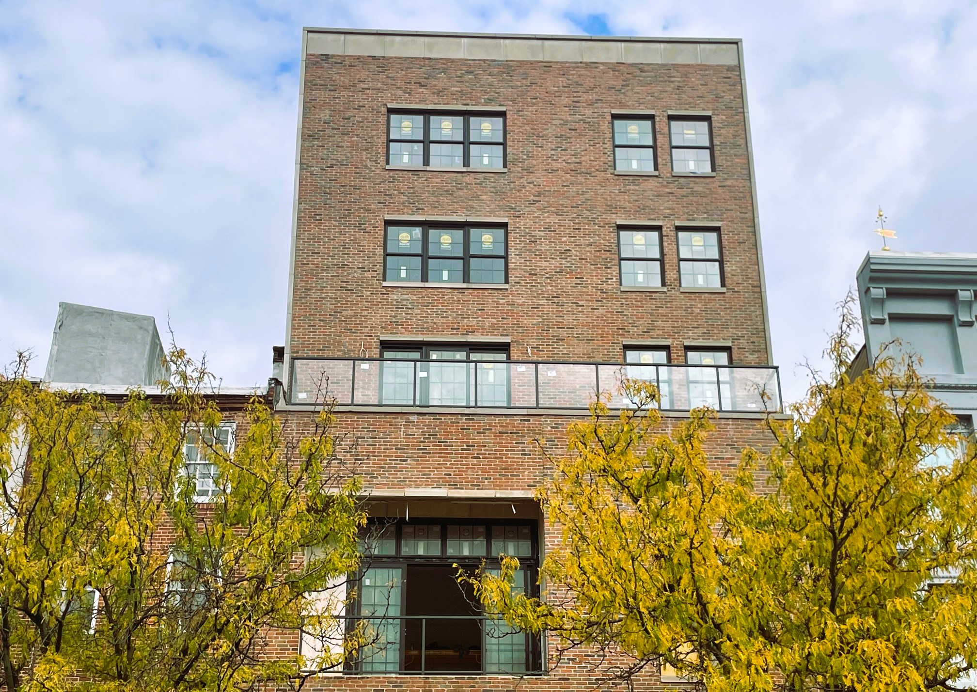
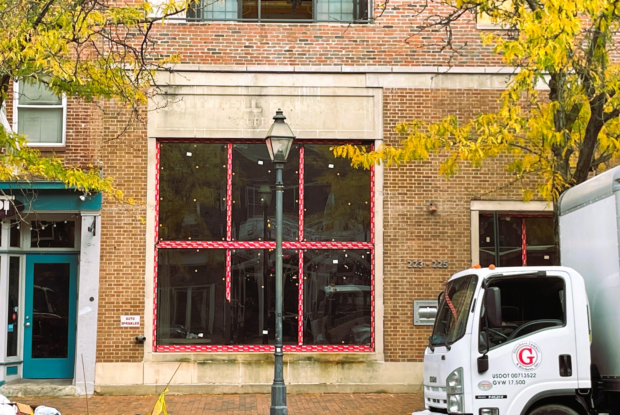
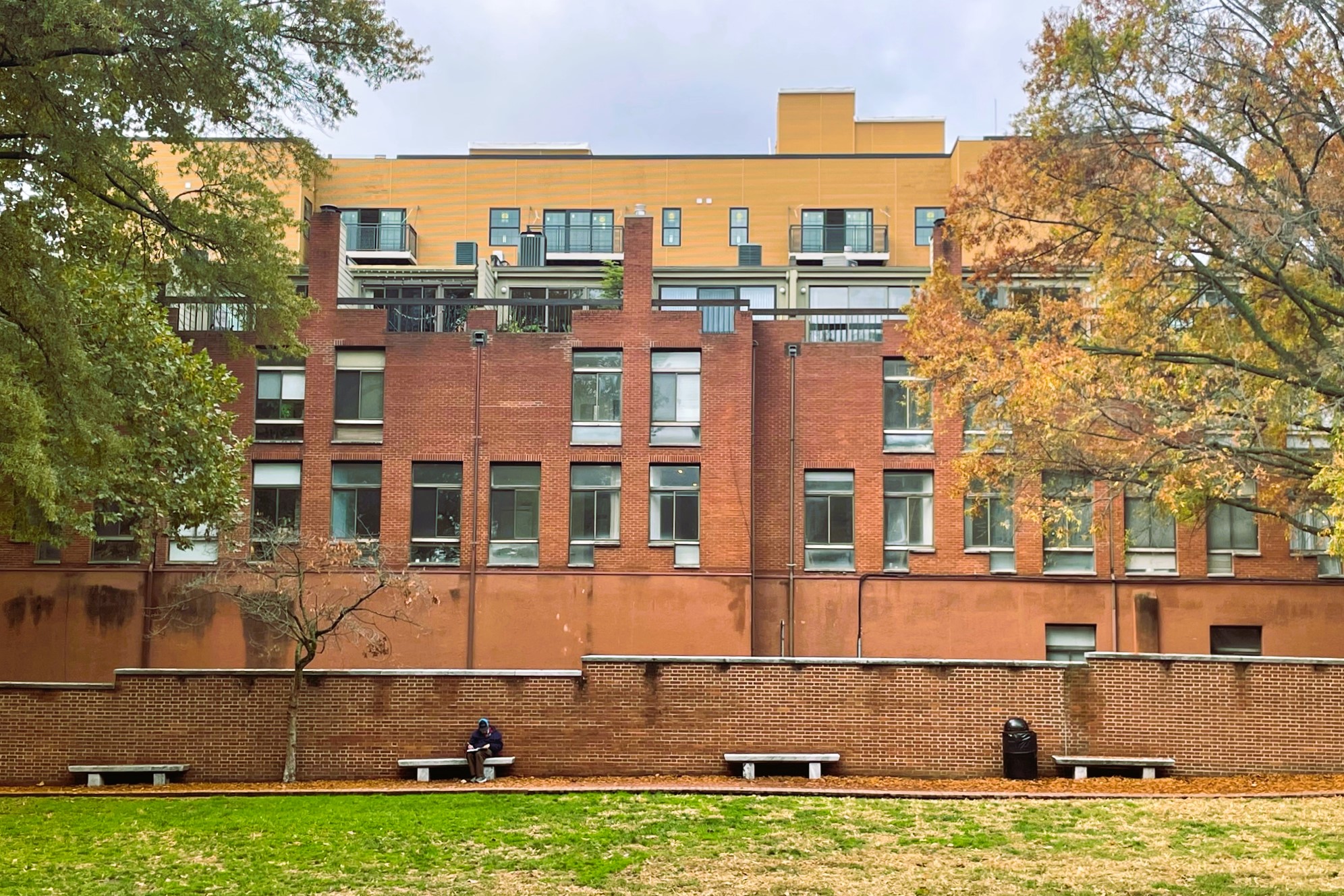
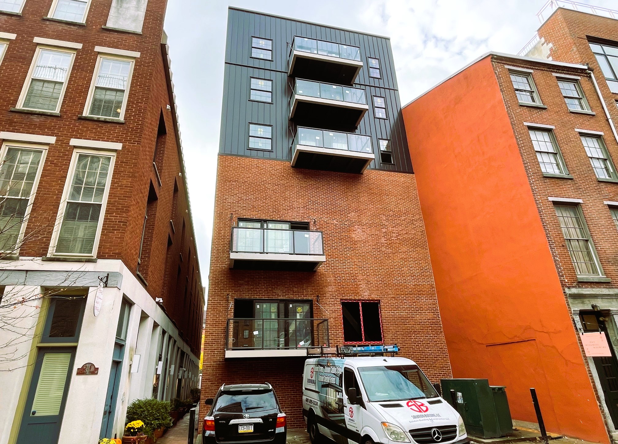
We are pleasantly surprised by how this is turning out. The brick fits right in and even the rear facade does a good job of offering a pleasing look on the Church Street side, where it would have been easy to value engineer to something far less welcoming. We also love the addition of dozens of new residents here, as a denser and busier Market Street can only mean good things for the many businesses on the corridor and in the vicinity. The inclusion of commercial space and the lack of on-site parking are also huge wins in our eyes, as the site sits less than a block away from the 2nd Street stop on the MFL.
